
Circular visualization in Python (Circos Plot, Chord Diagram, Radar Chart)
pyCirclize: Circular visualization in Python





Table of contents
Overview
pyCirclize is a circular visualization python package implemented based on matplotlib. This package is developed for the purpose of easily and beautifully plotting circular figure such as Circos Plot and Chord Diagram in Python. In addition, useful genome and phylogenetic tree visualization methods for the bioinformatics field are also implemented. pyCirclize was inspired by circlize and pyCircos. More detailed documentation is available here.
 Fig.1 pyCirclize example plot gallery
Installation
Python 3.10 or later is required for installation.
Install PyPI package:
pip install pycirclize
Install conda-forge package:
conda install -c conda-forge pycirclize
API Usage
API usage is described in each of the following sections in the document.
- Getting Started
- Plot API Example
- Chord Diagram
- Radar Chart
- Circos Plot (Genomics)
- Comparative Genomics
- Phylogenetic Tree
- Plot Tips
Code Example
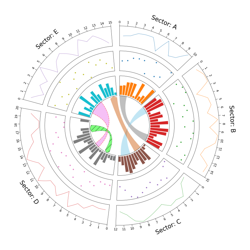
1. Circos Plot
from pycirclize import Circos
import numpy as np
np.random.seed(0)
Initialize Circos sectors
sectors = {"A": 10, "B": 15, "C": 12, "D": 20, "E": 15}
circos = Circos(sectors, space=5)
for sector in circos.sectors:     # Plot sector name     sector.text(f"Sector: {sector.name}", r=110, size=15)     # Create x positions & random y values     x = np.arange(sector.start, sector.end) + 0.5     y = np.random.randint(0, 100, len(x))     # Plot lines     track1 = sector.addtrack((80, 100), rpad_ratio=0.1)     track1.xticksbyinterval(interval=1)     track1.axis()     track1.line(x, y)     # Plot points      track2 = sector.addtrack((55, 75), rpad_ratio=0.1)     track2.axis()     track2.scatter(x, y)     # Plot bars     track3 = sector.addtrack((30, 50), rpad_ratio=0.1)     track3.axis()     track3.bar(x, y)
Plot links
circos.link(("A", 0, 3), ("B", 15, 12))
circos.link(("B", 0, 3), ("C", 7, 11), color="skyblue")
circos.link(("C", 2, 5), ("E", 15, 12), color="chocolate", direction=1)
circos.link(("D", 3, 5), ("D", 18, 15), color="lime", ec="black", lw=0.5, hatch="//", direction=2)
circos.link(("D", 8, 10), ("E", 2, 8), color="violet", ec="red", lw=1.0, ls="dashed")
circos.savefig("example01.png")
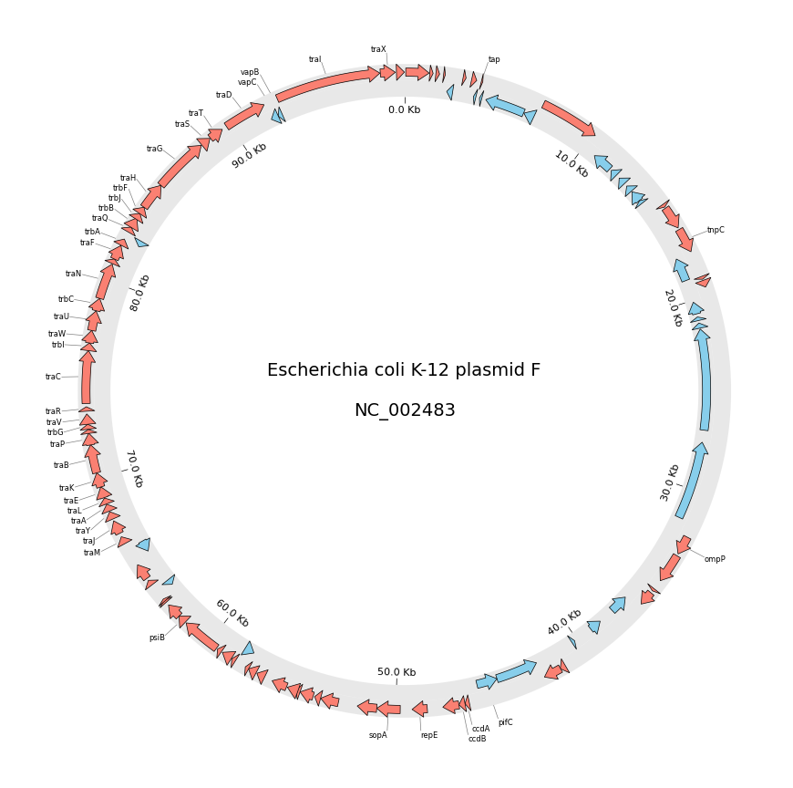
2. Circos Plot (Genomics)
from pycirclize import Circos
from pycirclize.utils import fetchgenbankby_accid
from pycirclize.parser import Genbank
Download NC_002483 E.coli plasmid genbank
gbkfetchdata = fetchgenbankbyaccid("NC002483")
gbk = Genbank(gbkfetchdata)
Initialize Circos instance with genome size
sectors = gbk.get_seqid2size()
space = 0 if len(sectors) == 1 else 2
circos = Circos(sectors, space=space)
circos.text(f"Escherichia coli K-12 plasmid F\n\n{gbk.name}", size=14)
seqid2features = gbk.getseqid2features(featuretype="CDS") for sector in circos.sectors:     # Setup track for features plot     fcdstrack = sector.add_track((95, 100))     fcdstrack.axis(fc="lightgrey", ec="none", alpha=0.5)     rcdstrack = sector.add_track((90, 95))     rcdstrack.axis(fc="lightgrey", ec="none", alpha=0.5)     # Plot forward/reverse strand CDS     features = seqid2features[sector.name]     for feature in features:         if feature.location.strand == 1:             fcdstrack.genomic_features(feature, plotstyle="arrow", fc="salmon", lw=0.5)         else:             rcdstrack.genomic_features(feature, plotstyle="arrow", fc="skyblue", lw=0.5)
# Plot 'gene' qualifier label if exists     labels, labelposlist = [], []     for feature in features:         start = int(feature.location.start)         end = int(feature.location.end)         label_pos = (start + end) / 2         gene_name = feature.qualifiers.get("gene", [None])[0]         if gene_name is not None:             labels.append(gene_name)             labelposlist.append(label_pos)             fcdstrack.annotate(labelpos, genename, label_size=6)
# Plot xticks (interval = 10 Kb)     rcdstrack.xticksbyinterval(         10000, outer=False, label_formatter=lambda v: f"{v/1000:.1f} Kb"     )
circos.savefig("example02.png")
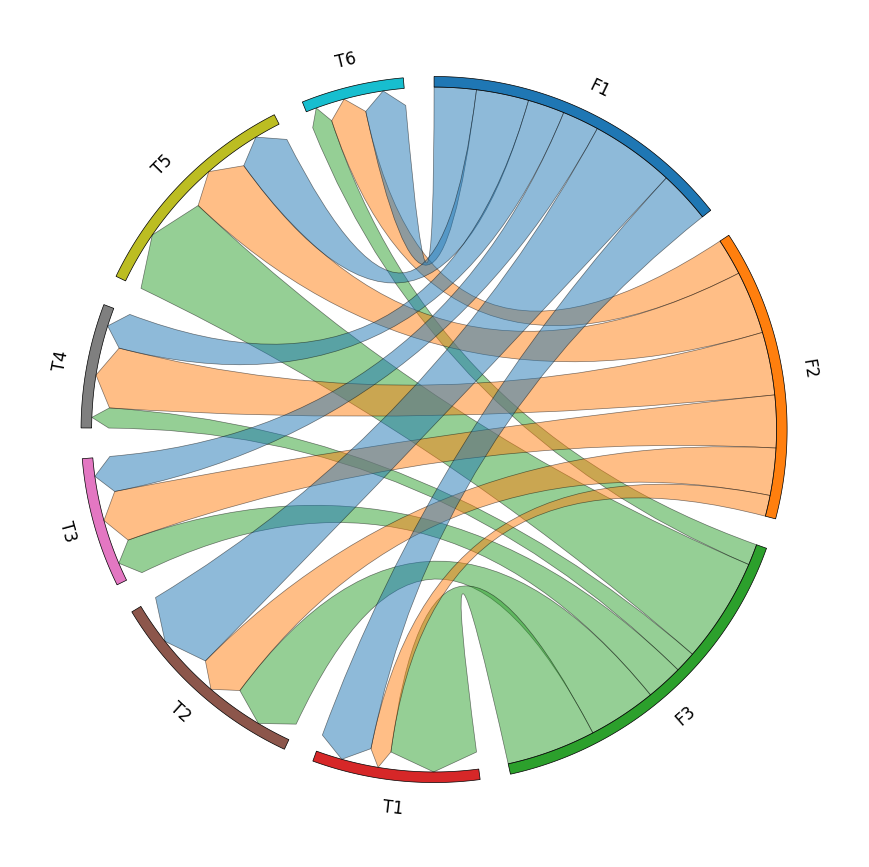
3. Chord Diagram
from pycirclize import Circos
import pandas as pd
Create matrix dataframe (3 x 6)
row_names = ["F1", "F2", "F3"]
col_names = ["T1", "T2", "T3", "T4", "T5", "T6"]
matrix_data = [
    [10, 16, 7, 7, 10, 8],
    [4, 9, 10, 12, 12, 7],
    [17, 13, 7, 4, 20, 4],
]
matrixdf = pd.DataFrame(matrixdata, index=rownames, columns=colnames)
Initialize Circos instance for chord diagram plot
circos = Circos.chord_diagram(
    matrix_df,
    space=5,
    cmap="tab10",
    label_kws=dict(size=12),
    link_kws=dict(ec="black", lw=0.5, direction=1),
)
circos.savefig("example03.png")
4. Phylogenetic Tree
from pycirclize import Circos
from pycirclize.utils import loadexampletree_file, ColorCycler
from matplotlib.lines import Line2D
Initialize Circos from phylogenetic tree
treefile = loadexampletreefile("large_example.nwk")
circos, tv = Circos.initializefromtree(
    tree_file,
    r_lim=(30, 100),
    leaflabelsize=5,
    line_kws=dict(color="lightgrey", lw=1.0),
)
Define group-species dict for tree annotation
In this example, set minimum species list to specify group's MRCA node
groupname2specieslist = dict(
    Monotremata=["Tachyglossusaculeatus", "Ornithorhynchusanatinus"],
    Marsupialia=["Monodelphisdomestica", "Vombatusursinus"],
    Xenarthra=["Choloepusdidactylus", "Dasypusnovemcinctus"],
    Afrotheria=["Trichechusmanatus", "Chrysochlorisasiatica"],
    Euarchontes=["Galeopterusvariegatus", "Theropithecusgelada"],
    Glires=["Oryctolaguscuniculus", "Microtusoregoni"],
    Laurasiatheria=["Talpaoccidentalis", "Miroungaleonina"],
)
Set tree line color & label color
ColorCycler.set_cmap("tab10")
groupname2color = {name: ColorCycler() for name in groupname2species_list.keys()}
for groupname, specieslist in groupname2specieslist.items():
    color = groupname2color[groupname]
    tv.setnodelineprops(specieslist, color=color, applylabelcolor=True)
Plot figure & set legend on center
fig = circos.plotfig()
_ = circos.ax.legend(
    handles=[Line2D([], [], label=n, color=c) for n, c in group_name2color.items()],
    labelcolor=group_name2color.values(),
    fontsize=6,
    loc="center",
    bboxtoanchor=(0.5, 0.5),
)
fig.savefig("example04.png")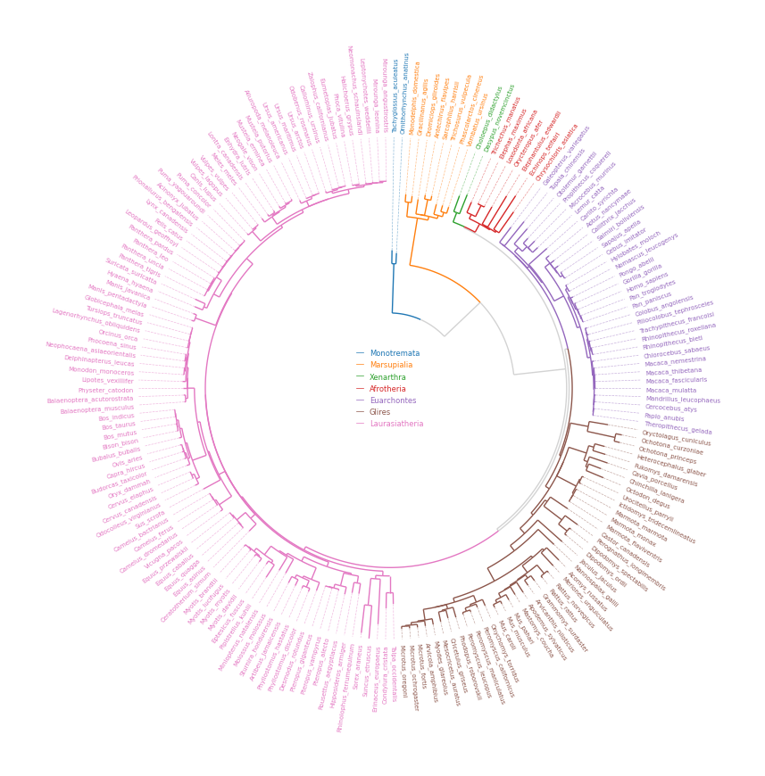
5. Radar Chart
from pycirclize import Circos
import pandas as pd
Create RPG jobs parameter dataframe (3 jobs, 7 parameters)
df = pd.DataFrame(
    data=[
        [80, 80, 80, 80, 80, 80, 80],
        [90, 20, 95, 95, 30, 30, 80],
        [60, 90, 20, 20, 100, 90, 50],
    ],
    index=["Hero", "Warrior", "Wizard"],
    columns=["HP", "MP", "ATK", "DEF", "SP.ATK", "SP.DEF", "SPD"],
)
Initialize Circos instance for radar chart plot
circos = Circos.radar_chart(
    df,
    vmax=100,
    marker_size=6,
    gridintervalratio=0.2,
)
Plot figure & set legend on upper right
fig = circos.plotfig()
_ = circos.ax.legend(loc="upper right", fontsize=10)
fig.savefig("example05.png")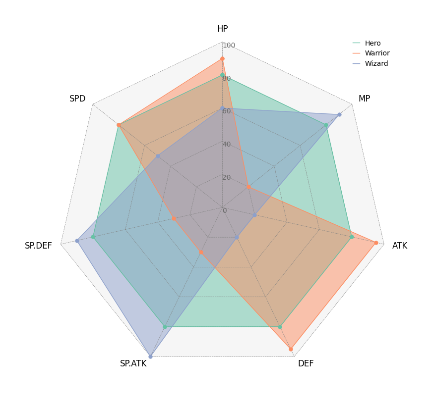
Tooltip Option
pyCirclize supports tooltip display in jupyter using ipympl. To enable tooltip, install pycirclize with ipympl and call circos.plotfig(tooltip=True) method. Tooltip option is tested on jupyter notebooks in VScode and JupyterLab.
pip install pycirclize[tooltip]
or
conda install -c conda-forge pycirclize ipympl
[!WARNING]
Interactive tooltip plots require live python kernel.
Be aware that tooltips are not permanently enabled in the notebook after plotting.


