
An elegant, animated and customizable segmented control for iOS created by Tapptitude
TTSegmentedControl



About
An elegant, animated and customizable segmented control for iOS.This project is maintained by Tapptitude, a mobile app development agency specialized in building high-quality iOS and Android mobile apps, for startups and brands alike. A lively team of skilled app developers and app designers based in Europe, we provide full-stack mobile app development services to entrepreneurs looking to innovate on mobile.
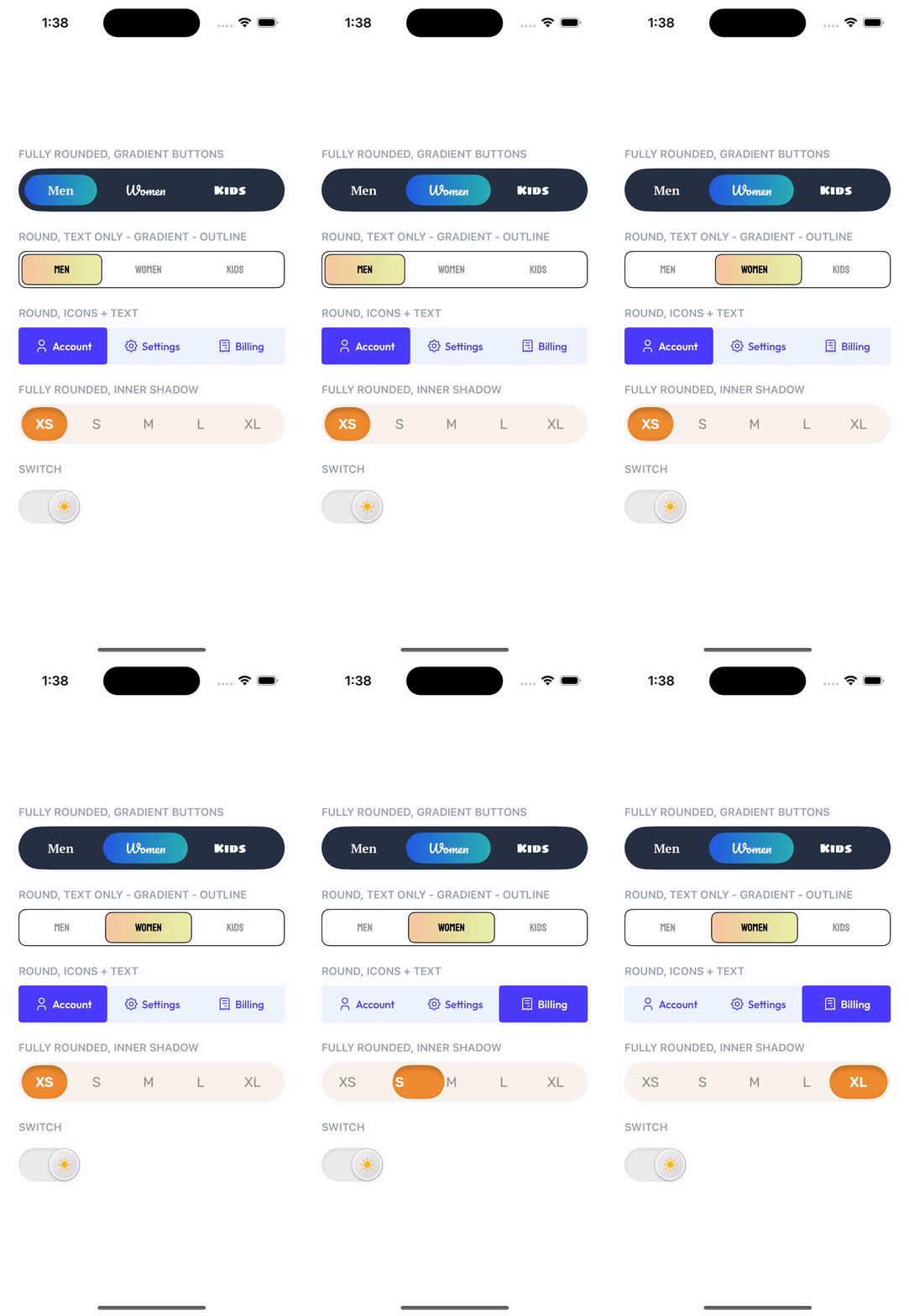
Features:
- Variable number of items
- Animated transition
- Bounce animation
- Fully configurable (color, gradient, shadow, border, corner radius)
- Designable into Interface Builder
Requirements
- iOS 13.0+
- Xcode 11+
Installation
Swift Package Manager
dependencies: [
    .package(url: "https://github.com/dumitruigor/TTSegmentedControl.git", branch: "swiftPackage")
]
CocoaPods
pod 'TTSegmentedControl', :git => 'https://github.com/dumitruigor/TTSegmentedControl.git', :branch => 'swiftPackage'Carthage
github "tapptitude/TTSegmentedControl"Manually
Add the TTSegmentedControl to your project.
Usage
- SwiftUI:
let titles = ["Title1", "Title2"].map { TTSegmentedControlTitle(text: $0) }
TTSwiftUISegmentedControl(titles: titles, selectedIndex: $selectedIndex)
- UIKit:
let titles = ["Title1", "Title2"].map { TTSegmentedControlTitle(text: $0) }
let segmentedControl = TTSegmentedControl() segmentedControl.titles = titles view.addSubview(segmentedControl)
How to customize?
In order to customize the segmented control you'll have to edit it's properties:
//UIKit
segmentedControl.selectionViewFillType = .fillSegment
segmentedControl.titleDistribution = .equalSpacing
segmentedControl.isDragEnabled = true
segmentedControl.isSizeAdjustEnabled = true
segmentedControl.isSwitchBehaviorEnabled = false
segmentedControl.containerBackgroundColor = .white
segmentedControl.cornerRadius = .constant(value: 15)
segmentedControl.cornerCurve = .continous
segmentedControl.padding = .init(width: 2, height: 2)
//SwiftUI TTSwiftUISegmentedControl(titles: titles)     .titleDistribution(.equalSpacing)     .padding(.init(width: 2, height: 2))     .isDragEnabled(true)     .containerBackgroundColor(.white)     .selectionViewColor(.blue)     .cornerRadius(.constant(value: 15))     .isSwitchBehaviorEnabled(false) )
You can even disable animation or/and bounce effect:
//UIKit
segmentedControl.animationOptions = nil
segmentedControl.bounceAnimationOptions = nil
//SwiftUI TTSwiftUISegmentedControl(titles: titles)     .animationOptions(nil)     .bounceAnimationOptions(nil) )
Or you can edit them:
let animationOptions = TTSegmentedControlAnimationOption(duration: 0.5, options: .curveEaseInOut)
let bounceAnimationOptions = TTSegmentedControlBounceOptions(springDamping: 0.7, springInitialVelocity: 0.2)
//UIKit segmentedControl.animationOptions = animationOptions segmentedControl.bounceAnimationOptions = bounceAnimationOptions
//SwiftUI TTSwiftUISegmentedControl(titles: titles)     .animationOptions(animationOptions)     .bounceAnimationOptions(bounceAnimationOptions) )
The segmentedControl titles can be customized:
let title1 = TTSegmentedControlTitle(
    text: "Title 1",
    defaultColor: .black,
    defaultFont: .systemFont(ofSize: 12),
    selectedColor: .white,
    selectedFont: .systemFont(ofSize: 13)
)
let title2 = TTSegmentedControlTitle(     text: "Title 2",     defaultColor: .black,     defaultFont: .systemFont(ofSize: 12),     selectedColor: .white,     selectedFont: .systemFont(ofSize: 13) )
//UIKit segmentedControl.titles = [title1, title2]
//SwiftUI TTSwiftUISegmentedControl(titles: [title1, title2])
Instead of text the titles can be initialized with NSAttributedString objects:
let title1 = TTSegmentedControlTitle(
    defaultAttributedText: attributedText1,
    selectedAttributedText: attributedText2
)
let title2 = TTSegmentedControlTitle(     defaultAttributedText: attributedText3,     selectedAttributedText: attributedText4 )
//UIKit segmentedControl.titles = [title1, title2]
//SwiftUI TTSwiftUISegmentedControl(titles: [title1, title2])
You can add image instead of title:

let title1 = TTSegmentedControlTitle(
    defaultImageName: "defaultimage1",
    selectedImageName: "selectedimage1"
)
let title2 = TTSegmentedControlTitle(     defaultImageName: "defaultimage2",     selectedImageName: "selectedimage2" )
let title3 = TTSegmentedControlTitle(     defaultImageName: "defaultimage3",     selectedImageName: "selectedimage3" )
//UIKit segmentedControl.titles = [title1, title2, title3]
//SwiftUI TTSwiftUISegmentedControl(titles: [title1, title2, title3])
The image sizes can be customized for each title:

let title1 = TTSegmentedControlTitle(
    defaultImageName: "defaultimage1",
    selectedImageName: "selectedimage1",
    imageSize: CGSize(width: 10, height: 10)
)
let title2 = TTSegmentedControlTitle(     defaultImageName: "defaultimage2",     selectedImageName: "selectedimage2",     imageSize: CGSize(width: 30, height: 30) )
let title3 = TTSegmentedControlTitle(     defaultImageName: "defaultimage3",     selectedImageName: "selectedimage3",     imageSize: CGSize(width: 20, height: 20) )
//UIKit segmentedControl.titles = [title1, title2, title3]
//SwiftUI TTSwiftUISegmentedControl(titles: [title1, title2, title3])
The texts can be combined with the images:

let title1 = TTSegmentedControlTitle(
    text: "Facebook",
    defaultImageName: "defaultimage1",
    selectedImageName: "selectedimage1",
    imageSize: CGSize(width: 5, height: 5),
    imagePosition: .left
)
let title2 = TTSegmentedControlTitle(     text: "Youtube",     defaultImageName: "defaultimage2",     selectedImageName: "selectedimage2",     imageSize: CGSize(width: 8, height: 8),     imagePosition: .bottom )
let title3 = TTSegmentedControlTitle(     text: "Twitter",     defaultImageName: "defaultimage2",     selectedImageName: "selectedimage2",     imageSize: CGSize(width: 8, height: 7),     imagePosition: .top )
//UIKit segmentedControl.titles = [title1, title2, title3]
//SwiftUI TTSwiftUISegmentedControl(titles: [title1, title2, title3])
Contribution
Feel free to Fork, submit Pull Requests or send us your feedback and suggestions!
License
TTSegmentedControl is available under the MIT license. See the LICENSE file for more info.


