
A new way to implement navigation in your app 🏎
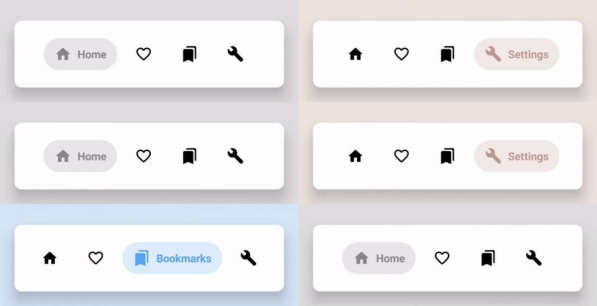
ExpandableBottomBar



A new way to improve navigation in your app
Its really easy integrate to your project
take it, faster, faster
Important: library was migrated from JCenter to MavenCentral
It means that it may be necessary to add mavenCentral repository to your repositories list
allprojects {
    repositories {
        // your repositories
mavenCentral()     } }
- Maven
<dependency>
  <groupId>com.github.st235</groupId>
  <artifactId>expandablebottombar</artifactId>
  <version>X.X</version>
  <type>pom</type>
</dependency>- Gradle
implementation 'com.github.st235:expandablebottombar:X.X'- Ivy
<dependency org='com.github.st235' name='expandablebottombar' rev='X.X'>
  <artifact name='expandablebottombar' ext='pom' ></artifact>
</dependency>
P.S.: Check out latest version code in badge at the top of this page.
Usage
Really simple as I wrote earlier
Firstly, you should declare your view in xml file
<github.com.st235.expandablebottombar.ExpandableBottomBar
        android:id="@+id/expandablebottombar"
        android:layout_width="0dp"
        android:layoutheight="wrapcontent"
        android:layout_margin="20dp"
        app:exb_backgroundCornerRadius="25dp"
        app:exb_backgroundColor="#2e2e2e"
        app:exb_itemInactiveColor="#fff"
        app:layout_c
        app:layout_c
        app:layout_c />
Then you should add menu items to your navigation menu To access menu call bottomBar.menu on your navigation view
val bottomBar: ExpandableBottomBar = findViewById(R.id.expandablebottombar)
        val menu = bottomBar.menu
menu.add(             MenuItemDescriptor.Builder(                 this,                 R.id.icon_home,                 R.drawable.ic_home,                 R.string.text,                  Color.GRAY             )                 .build()         )
bottomBar.onItemSelectedListener = { view, menuItem ->             /**              * handle menu item clicks here,              * but clicks on already selected item will not affect this callback              */         }                  bottomBar.onItemReselectedListener = { view, menuItem ->             /**              * handle here all the click in already selected items              */         }
Xml menu declaration
If your menu is constantly, you may specify it from xml
Firstly, you should declare menu items in xml
<?xml version="1.0" encoding="utf-8"?>
<menu xmlns:app="http://schemas.android.com/apk/res-auto" xmlns:android="http://schemas.android.com/apk/res/android">
    <item
        android:id="@+id/home"
        android:title="@string/text"
        android:icon="@drawable/ic_home"
        app:exb_color="#FF8888" />
<item         android:id="@+id/settings"         android:title="@string/text4"         android:icon="@drawable/ic_settings"         app:exb_color="@color/colorSettings" />
<item         android:id="@+id/bookmarks"         android:title="@string/text3"         android:icon="@drawable/ic_bookmarks"         app:exb_color="#fa2" /> </menu>
each item tag has the following attributes:
| property | type | description | |------------------------|-----------------|-------------------------------------------------------------------------------------------| | id | reference | an id of menu item | | exb_color | reference/color | color of element, it may be color reference or color | | icon | reference | icon reference (vector drawables supported) | | title | reference/text | item title | | exb_badgeColor | color | notification badge background color. It will override the color from layout attribute | | exb_badgeTextColor | color | notification badge text color. It will override the color from layout attribute |
Just like any Android menu 😉
Then you should reference this xml file at the view attributes
<github.com.st235.expandablebottombar.ExpandableBottomBar
        android:id="@+id/expandablebottombar"
        android:layout_width="0dp"
        android:layoutheight="wrapcontent"
        android:layout_margin="20dp"
        app:exb_backgroundCornerRadius="25dp"
        app:exb_itemInactiveColor="#fff"
        app:exbitems="@menu/bottombar"
        app:layout_c
        app:layout_c
        app:layout_c />
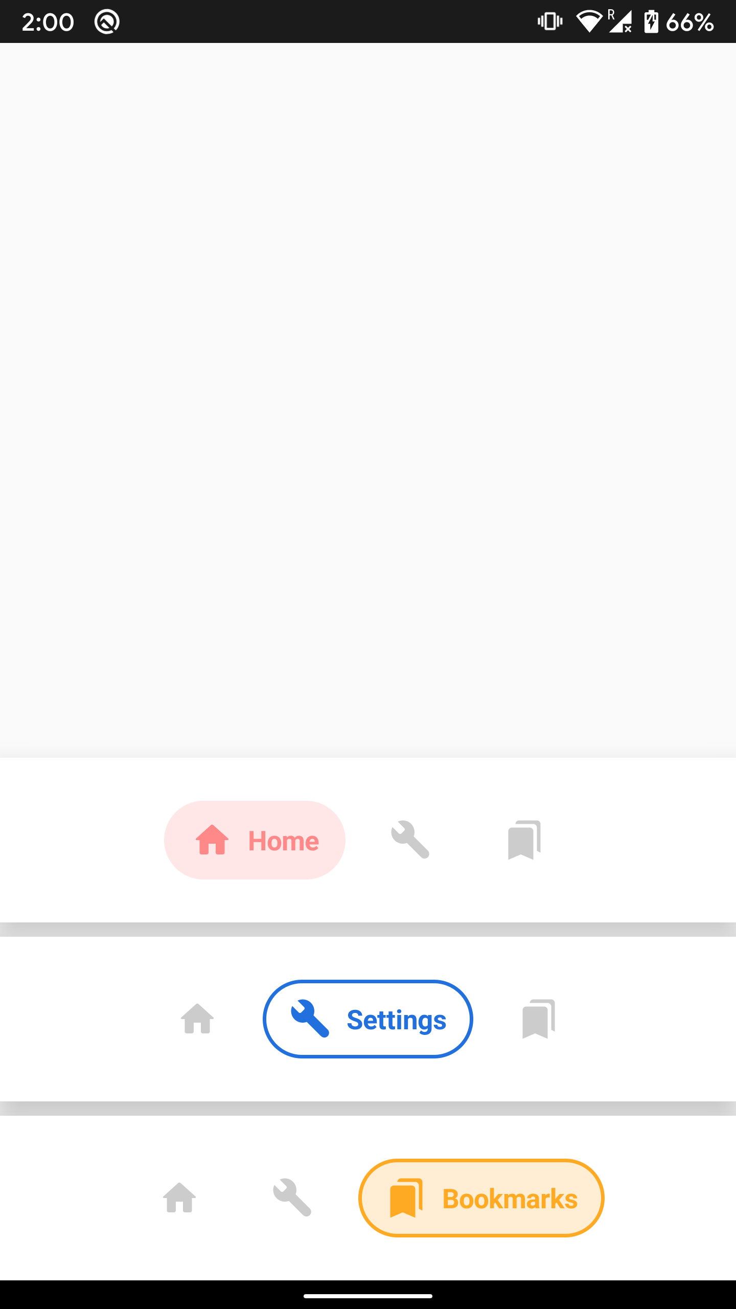
Xml attributes
| property | type | description | |------------------------------------------|-------------------------------|---------------------------------------------------------------------------------------------------------------------------------------------| | exb_elevation | dimen | component elevation (important: api 21+) | | exb_backgroundColor | color | bottom bar background color | | exb_transitionDuration | integer | time between one item collapsed and another item expanded | | exb_backgroundCornerRadius | dimen | bottom bar background corners radius | | exb_itemInactiveColor | color | item menu color, when its inactive | | exb_itemBackgroundCornerRadius | dimen | item background corner radius | | exb_itemStyle | enum: normal, outline, stroke | controls the style of items. normal = items are filled with solid color; outline = no fill, only border; stroke = fill + border | | exb_itemBackgroundOpacity | float | item background opacity (important: final color alpha calculates by next formulae alpha = opacity * 255) | | exbitemvertical_margin | dimen | top & bottom item margins | | exbitemhorizontal_margin | dimen | left & right item margins | | exbitemvertical_padding | dimen | top & bottom item padding | | exbitemhorizontal_padding | dimen | left & right item padding | | exb_items | reference | xml supported menu format | | exb_notificationBadgeBackgroundColor | color | notification badge background color. Will be applied to all menu items | | exb_notificationBadgeTextColor | color | notification badge text color. Will be applied to all menu items |
Notification badges
/**
     * Returns notification object
     */
    val menu = bottomBar.menu
    val notification = menu.findItemById(i.itemId).notification() // itemId is R.id.action_id
notification.show() // shows simple dot-notification    notification.show("string literal") // shows notification with counter. Counter could not exceed the 4 symbols length
notification.clear() // removes notification badge from menu item
Navigation Components support
Usually Drawer or BottomNavigationView attached to navigation controller with NavigationUI.setupWithNavController(view, navController), but this system is not applicable to customview components. That's why ExpandableBottomBar offers it's own ExpandableBottomBarNavigationUI
To attach ExpandableBottomBar to your navigation components you should use the same approach
ExpandableBottomBarNavigationUI.setupWithNavController(bottomNavigation, navigationController)Coordinator Layout support
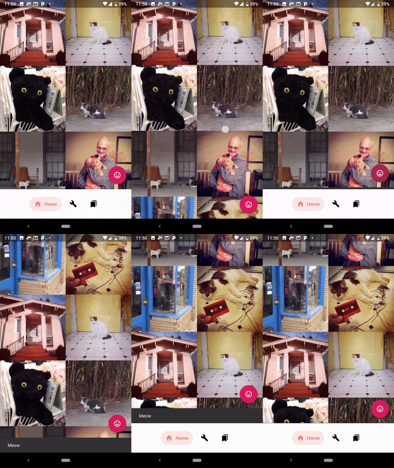
Do you waiting for Coordinator Layout support - and it is already here! Fabs and Snackbars aligned by bottom bar! Hooray 🎉
Available without registration and SMS, starting from 0.8 version. Seriously, everything is already working out of the box - nothing needs to be done.
But... if you need to support hiding the menu by list/grid scroll - then you are really lucky!
This functionality is very simple to implement. You need to redeclare custom Coordinator Layout Behavoir to ExpandableBottomBarScrollableBehavior.
<github.com.st235.expandablebottombar.ExpandableBottomBar
    android:id="@+id/expandablebottombar" android:layoutwidth="matchparent"
    android:layoutheight="wrapcontent" android:layout_gravity="bottom"
    app:layout_behavior="github.com.st235.expandablebottombar.behavior.ExpandableBottomBarScrollableBehavior"
    app:items="@menu/bottom_bar" />
Really easy ;D
After integration this behavior should looks like:
Migration guide
You may found all necessary info about migration from old versions here
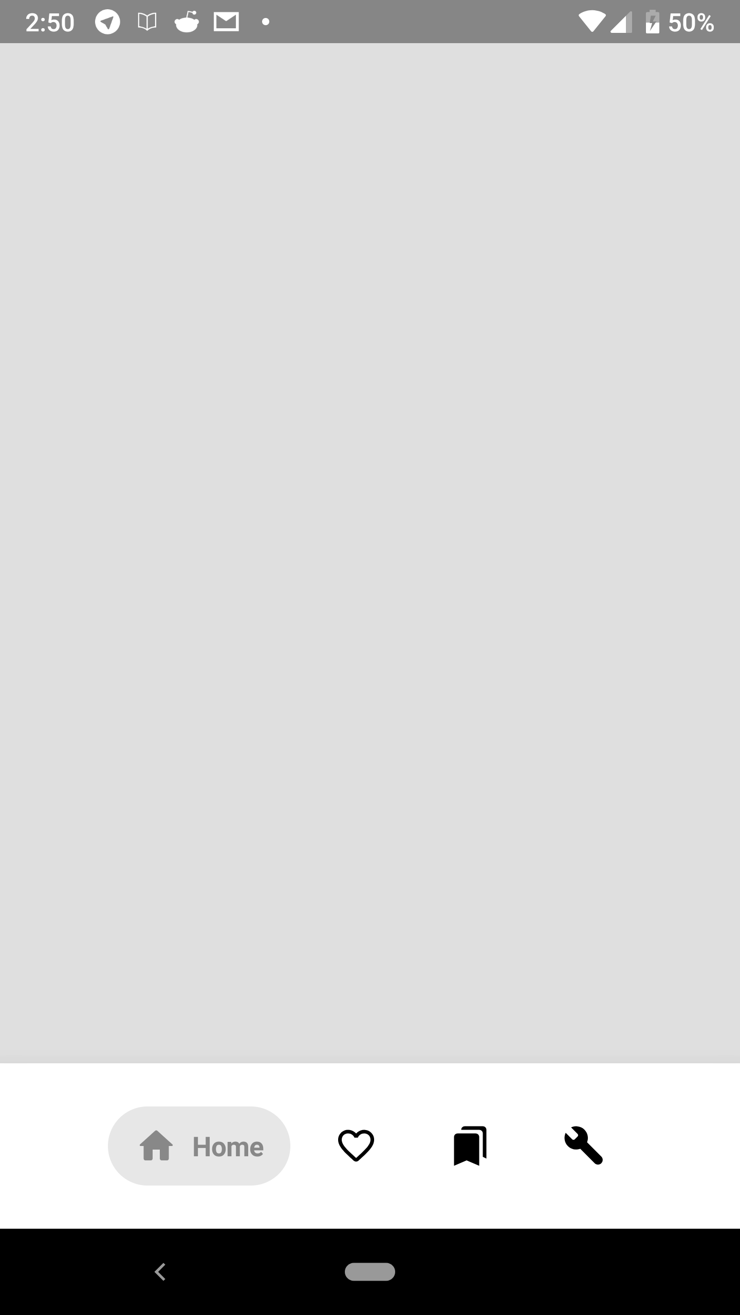
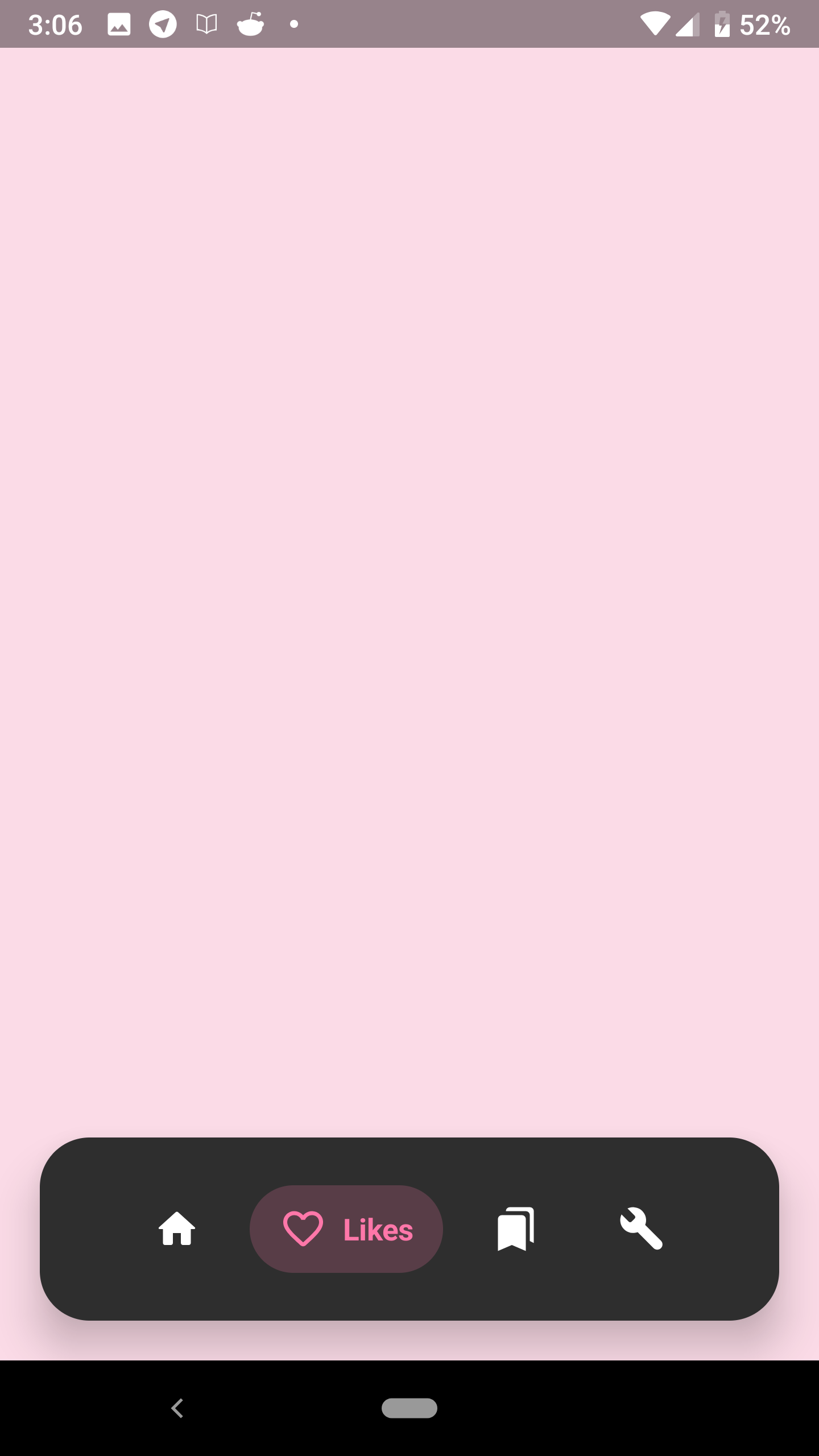
Screens


License
MIT License
Copyright (c) 2019 - present, Alexander Dadukin
Permission is hereby granted, free of charge, to any person obtaining a copy of this software and associated documentation files (the "Software"), to deal in the Software without restriction, including without limitation the rights to use, copy, modify, merge, publish, distribute, sublicense, and/or sell copies of the Software, and to permit persons to whom the Software is furnished to do so, subject to the following conditions:
The above copyright notice and this permission notice shall be included in all copies or substantial portions of the Software.
THE SOFTWARE IS PROVIDED "AS IS", WITHOUT WARRANTY OF ANY KIND, EXPRESS OR IMPLIED, INCLUDING BUT NOT LIMITED TO THE WARRANTIES OF MERCHANTABILITY, FITNESS FOR A PARTICULAR PURPOSE AND NONINFRINGEMENT. IN NO EVENT SHALL THE AUTHORS OR COPYRIGHT HOLDERS BE LIABLE FOR ANY CLAIM, DAMAGES OR OTHER LIABILITY, WHETHER IN AN ACTION OF CONTRACT, TORT OR OTHERWISE, ARISING FROM, OUT OF OR IN CONNECTION WITH THE SOFTWARE OR THE USE OR OTHER DEALINGS IN THE SOFTWARE.


