
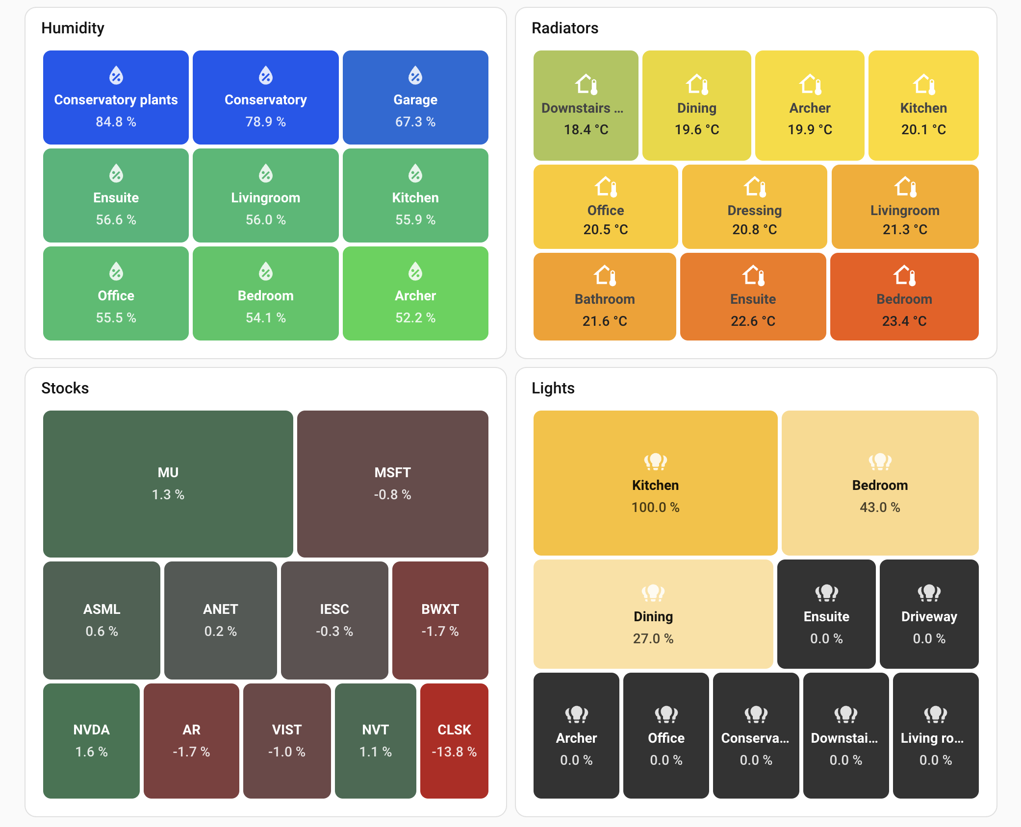
Treemap card for Home Assistant - like a stock market heatmap, but for your home. Instantly see which sensors need attention.

Treemap Card for Home Assistant





Free open source community project.
If you find it useful, please support it by giving a ⭐️ on GitHub
A custom Lovelace card that dynamically visualizes entities as a treemap. Rectangle sizes represent relative values while colors indicate status - perfect for comparing sensors, lights, thermostats, portfolios or any numeric data at a glance.
Why Treemap Card?
- Optimized for thousands of entities without breaking a sweat
- Works beautifully with sensors, lights, thermostats, switches & binary sensors, and custom data
- Smart defaults, fully customizable - including tap/hold actions and per-tile CSS
- Works with auto-entities for advanced filtering (area, device, label)
- 18 KB gzipped, 90%+ test coverage
Installation
HACS (Recommended)

Or manually:
- Go to HACS → Frontend
- Search for "Treemap Card"
- Install and restart Home Assistant
Manual
Download treemap-card.js from releases and follow the official guide.
Data Modes
The card supports two ways to get data:
Entities Mode
Display Home Assistant entities directly. Supports wildcards and per-entity customization.
type: custom:treemap-card
entities:
  - sensor.temperature_* # Wildcard pattern
  - sensor.humidity_*
  - entity: sensor.power_total # Object format with overrides
    name: 'Total Power'
    icon: mdi:lightning-bolt
exclude:
  - sensor.*_battery
JSON Attribute Mode
For data where all values come from a single entity as JSON. Since Home Assistant doesn't allow JSON as sensor state values, structured data must be stored in attributes - a common pattern when feeding HA from external sources like Node-RED or custom integrations. This is ideal when you don't want (or can't) create individual sensors for each data item, especially for dynamic lists like stock portfolios, server metrics, or any array of objects.
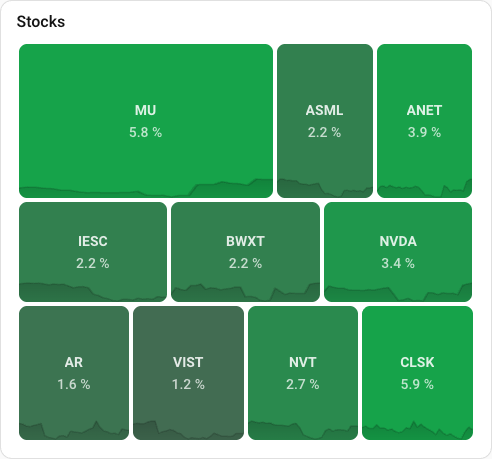
type: custom:treemap-card
entity: sensor.my_data
data_attribute: items
label:
  attribute: name
value:
  attribute: amount
Entity Types
The card is optimized for three entity types, each with special handling.
Sensors
Standard numeric sensors like temperature, humidity, battery levels, energy usage.
type: custom:treemap-card
header:
  title: Humidity Levels
entities:
  - sensor.*_humidity
exclude:
  - sensor.target
size:
  equal: true
value:
  suffix: '%'
color:
  low: '#4dabf7'
  mid: '#69db7c'
  high: '#ff6b35'
  scale:
    neutral: 50
    min: 30
    max: 70
label:
  replace: ' Humidity$//'
height: 300
Lights
Light entities automatically use brightness for sizing and display their actual color.
- RGB/HS color lights: Rectangle shows the light's actual color
- Dimmable-only lights: Yellow gradient based on brightness
- Off lights: Uses
color.low(default: dark gray#333333)
type: custom:treemap-card
header:
  title: Lights
entities:
  - light.*
color:
  low: '#1a1a1a'
  high: '#fbbf24'
height: 300
Light-specific behavior:
| Feature | Behavior | | --------- | ---------------------------------------- | | Size | Based on brightness (brighter = bigger) | | Color | Actual light color (RGB/HS) if available | | Off state | Uses color.low value | | Value | Shows brightness percentage |
Climate
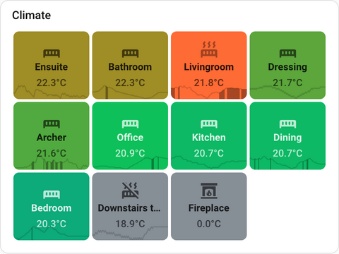
Climate entities (thermostats, HVAC) support special computed values that make it easy to visualize which rooms need attention.
Standard attributes you can use:
| Attribute | What it shows | | --------------------- | --------------------------------------------------- | | current_temperature | Current room temperature | | temperature | Target/setpoint temperature | | hvac_action | Current action: heating, cooling, idle, off |
Computed attributes - calculated automatically for you:
| Attribute | What it shows | Best for | | ----------------- | ---------------------------------------------------------------------------------------- | ---------------------------------------------------------- | | temp_difference | How far from target (always positive). A room 3°C too cold or 3°C too hot both show 3. | Sizing - rooms furthest from target get biggest rectangles | | temp_offset | Direction from target. Too cold = negative, too hot = positive. | Coloring - blue for cold, red for hot |
Smart offset behavior: The card understands your heating/cooling goals:
- Heating mode: If the room is already warm enough, offset shows
0(not a positive number) - Cooling mode: If the room is already cool enough, offset shows
0(not a negative number)
0.0°C because it's warm enough. No action needed.
Example: Temperature offset view
Show how far each room is from target. Blue = too cold, green = on target, orange = too hot:
type: custom:treemap-card
header:
  title: Temperature Offset
entities:
  - climate.*
size:
  attribute: temp_difference
  inverse: true
value:
  attribute: temp_offset
  suffix: '°C'
color:
  attribute: temp_offset
  low: '#4dabf7'
  mid: '#69db7c'
  high: '#ff6b35'
  scale:
    neutral: 0
    min: -3
    max: 3
label:
  replace: ^Wiser //
height: 350
Example: Current temperature with HVAC status
Show current temperature, colored by value but override when actively heating/cooling:
type: custom:treemap-card
header:
  title: Room Temperatures
entities:
  - climate.*
size:
  equal: true
value:
  attribute: current_temperature
  suffix: '°C'
color:
  low: '#4dabf7'
  mid: '#69db7c'
  high: '#ff6b35'
  scale:
    neutral: 21
    min: 18
    max: 24
  hvac:
    heating: '#ff6b35'
    cooling: '#4dabf7'
label:
  replace: ^Wiser //
height: 400
HVAC color behavior:
When color.hvac is configured:
| State | Color behavior | | --------------------- | ------------------------------------------------------ | | heating | Uses hvac.heating color (overrides gradient) | | cooling | Uses hvac.cooling color (overrides gradient) | | idle | Uses gradient based on value (so you see temp offset) | | off / unavailable | Always uses hvac.off color (default: gray #868e96) |
This lets you see temperature-based colors normally, but immediately spot which rooms are actively heating or cooling.
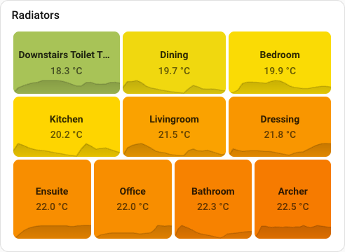
Climate sparklines:
Climate entities show temperature history with HVAC activity highlighted. The filled sections indicate when heating (or cooling) was active, making it easy to see how often each room needed climate control.
Binary Sensors & Switches
switch., inputboolean., and binarysensor.* entities display On / Off and use your configured color.high and color.low colors.
| State | Color behavior | | ----- | ---------------------------------- | | On | Uses color.high (default: green) | | Off | Uses color.low (default: red) |
type: custom:treemap-card
header:
  title: Switches & Devices
entities:
  - switch.*
  - input_boolean.*
size:
  equal: true
color:
  high: '#16a34a' # Green for On
  low: '#6c757d' # Gray for Off
Configuration Reference
Data Source
| Option | Default | Description | | ---------------- | ------- | --------------------------------------------------------------------------------------------------------------------------------------------- | | entities | | List of entity IDs or patterns. Supports wildcards (sensor.*) and object format ({ entity, name, icon, color, tapaction, holdaction }). | | exclude | | List of entity patterns to exclude. Supports * wildcards. | | entity | | Single entity ID with array data in attributes (JSON mode). | | data_attribute | items | Which attribute contains the array (JSON mode). |
Label
| Option | Default | Description | | ----------------- | --------------- | --------------------------------------------------------------------------------------------------------- | | label.show | true | Show/hide labels. | | label.attribute | friendlyname | Field/attribute for label. Default: friendlyname (entities) or label (JSON). | | label.replace | | Regex to clean labels. Format: pattern/replacement/flags. Example: ^Wiser // removes "Wiser " prefix. | | label.prefix | | Text before label. | | label.suffix | | Text after label. | | label.style | | CSS for labels. |
Value
| Option | Default | Description | | ------------------ | ------- | -------------------------------------------------------------------------------------------------------------------------------------------- | | value.show | true | Show/hide values. | | value.attribute | state | Field/attribute for value. Default: state (entities) or value (JSON). Climate: currenttemperature, temperature, tempoffset, etc. | | value.precision | 1 | Number of decimal places. Default uses entity's display_precision from HA registry, or 1 if not set. | | value.abbreviate | false | Abbreviate large numbers with suffixes: k (thousands), M (millions), B (billions), T (trillions). | | value.prefix | | Text before value. | | value.suffix | | Text after value. Example: °C, %. | | value.style | | CSS for values. |
Value Formatting
Control how numbers are displayed using precision (decimal places) and abbreviate (large number suffixes).
| precision | abbreviate | Input | Output | Description | | --------- | ---------- | ------- | --------- | ----------------------- | | 0 | false | 1234.5 | 1235 | Whole number (rounded) | | 1 | false | 1234.56 | 1234.6 | 1 decimal place | | 2 | false | 1234.5 | 1234.50 | 2 decimal places | | 0 | true | 1234 | 1k | Abbreviated whole | | 1 | true | 2345 | 2.3k | Abbreviated, 1 decimal | | 2 | true | 1234567 | 1.23M | Abbreviated, 2 decimals |
Precision priority: value.precision config > entity's display_precision from HA registry > default 1
Examples:
# Show whole numbers (no decimals)
value:
  precision: 0
Show 2 decimal places
value:
  precision: 2
Large values abbreviated (2.3k, 1.5M)
value:
  precision: 1
  abbreviate: true
Size
| Option | Default | Description | | ---------------- | ------------------------- | --------------------------------------------------------------------------------------------------------------- | | size.attribute | same as value.attribute | Field/attribute for sizing. For climate: temp_difference works well with inverse: true. | | size.equal | false | All rectangles same size. | | size.inverse | false | Low values get bigger rectangles. | | size.min | auto | Minimum size floor in entity units (e.g., 5 for 5W or 5°C). Ensures zero-value items visible. 0 hides them. | | size.max | | Maximum size cap in entity units (e.g., 500 for 500W). Prevents outliers from dominating the layout. |
Color
| Option | Default | Description | | --------------------- | ------------------------- | ------------------------------------------------------------------------------------ | | color.target | background | Where to apply color: background (default) or foreground (text/icon). | | color.low | #b91c1c (red) | Color for lowest values. Also used for off lights. | | color.mid | | Optional middle color. Creates three-color gradient: low → mid → high. | | color.high | #16a34a (green) | Color for highest values. | | color.unavailable | #868e96 (gray) | Color for unavailable/unknown entities. See filter.unavailable. | | color.opacity | 1 | Color opacity (0-1). | | color.attribute | same as value.attribute | Field/attribute for coloring. For climate: tempoffset, hvacaction. | | color.scale.neutral | | Value where mid color appears. Example: 0 for profit/loss, 21 for temperature. | | color.scale.min | auto | Values at or below get full low color. | | color.scale.max | auto | Values at or above get full high color. | | color.hvac.heating | #ff6b35 | Color when actively heating (climate only). | | color.hvac.cooling | #4dabf7 | Color when actively cooling (climate only). | | color.hvac.idle | | Not used - idle falls back to gradient. | | color.hvac.off | #868e96 | Color for off/unavailable climate entities. |
Foreground coloring:
Use color.target: foreground to apply the gradient color to text and icons instead of the background. The background becomes a subtle dark overlay, making the colored text stand out.
type: custom:treemap-card
entities:
  - sensor.temperature_*
color:
  target: foreground
  low: '#4dabf7'
  high: '#ff6b35'
Note: Custom styles (label.style,value.style,icon.style) always take priority overcolor.target.
Per-entity color overrides:
Individual entities can have a fixed color that bypasses the gradient entirely. Useful for category dashboards where you want consistent, meaningful colors regardless of value:
type: custom:treemap-card
entities:
  - entity: sensor.cost_lights
    color: '#F68C00'
    name: Lighting
  - entity: sensor.cost_heating
    color: '#B40404'
    name: Heating
  - entity: sensor.cost_appliances
    color: '#1B5E20'
    name: Appliances
The color field accepts any valid CSS color: hex (#F68C00), rgb(...), or named colors. It takes the highest priority — it overrides the gradient, light color, HVAC coloring, and everything else.
Icon
| Option | Default | Description | | ---------------- | ------- | ------------------------------------------------------ | | icon.show | true | Show/hide icons. | | icon.icon | | Static icon for all items. Example: mdi:thermometer. | | icon.attribute | icon | Field/attribute containing icon. | | icon.style | | CSS for icons. |
Order & Filter
| Option | Default | Description | | -------------------- | ------- | ------------------------------------------------------------------------------------------------------------------------------------------------------------------------------------------------------------------------------------------------------------------------------ | | order | desc | Sort direction: desc (high to low) or asc (low to high). Works with any sort_by option. | | sortby | value | What to sort by: value (optimal layout), entityid (alphabetically), label (by friendly name), or default (preserve config order). Perfect for battery grids or alphabetical lists where predictable positioning matters. | | limit | | Maximum items to show. | | filter.above | | Only show items with value greater than this. | | filter.below | | Only show items with value less than this. | | filter.unavailable | false | Include entities that stopped reporting or are unreachable (unavailable, unknown, none states). Useful for battery monitoring where dead sensors matter as much as low batteries. Displays state text and gray background (customize via color.unavailable). |
Note: These filters work on entity values after entities are resolved. For entity-level filtering (by area, device, label, attributes), see the Auto-Entities guide.
Battery monitoring with fixed positions:
When monitoring battery cells or sensors where predictable positioning matters more than value-based layout, use sortby: entityid or sort_by: label:
type: custom:treemap-card
header:
  title: Battery Cells
entities:
  - sensor.batterycell1
  - sensor.batterycell2
  - sensor.batterycell3
  - sensor.batterycell4
  - sensor.batterycell5
  - sensor.batterycell6
  - sensor.batterycell7
  - sensor.batterycell8
sortby: entityid # Cells always appear in same position
size:
  equal: true # Equal-size grid
color:
  low: '#ff6b35' # Red for low battery
  high: '#16a34a' # Green for full
This creates a predictable grid where each cell stays in the same position regardless of charge level. Perfect for quickly spotting which specific cell needs attention.
For alphabetical sorting by friendly name, use sortby: label. For exact config order (top to bottom, left to right), use sortby: default.
Layout
| Option | Default | Description | | -------- | ------- | --------------------------------------------------------------------------- | | height | auto | Card height in pixels. Auto-calculates based on row count (~100px per row). | | gap | 6 | Space between rectangles in pixels. |
Tap & Hold Actions
Clicking or long-pressing a tile triggers an action. By default, tapping opens the entity's more-info dialog. Hold actions are disabled by default.
| Option | Default | Description | | ------------- | ----------- | ---------------------------------------------- | | tap_action | more-info | Action when tapping a tile. | | hold_action | none | Action when long-pressing a tile (500ms hold). |
Action Types
| Action | Description | | -------------- | --------------------------------------------------------------------------------- | | more-info | Opens the entity's more-info dialog (default). | | navigate | Navigates to a dashboard or view. Requires navigation_path. | | url | Opens a URL in a new tab. Requires url_path. | | toggle | Toggles the entity (lights, switches, etc.). | | call-service | Calls a Home Assistant service. Requires service and optionally service_data. | | assist | Opens the voice assistant dialog. | | none | Disables the action entirely. |
Examples
More info (default — no config needed):
type: custom:treemap-card
entities:
  - sensor.temperature_*
tap_action:
  action: more-info
Navigate to a dashboard view on tap:
type: custom:treemap-card
entities:
  - light.*
tap_action:
  action: navigate
  navigation_path: /lovelace/lights
Open a URL on tap:
type: custom:treemap-card
entities:
  - sensor.power_*
tap_action:
  action: url
  url_path: https://my.home-assistant.io
Toggle lights on tap, open more-info on hold:
type: custom:treemap-card
entities:
  - light.*
tap_action:
  action: toggle
hold_action:
  action: more-info
Call a service on tap:
type: custom:treemap-card
entities:
  - light.*
tap_action:
  action: call-service
  service: light.turn_on
  service_data:
    brightness_pct: 80
Open voice assistant on tap:
type: custom:treemap-card
entities:
  - sensor.temperature_*
tap_action:
  action: assist
Disable tap, navigate on hold:
type: custom:treemap-card
entities:
  - sensor.*
tap_action:
  action: none
hold_action:
  action: navigate
  navigation_path: /lovelace/sensors
Per-Entity Action Overrides
Individual entities can have their own tap/hold actions, overriding the card-level defaults:
type: custom:treemap-card
entities:
  - light.*
  - entity: light.living_room
    tap_action:
      action: navigate
      navigation_path: /lovelace/living-room
  - entity: light.kitchen
    tap_action:
      action: toggle
    hold_action:
      action: more-info
tap_action:
  action: more-info # Default for all other lights
Title & Header guide
Two ways to add a title - use one or the other, not both:
title - Uses Home Assistant's built-in card header. Consistent with other HA cards, but no customization options.
title: Humidityheader - Custom compact header with full styling control. Takes less vertical space than HA's default.
header:
  title: Humidity
  style: |
    font-size: 14px;
    padding: 4px 16px;
If both are set, header.title takes precedence and title is ignored.
Styling guide
Customize the appearance with inline CSS. All style options accept multiline YAML strings.
header:
  title: My Treemap
  style: |
    font-size: 20px;
    color: red;
label:
  style: |
    text-shadow: 0 0 10px rgba(0,0,0,0.5);
value:
  style: |
    font-size: 18px;
    font-weight: bold;
icon:
  style: |
    opacity: 0.8;
card_style: |
background: transparent;| Option | Description |
|---|---|
header.show | Show or hide custom header. Default: true if header.title is set. |
header.title | Custom header text. More compact than HA's default title. |
header.style | CSS for the custom header. Example: font-size: 14px; padding: 4px 16px; |
label.style | CSS for labels. Example: text-shadow: 0 0 10px rgba(0,0,0,0.3); |
value.style | CSS for values. Example: font-size: 18px; |
icon.style | CSS for icons. Example: color: white; opacity: 0.8; |
card_style | CSS for the entire card. Example: background: transparent; |
Sparkline
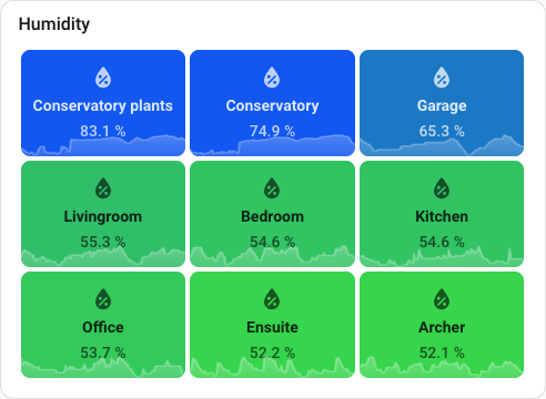
Each rectangle can display a mini chart showing historical data.
|
|
Entities mode: Uses Home Assistant's long-term statistics (most numeric sensors).
type: custom:treemap-card
entities:
  - sensor.temperature_*
sparkline:
  period: 24h
JSON mode: Uses data array from each item's attribute.
type: custom:treemap-card
entity: sensor.portfolio
data_attribute: holdings
sparkline:
  attribute: history
Sparkline Options
| Option | Default | Description | | ---------------------- | ------- | ------------------------------------------------------------------------------------------------------------------------- | | sparkline.show | true | Show/hide sparklines. | | sparkline.attribute | | Field containing sparkline data array (JSON mode). | | sparkline.period | 24h | Time period for entity history: 12h, 24h, 7d, or 30d. | | sparkline.mode | dark | Color mode: dark (dark line/fill) or light (light line/fill). | | sparkline.min | auto | Fixed Y-axis minimum. Useful for sensors with a known range (e.g., 0 for humidity) so small changes aren't exaggerated. | | sparkline.max | auto | Fixed Y-axis maximum. Pair with sparkline.min to pin both bounds. | | sparkline.hvac.show | true | Show HVAC activity bars for climate entities. | | sparkline.line.show | true | Show/hide the line. | | sparkline.line.style | | Custom CSS for line (SVG properties). | | sparkline.fill.show | true | Show/hide the filled area under the line. | | sparkline.fill.style | | Custom CSS for fill (SVG properties). |
Period Details
| Period | Time Range | Data Points | Best For | | ------ | ---------- | ----------- | -------------------- | | 12h | 12 hours | ~144 | Detailed recent view | | 24h | 24 hours | ~24 | Daily overview | | 7d | 7 days | ~168 | Weekly trends | | 30d | 30 days | ~30 | Monthly trends |
Custom Styling Examples
Red line, no fill:
sparkline:
  fill:
    show: false
  line:
    style: |
      stroke: rgba(255, 0, 0, 0.5);
      stroke-width: 2;
Thick white line with light fill:
sparkline:
  mode: light
  line:
    style: |
      stroke: rgba(255, 255, 255, 0.8);
      stroke-width: 3;
  fill:
    style: |
      fill: rgba(255, 255, 255, 0.2);
Fill only, no line:
sparkline:
  line:
    show: false
  fill:
    style: |
      fill: rgba(0, 0, 0, 0.3);
Fixed Y-axis bounds:
Prevents a nearly flat line from filling the full chart height when values change only slightly. Set both bounds to the sensor's meaningful range:
sparkline:
  min: 0
  max: 100
Note: Sparklines use Home Assistant's long-term statistics. Most numeric sensors and climate entities (temperature) have statistics enabled by default.
Size & Order guide
Tip: You may often prefer size.equal: true for a clean, uniform grid layout.
Below are common sizing and ordering configurations to achieve different visual effects:
| What you want | Configuration | | ------------------------------------------------- | ----------------------------------------- | | Biggest values = biggest rectangles, shown first | order: desc (default) | | Biggest values = biggest rectangles, shown last | order: asc | | Smallest values = biggest rectangles, shown first | order: desc + size.inverse: true | | Smallest values = biggest rectangles, shown last | order: asc + size.inverse: true | | All rectangles same size | size.equal: true | | Battery grid sorted by cell number | size.equal: true + sortby: entityid | | Alphabetical list by friendly name | sort_by: label | | Keep exact config order | sort_by: default | | Hide zero-value items | size.min: 0 | | Tame outliers (e.g., cap 1000W at 100W) | size.max: 100 | | Boost small items (e.g., 0-5 become 10) | size.min: 10 |
Note:>size.minandsize.maxuse the same units as your entity values, not percentages of the layout.
Example with valve sensors (0-100%):>
- Valve A: 75%, Valve B: 50%, Valve C: 0%, Valve D: 0%
- Default behavior: Zero-value valves automatically get a small minimum size so they're visible
- size.min: 10 - All valves below 10% are treated as 10% for sizing
- size.min: 0 - Zero-value valves are hidden (no rectangle area)
>
Example with power sensors (0-3000W):>
- One device at 2500W dominates the layout, others at 50-200W are tiny
- size.max: 500 - Caps the 2500W device to 500W for sizing, giving other devices more visible space
Auto-Entities guide
For advanced entity filtering by area, device, label, or attributes, use auto-entities. This is YAML-only (no visual editor when using auto-entities as a wrapper).
| Use Case | Solution | | ----------------------------- | -------------------------- | | Simple pattern matching | Built-in: sensor.power_* | | Filter by area, device, label | Auto-entities | | Filter by attributes or state | Auto-entities |
Filter by area and device class:
type: custom:auto-entities
card:
  type: custom:treemap-card
  header:
    title: Kitchen Power
filter:
  include:
    - domain: sensor
      area: Kitchen
      attributes:
        device_class: power
  exclude:
    - state: unavailable
With treemap filtering:
type: custom:auto-entities
card:
  type: custom:treemap-card
  filter:
    above: 10 # Only show values > 10W
  order: desc
  limit: 20
filter:
  include:
    - domain: sensor
      attributes:
        device_class: power
Per-entity customization (works with or without auto-entities):
type: custom:treemap-card
entities:
  - sensor.power_*
  - entity: sensor.solar_production
    name: 'Solar Panels'
    icon: mdi:solar-power
Resources

2 New HACS Energy Cards You NEED in Home Assistant
by BeardedTinker

I Found 5 Home Assistant Dashboard Cards You NEED to See in 2026
by Byte of Geek
Visualizing Your Smart Home Health with the HA Treemap Card
by Dima Tokar
In-depth guide on using the treemap card for maintenance dashboards: battery monitoring, MQTT reconnect tracking, and WiFi signal strength visualization.

Author
Created and maintained by Ondrej Machala (LinkedIn).
MIT License. Contributions and feedback are welcome - feel free to open an issue or submit a PR.


