
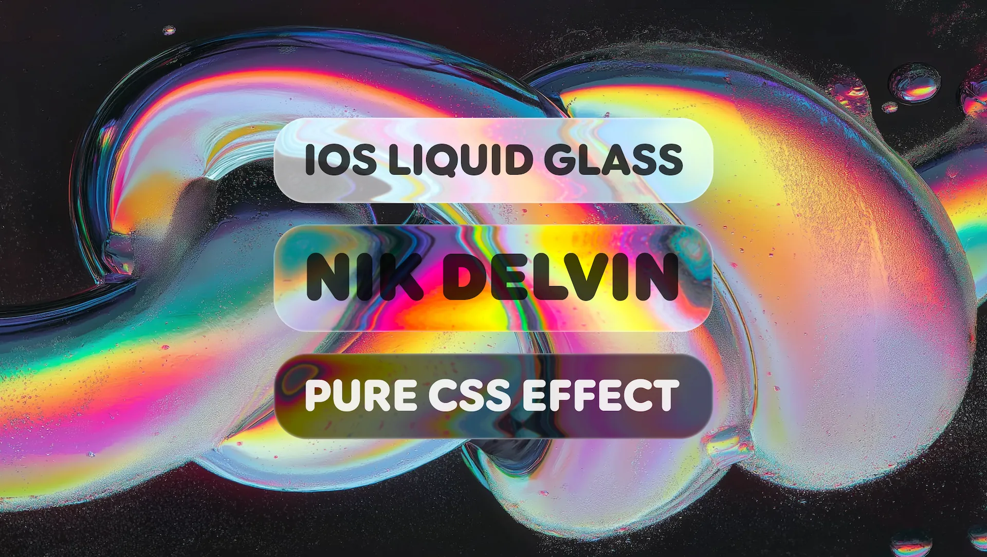
🫧 Pixel-perfect recreation of Apple's iOS 26 Liquid Glass effect using only CSS and SVG filters. Includes LiquidGlass containers, LiquidText, and LiquidButton components.
🫧 Liquid Glass
iOS 26 Liquid Glass effect recreated for the web using pure CSS SVG filters.


✨ Features
- 🎨 Pure CSS SVG Filters - Displacement mapping with backdrop-filter
- 🔮 Realistic Refraction - Dynamic displacement creates authentic glass distortion
- 🌈 Chromatic Aberration - RGB color splitting for that premium glass look
- ⚡ Performant - GPU-accelerated CSS transforms and filters
- 📱 Responsive - Auto-sizing components that scale beautifully
- 🍎 Safari Fallback - Automatic graceful degradation with glassmorphism mode
- 🎬 Animated Backgrounds - Optional spinning background images with hover control
🧩 Components
LiquidGlass
A versatile container with liquid glass refraction effect. Can be used for cards, panels, hero sections, inline elements, and buttons.
<!-- Basic glass panel -->
<LiquidGlass class="rounded-[50px]" blur={0} chromaticAberration={2}>
  <div class="p-8 text-4xl font-bold text-white">
    Your content here
  </div>
</LiquidGlass>
<!-- Glass with animated background --> <LiquidGlass   class="rounded-[50px]"   background="/assets/chrome1.png"   blur={0}   chromaticAberration={2} >   <div class="p-8 text-6xl font-black text-white">     Animated Background   </div> </LiquidGlass>
<!-- Button style --> <LiquidGlass class="rounded-[30px]" color="black" chromaticAberration={2} button>   <a href="/link" class="px-8 py-4 text-xl text-white">Click Me</a> </LiquidGlass>
<!-- Inline usage --> <p>   This is an   <LiquidGlass class="rounded-full" chromaticAberration={2} button inline>     <span class="px-2 py-0.5 text-sm text-white">inline glass</span>   </LiquidGlass>   element. </p>
| Prop | Type | Default | Description | |------|------|---------|-------------| | class | string | — | CSS classes (use for border-radius, etc.) | | depth | number | 10 | Edge refraction depth | | strength | number | 100 | Displacement filter strength | | blur | number | 0 | Blur amount | | chromaticAberration | number | 0 | RGB split intensity | | color | 'black' \| 'white' | — | Glass tint color | | background | string | — | Background image URL (enables spinning animation) | | freeze | true | — | Disable background spin animation | | noMorph | true | — | Disable Safari glassmorphism fallback | | button | true | — | Enable button styling with hover effects | | inline | true | — | Render as inline element (span) |
🚀 Quick Start
# Clone the repository
git clone https://github.com/nikdelvin/liquid-glass.git
Install dependencies
npm install
Start development server
npm run dev
🌐 Browser Support
| Browser | Support | |---------|---------| | Chrome 76+ | ✅ Full | | Firefox 103+ | ✅ Full | | Safari 15+ | ⚠️ Partial (auto-fallback to glassmorphism) | | Edge 79+ | ✅ Full |
Safari automatically falls back to a blurred glassmorphism effect when backdrop-filter: url() is not supported.
📁 Project Assets
Background images and textures in /public/assets/:
public/
└── assets/
    ├── background.webp          # Default background
    ├── chrome1.png, chrome2.png, chrome3.png
    ├── rocks1.png, rocks2.png, rocks3.png
    ├── silk1.png, silk2.png, silk3.png
    ├── lines1.svg, lines2.svg, lines3.svg
    ├── displacement-map-*.png   # Displacement textures
    └── specular-map-*.png       # Specular textures
🛠️ Tech Stack
- Astro - Static site generator
- Tailwind CSS - Utility-first CSS
- Anime.js - Animation library for background effects
- SVG Filters - feDisplacementMap, feGaussianBlur, feColorMatrix
- CSS backdrop-filter
📄 License
MIT © Nik Delvin
Made with 🫧 by Nik Delvin


