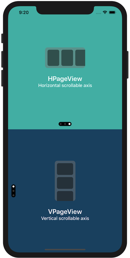
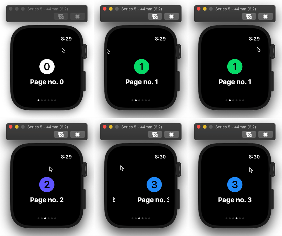
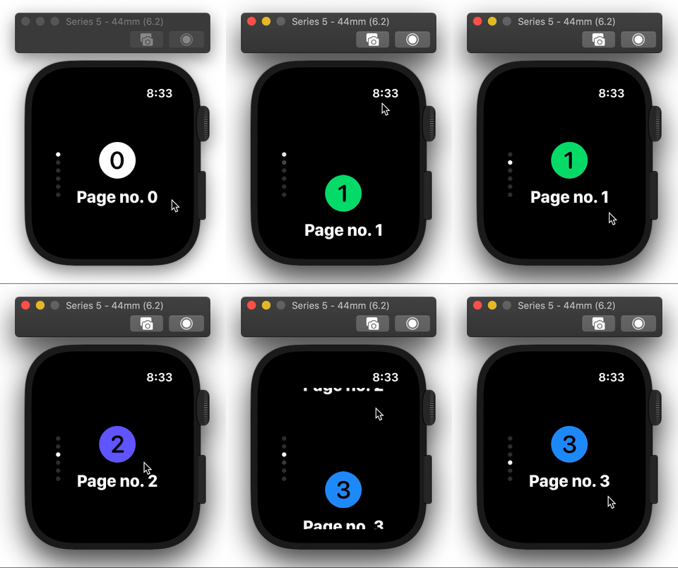
SwiftUI view enabling navigation between pages of content, imitating the behaviour of UIPageViewController for iOS and watchOS
PageView
SwiftUI view enabling page-based navigation, imitating the behaviour of UIPageViewController in iOS.
Why
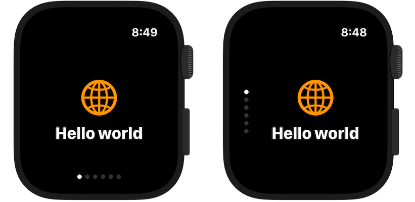
SwiftUI doesn't have any kind of paging control component, with features similar to UIPageViewController from UIKit. While on iOS this could be solved by wrapping UIPageViewController into UIViewRepresentable, on watchOS horizontal/vertical paging functionality cannot be achieved without using storyboards, which forces developers into using multiple WKHostingControllers.
This package attempts to provide native SwiftUI component for navigation between pages of content.
Installation
Package requires iOS 14, watchOS 7 and Xcode 12.
Swift Package Manager
For Swift Package Manager add the following package to your Package.swift:
.package(url: "https://github.com/fredyshox/PageView.git", .upToNextMajor(from: "1.5.0")),Carthage
Carthage is also supported, add following line to Cartfile:
github "fredyshox/PageView" ~> 1.5.0Demo
Demo app for both iOS and watchOS is provided in Examples/ directory.
Usage
import PageViewPageView component is available as HPageView or VPageView depending on scroll direction (horizontal and vertical, respectively). To add paged view with 3 pages use following code:
@State var pageIndex = 0
...
// horizontal axis HPageView(selectedPage: $pageIndex) {     SomeCustomView()     AnotherCustomView()     AnotherCustomView() }
// vertical axis VPageView(selectedPage: $pageIndex) {     SomeCustomView()     AnotherCustomView()     AnotherCustomView() }
By default PageView fills all the available area, you can constrain it's size using .frame(width:, height:) view modifier.
Selected page binding
Displayed page can be programmatically controled using Binding. For example, you can change it, with animation effect using:
withAnimation {
  // page index is some State property, which binding was passes into PageView
  self.pageIndex = 2
}
ForEach-style init
PageView supports ForEach-like initialization, that is:
// integer ranges
HPageView(selectedPage: $pageIndex, data: 0..<5) { index in
    SomeCustomView(withIndex: index)
}
// or collection of Identifiable let identifiableArray: [SomeIdentifiableItem] = ... HPageView(selectedPage: $pageIndex, data: identifiableArray) { item in     SomeCustomView(withItem: item)  }
// or any other collection, by specifing id by key-path let nonIdentifiableArray: [SomeNonIdentifiableItem] = ... HPageView(selectedPage: $pageIndex, data: nonIdentifiableArray, idKeyPath: \.path.to.id) { item in     SomeCustomView(withItem: item)  }
Page switch threshold
You can also control minimum distance that needs to be scrolled to switch page, expressed in fraction of page dimension (width or height, depending on axis). This parameter is called pageSwitchThreshold, and must be in range from 0.0 to 1.0.
For iOS the default value is set to 0.3, while on watchOS 0.5.
Gesture type
If PageView gestures are intefering with gestures present on individual pages, PageView's gesture type can be changed by passing PageGestureType. Possible values: .standard, .simultaneous, .highPriority (default)
VPageView(selectedPage: $pageIndex, pageGestureType: .simultaneous) {
    // views
}
Theme
Styling of page control component can be customized by passing PageControlTheme. Customizable properties:
backgroundColordotActiveColor: active page dot colordotInactiveColor: inactive page dot colordotSize: size of page dotspacing: spacing between dotspadding: padding of page controlxOffset: page control x-axis offset, used only in vertical modeyOffset: page control y-axis offset, used only in horizontal modeopacity: page control opacity in range from 0.0 (invisible) to 1.0 (opaque)alignment: alignment of page control component (default: bottom-center in horizontal mode, center-leading in vertical mode)
let theme = PageControlTheme(
    backgroundColor: .white,
    dotActiveColor: .black,
    dotInactiveColor: .gray,
    dotSize: 10.0,
    spacing: 12.0,
    padding: 5.0,
  	xOffset: 8.0,
    yOffset: -8.0,
    opacity: 0.5,
    alignment: Alignment(horizontal: .trailing, vertical: .top)
)
...
VPageView(theme: theme) {
    ...
}
There is also a built-in PageControlTheme.default style, mimicking UIPageControl appearance. To hide it completely use PageControlTheme.invisible.
API
// Horizontal page view
public struct HPageView<Pages>: View where Pages: View {
    public init(
        selectedPage: Binding<Int>,
        pageSwitchThreshold: CGFloat = .defaultSwitchThreshold,
        pageGestureType: PageGestureType = .highPriority,
        theme: PageControlTheme = .default,
        @PageViewBuilder builder: () -> PageContainer<Pages>
    )
}
// Vertical page view public struct VPageView<Pages>: View where Pages: View {     public init(         selectedPage: Binding<Int>,         pageSwitchThreshold: CGFloat = .defaultSwitchThreshold,         pageGestureType: PageGestureType = .highPriority,         theme: PageControlTheme = .default,         @PageViewBuilder builder: () -> PageContainer<Pages>     ) }
public enum PageGestureType {     case standard, simultaneous, highPriority }
public struct PageControlTheme {     public var backgroundColor: Color     public var dotActiveColor: Color     public var dotInactiveColor: Color     public var dotSize: CGFloat     public var spacing: CGFloat     public var padding: CGFloat     public var xOffset: CGFloat     public var yOffset: CGFloat     public var opacity: Double     public var alignment: Alignment? }
Screenshots