
Interactive 2D scatter plot widget for Jupyter Lab and Notebook. Scales to millions of points!
 Jupyter Scatter






An interactive scatter plot widget for Jupyter, Marimo, and Colab
that can handle millions of points and supports view linking.
Features?
- 🖱️ Interactive: Pan, zoom, and select data points interactively with your mouse or through the Python API.
- 🚀 Scalable: Plot up to several millions data points smoothly thanks to WebGL rendering.
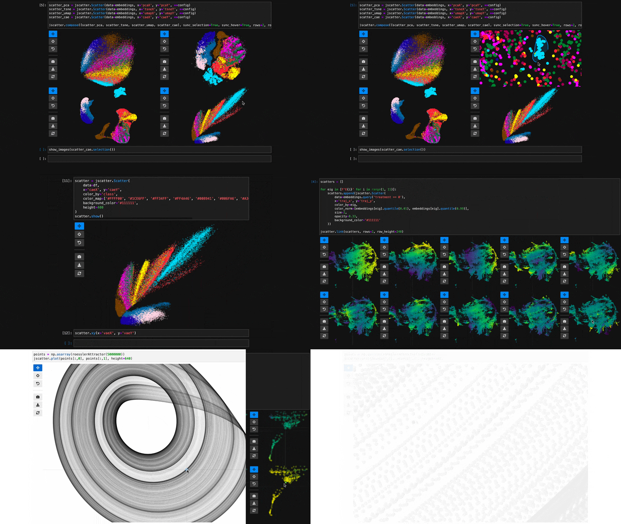
- 🔗 Interlinked: Synchronize the view, hover, and selection across multiple scatter plot instances.
- ✨ Effective Defaults: Rely on Jupyter Scatter to choose perceptually effective point colors and opacity by default.
- 📚 Friendly API: Enjoy a readable API that integrates with Pandas, Polars, and any Arrow-compatible DataFrame.
- 🛠️ Integratable: Use Jupyter Scatter in your own widgets by observing its traitlets.
Imagine trying to explore a dataset of millions of data points as a 2D scatter. Besides plotting, the exploration typically involves three things: First, we want to interactively adjust the view (e.g., via panning & zooming) and the visual point encoding (e.g., the point color, opacity, or size). Second, we want to be able to select and highlight data points. And third, we want to compare multiple datasets or views of the same dataset (e.g., via synchronized interactions). The goal of jupyter-scatter is to support all three requirements and scale to millions of points.
How?
Internally, Jupyter Scatter uses regl-scatterplot for WebGL rendering, traitlets for two-way communication between the JS and iPython kernels, and anywidget for composing the widget.
Quick Start
Try out Jupyter Scatter with our one-liner. This requires uv.
uvx jupyter-scatter demoDocs
Visit https://jupyter-scatter.dev for detailed documentation including examples and a complete API description.
Index
1. Simplest Example 2. DataFrame Example 3. Advanced Example 4. Functional API Example 5. Linking Scatter Plots 6. Visualize Millions of Data Points 7. Google ColabInstall
pip install jupyter-scatterThe default installation includes 99% of features. If you want all additional features install Jupyter Scatter as follows:
pip install "jupyter-scatter[all]"This includes the following additional features:
- Contour annotation with Seaborn
- Label positioning
"largestcluster"with HDBSCAN - Progress showing with tqdm when precomputing labels via
labelplacement.compute(show_progress=True)
jupyter labextension install @jupyter-widgets/jupyterlab-manager jupyter-scatterIf you want to instal Jupyter Scatter from source, make sure to have Node installed. While several version might work, we're primarily testing against the Active LTS and Maintenance LTS releases.
For a minimal working example, take a look at test-environments.
Get Started
[!TIP]
Visit jupyter-scatter.dev for details on all essential features of Jupyter Scatter and check out our full-blown tutorial from SciPy '23.
Simplest Example
In the simplest case, you can pass the x/y coordinates to the plot function as follows:
import jscatter
import numpy as np
x = np.random.rand(500) y = np.random.rand(500)
jscatter.plot(x, y)

DataFrame Example
You can pass a DataFrame and reference columns by name. Jupyter Scatter supports Pandas, Polars, and any DataFrame implementing the Arrow PyCapsule Interface (e.g., DuckDB, cuDF).
import pandas as pd
Just some random float and int values
data = np.random.rand(500, 4)
df = pd.DataFrame(data, columns=['mass', 'speed', 'pval', 'group'])
We'll convert the group column to strings to ensure it's recognized as
categorical data. This will come in handy in the advanced example.
df['group'] = df['group'].map(lambda c: chr(65 + round(c)), na_action=None)
| | x | y | value | group | |---|------|------|-------|-------| | 0 | 0.13 | 0.27 | 0.51 | G | | 1 | 0.87 | 0.93 | 0.80 | B | | 2 | 0.10 | 0.25 | 0.25 | F | | 3 | 0.03 | 0.90 | 0.01 | G | | 4 | 0.19 | 0.78 | 0.65 | D |
You can then visualize this data by referencing column names:
jscatter.plot(data=df, x='mass', y='speed')The same works with Polars:
import polars as pl
df_polars = pl.DataFrame(data, schema=['mass', 'speed', 'pval', 'group']) jscatter.plot(data=df_polars, x='mass', y='speed')
Show the resulting scatter plot

Advanced Example
Often you want to customize the visual encoding, such as the point color, size, and opacity.
jscatter.plot(
  data=df,
  x='mass',
  y='speed',
  size=8, # static encoding
  color_by='group', # data-driven encoding
  opacity_by='density', # view-driven encoding
)
In the above example, we chose a static point size of 8. In contrast, the point color is data-driven and assigned based on the categorical group value. The point opacity is view-driven and defined dynamically by the number of points currently visible in the view.
Also notice how jscatter uses an appropriate color map by default based on the data type used for color encoding. In this examples, jscatter uses the color blindness safe color map from Okabe and Ito as the data type is categorical and the number of categories is less than 9.
Important: in order for jscatter to recognize categorical data, the dtype of the corresponding column needs to be category!
You can, of course, customize the color map and many other parameters of the visual encoding as shown next.
Functional API Example
The flat API can get overwhelming when you want to customize a lot of properties. Therefore, jscatter provides a functional API that groups properties by type and exposes them via meaningfully-named methods.
scatter = jscatter.Scatter(data=df, x='mass', y='speed')
scatter.selection(df.query('mass < 0.5').index)
scatter.color(by='mass', map='plasma', order='reverse')
scatter.opacity(by='density')
scatter.size(by='pval', map=[2, 4, 6, 8, 10])
scatter.height(480)
scatter.background('black')
scatter.show()
When you update properties dynamically, i.e., after having called scatter.show(), the plot will update automatically. For instance, try calling scatter.xy('speed', 'mass')and you will see how the points are mirrored along the diagonal.
Moreover, all arguments are optional. If you specify arguments, the methods will act as setters and change the properties. If you call a method without any arguments it will act as a getter and return the property (or properties). For example, scatter.selection() will return the currently selected points.
Finally, the scatter plot is interactive and supports two-way communication. Hence, if you select some point with the lasso tool and then call scatter.selection() you will get the current selection.
Linking Scatter Plots
To explore multiple scatter plots and have their view, selection, and hover interactions link, use jscatter.link().
jscatter.link([
  jscatter.Scatter(data=embeddings, x='pcaX', y='pcaY', **config),
  jscatter.Scatter(data=embeddings, x='tsneX', y='tsneY', **config),
  jscatter.Scatter(data=embeddings, x='umapX', y='umapY', **config),
  jscatter.Scatter(data=embeddings, x='caeX', y='caeY', **config)
], rows=2)
https://user-images.githubusercontent.com/932103/162584133-85789d40-04f5-428d-b12c-7718f324fb39.mp4
See notebooks/linking.ipynb for more details.
Visualize Millions of Data Points
With jupyter-scatter you can easily visualize and interactively explore datasets with millions of points.
In the following we're visualizing 5 million points generated with the Rössler attractor.
points = np.asarray(roesslerAttractor(5000000))
jscatter.plot(points[:,0], points[:,1], height=640)
https://user-images.githubusercontent.com/932103/162586987-0b5313b0-befd-4bd1-8ef5-13332d8b15d1.mp4
See notebooks/examples.ipynb for more details.
Google Colab
While jscatter is primarily developed for Jupyter Lab and Notebook, it also runs just fine in Google Colab. See jupyter-scatter-colab-test.ipynb for an example.
Marimo
Jupyter Scatter works in Marimo notebooks too, including compose() and link() for multi-plot layouts. See notebooks/marimo.py for an example.
Development
Requirements: After Changing Python code: restart the kernel. Alternatively, you can enable auto reloading by enabling the After Changing JavaScript code: do Alternatively, you can enable anywidgets hot-module-reloading (HMR) as follows and run Setting up a development environment
Installation:
git clone https://github.com/flekschas/jupyter-scatter/ jupyter-scatter && cd jupyter-scatter
uv pip install -e ".[all]"
uv run jupyter-labautoreload extension. To do so, run the following code at the beginning of a notebook:%load_ext autoreload
%autoreload 2cd js && npm run build.npm run watch to rebundle the JS code on the fly.%env ANYWIDGET_HMR=1
Go to test-environments and follow the instructions.Setting up a test environment
Run Running tests
uv run pytest.
Citation
If you use Jupyter Scatter in your research, please cite our JOSS paper:
@article{lekschas2024jupyter,
  title = {{Jupyter Scatter}: Interactive Exploration of Large-Scale Datasets},
  author = {Fritz Lekschas and Trevor Manz},
  journal = {Journal of Open Source Software},
  publisher = {The Open Journal},
  year = {2024},
  volume = {9},
  number = {101},
  pages = {7059},
  doi = {10.21105/joss.07059},
  url = {https://doi.org/10.21105/joss.07059},
}


