
Airbnb App Clone Projet
Airbnb App Clone in React Native
This is my first React Native project done with expo. Demo Video
Desktop version in React can be found here.
Goal
- Componentize reusable features
- Learn to utilize popular libraries
- Add messaging feature using socket.io
Librares used
- react navigation
- socket.io
- redux
- formik
- yup
- react-native-calendars
- lodash
- moment
- react-native-maps
Features Implemented
Signup and Login
- Error handling
- Search filter
- Calendar
- Counter
- Fetching data
- Google maps
- Image slider
- Adding images using native ImagePicker
- Getting current location
- Creating socket connection
- Sending and receiving messages
Features componentized
colors
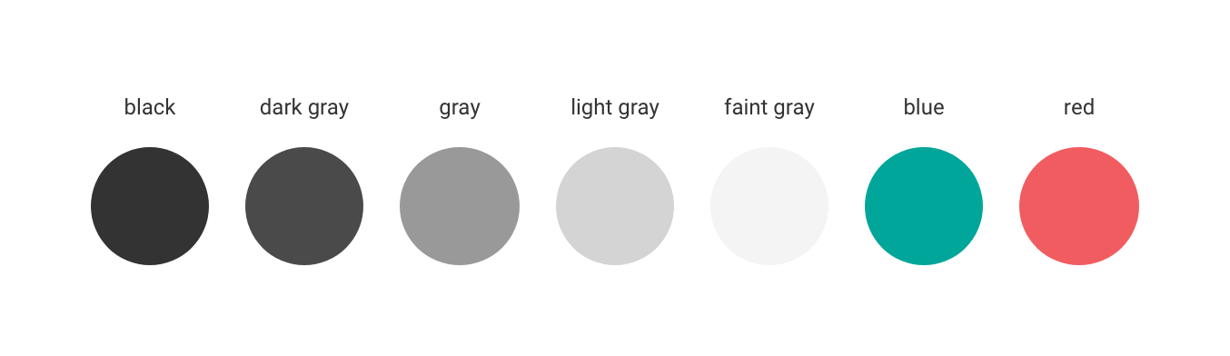
Example
import colors from "../config/colors.js";
// inline style <View style={{color: colors.red}} />
// styled components const Container = styled.View 	color: ${colors.red}
Typography
Font family
--App.js--
const Common = styled.SafeAreaView   ${Platform.select({     ios: {       fontFamily: "Avenir",     },     android: {       fontFamily: "Roboto",       paddingTop: StatusBar.currentHeight,     },   })} ;
Types
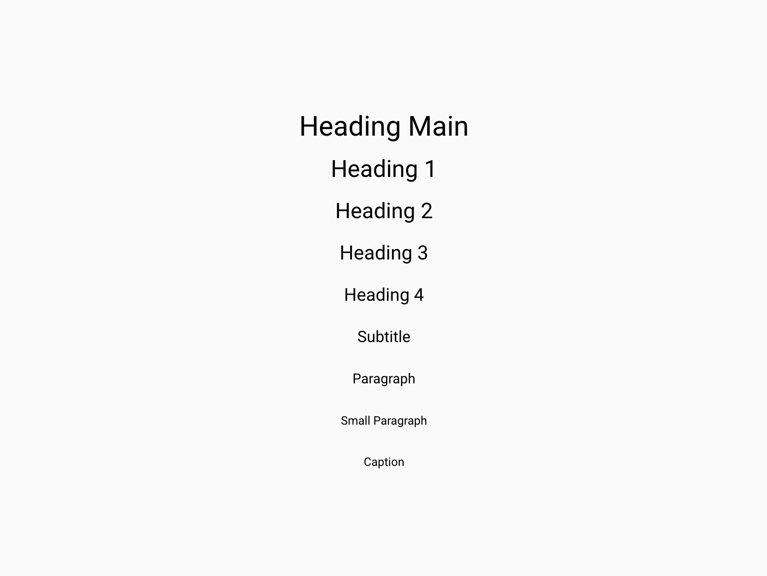
Example
import * as Typography from "../config/typography.js";
<Typography.H1 color={colors.red}>Welcome to Airbnb</Typography.H1>
Buttons
Button Types
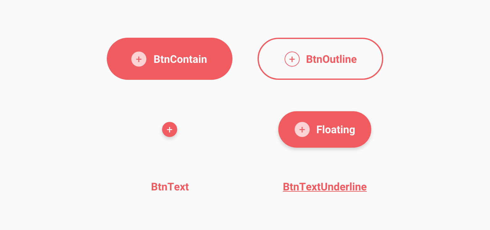
1. Contained Button
2. Outlined Button
3. Icon Button
4. Floating Action Button
5. Text Button
6. Underlined Text Button
Anatomy

Example
import * as Button from "../components/Button.js";
<Button.BtnContain   icon="search"   label="Next" 	labelcolor={colors.white}   color={colors.red}   size="small"   disabled={false}   onPress={() => onNavigate()} />
Lists
List Types
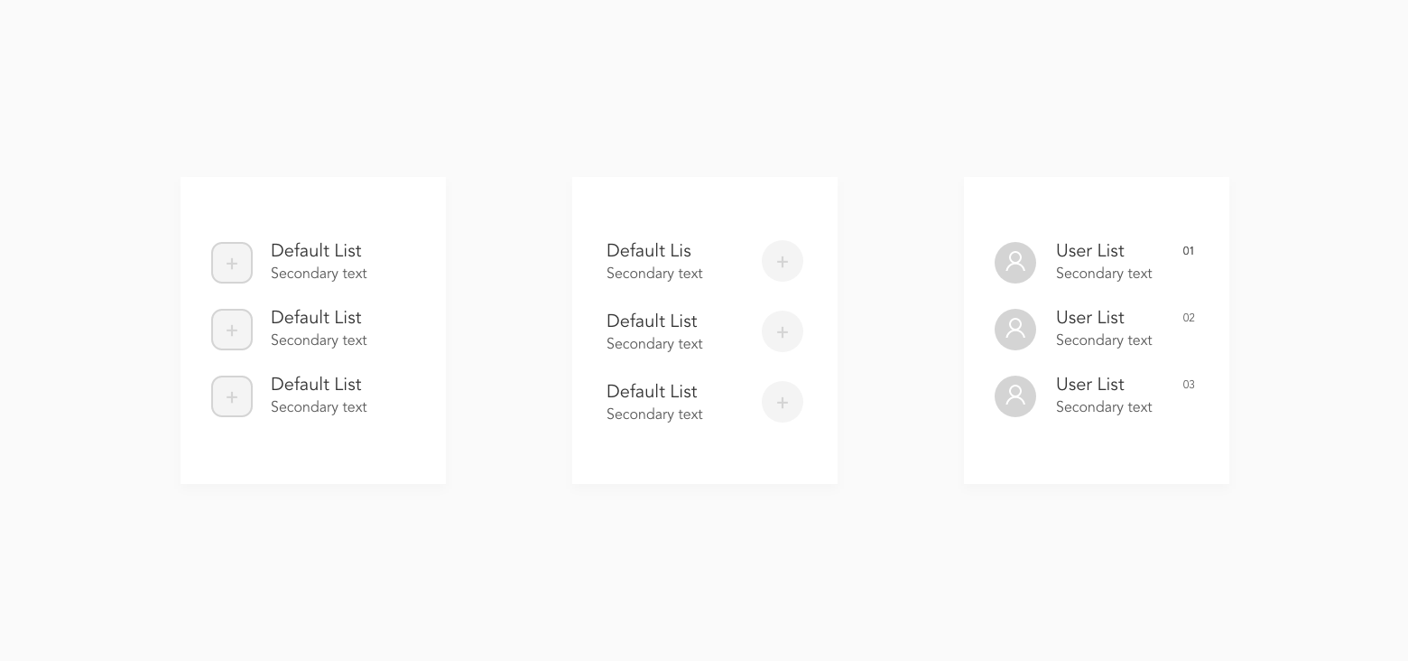
1. Default list item with contained icon
2. Default list item with icon to the right
3. User list item
List Anatomy

Example
import * as List from "../components/List.js";
<ListItem.Default   title="Title" 	sec   c   onPress={() => onNavigate(item.title)} />
<List.UserList   title="User Name"   sec   image={userimage}   meta={item.dates}   onPress={() => handleNavigation(item)}   RightActions={() => (     <DeleteItem onPress={() => handleDelete(item)} />   )} />
Cards
Card Types
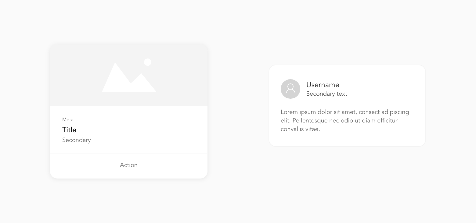
1. Default
2. Review
Card Anatomy

Example
import * as Cards from "../components/Cards.js";
<Cards.Image   image={image}   sub="Subheader"   title="Title"   sec   action="View More"   onPress={() => console.log(item)} />
Issues to resolve in the future
- keyboardshouldpersist
- Typescript


