
A SwiftUI collection view with support for custom layouts, preloading, and more.
ASCollectionView
This repository is no longer maintained. Here's why:
- with the release of iOS 16 SwiftUI now enables most of the features this library was created to replace.
- The UIHostingConfiguration API makes it easy to implement custom UICollectionViews using SwiftUI cells. This implementation handles cell-resizing and updates much better than a third party component is able to.
- In cases where a collection view is overkill, the new SwiftUI Layout protocol is the better choice. We've started a small library of native layouts here
README:
A SwiftUI implementation of UICollectionView & UITableView. Here's some of its useful features: * supports preloading and onAppear/onDisappear. * supports cell selection, with automatic support for SwiftUI editing mode. * supports autosizing of cells. * supports the new UICollectionViewCompositionalLayout, and any other UICollectionViewLayout * supports removing separators for ASTableView. * supports directly using FetchedResults as a data source[![Contributors][contributors-shield]][contributors-url] [![Forks][forks-shield]][forks-url] [![Stargazers][stars-shield]][stars-url] [![Issues][issues-shield]][issues-url] [![MIT License][license-shield]][license-url] 
Pull requests and suggestions welcome :)
Report Bug · Suggest a featureTable of Contents
* Basic Examples * Supplementary Views * Decoration Views * LayoutScreenshots from demo app
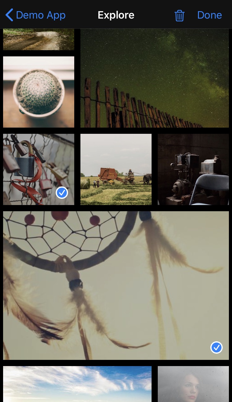
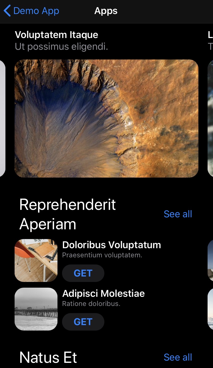
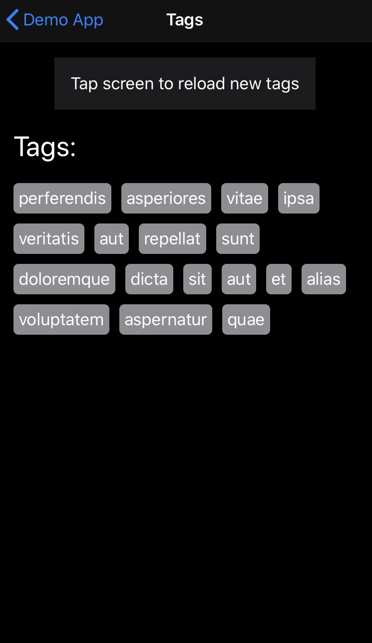
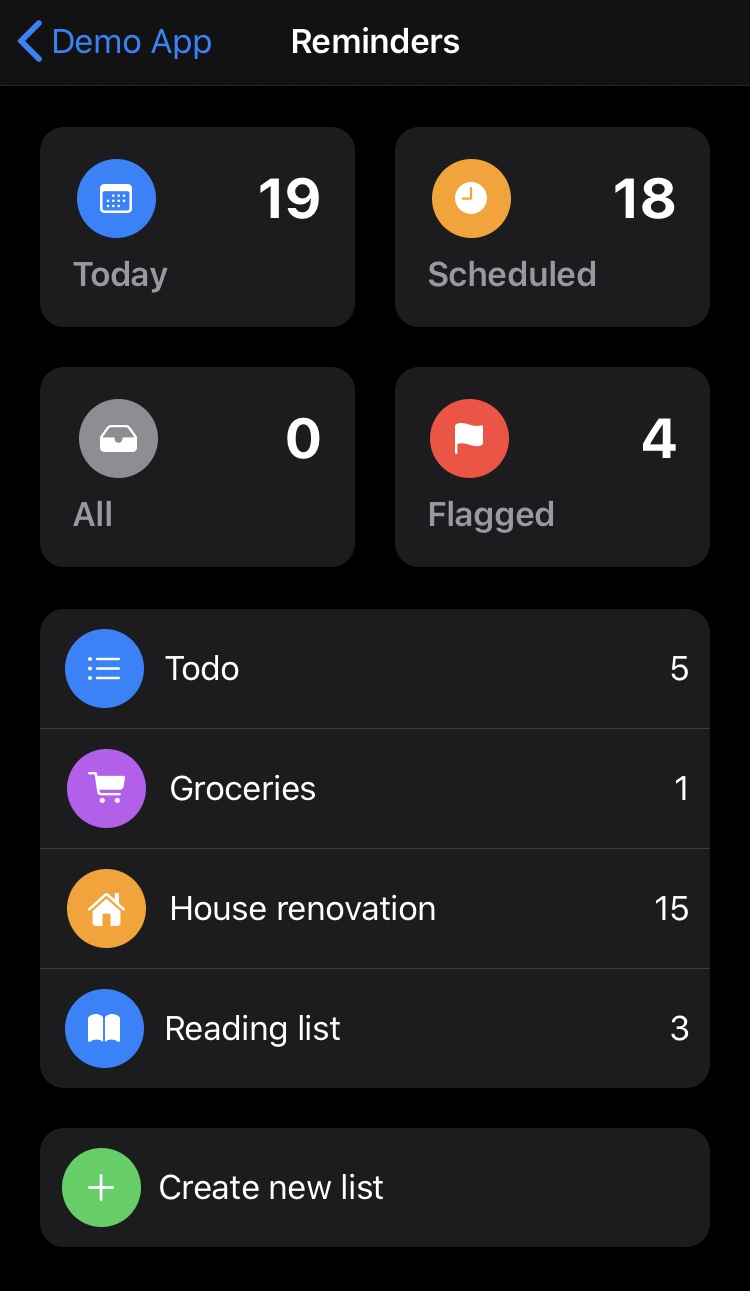
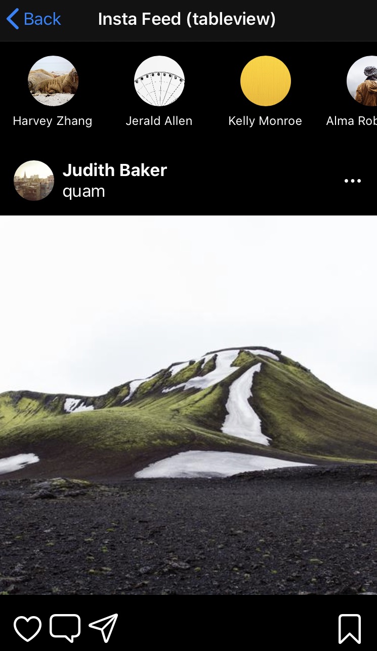
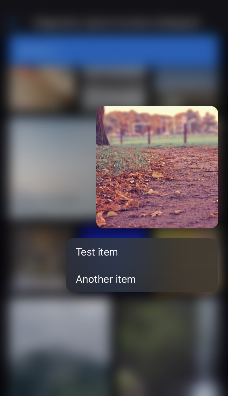
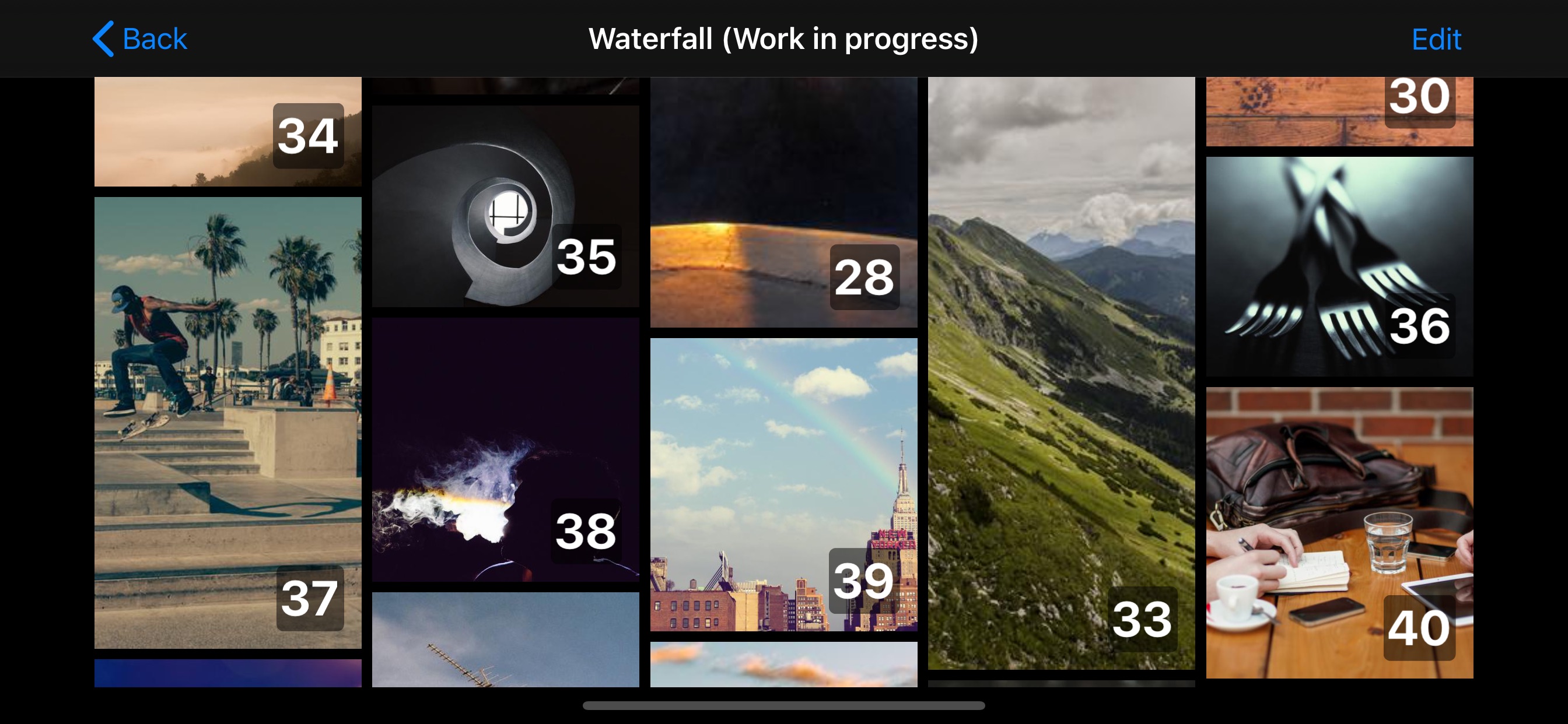
Getting Started
ASCollectionView is a swift package. * It can be imported into an app project using Xcode’s new Swift Packages option, which is located within the File menu. * When asked, use this repository's url: https://github.com/apptekstudios/ASCollectionViewAlternatively, if you're unable to use SPM for some reason, you can import it using cocoapods:
'ASCollectionView-SwiftUI', '~> 1.3'Usage
Basic example - single section:
import ASCollectionView
import SwiftUI
struct SingleSectionExampleView: View {     @State var dataExample = (0 ..< 30).map { $0 }          var body: some View     {         ASCollectionView(data: dataExample, dataID: \.self)         { item, _ in             Color.blue                 .overlay(Text("\(item)"))         }         .layout         {             .grid(                 layoutMode: .adaptive(withMinItemSize: 100),                 itemSpacing: 5,                 lineSpacing: 5,                 itemSize: .absolute(50))         }     } }
Multiple sections with unique data sources
Below is an example of how to include a collection view with two sections (each with their own data source). For an extended example with a custom compositional layout see here. Or for more in-depth examples download the demo project included in this repo.import SwiftUI
import ASCollectionView
struct ExampleView: View { @State var dataExampleA = (0 ..< 21).map { $0 } @State var dataExampleB = (0 ..< 15).map { "ITEM \($0)" } var body: some View { ASCollectionView { ASCollectionViewSection( id: 0, data: dataExampleA, dataID: \.self) { item, _ in Color.blue .overlay( Text("\(item)") ) } ASCollectionViewSection( id: 1, data: dataExampleB, dataID: \.self) { item, _ in Color.green .overlay( Text("Complex layout - \(item)") ) } .sectionHeader { Text("Section header") .padding() .frame(maxWidth: .infinity, alignment: .leading) // Fill width and align text to the left .background(Color.yellow) } .sectionFooter { Text("This is a section footer!") .padding() } } .layout { sectionID in switch sectionID { case 0: // Here we use one of the provided convenience layouts return .grid( layoutMode: .adaptive(withMinItemSize: 100), itemSpacing: 5, lineSpacing: 5, itemSize: .absolute(50)) default: return ASCollectionLayoutSection { environment in // ... // You could return any custom NSCollectionLayoutSection here. For an example see this file: /readmeAssets/SampleUsage.swift // ... } } } } }
Supplementary Views
ASCollectionView has support for supplementary views. To add a supplementary view, use thesectionHeader, sectionFooter, or sectionSupplementary modifiers on your ASCollectionViewSection.
* sectionHeader and sectionFooter set the supplementary for UICollectionView.elementKindSectionHeader and UICollectionView.elementKindSectionHeader respectively.
* sectionSupplementary lets you specify any supplementaryKind.
ASCollectionViewSection(...) { ... }
    .sectionHeader
    {
        Text("Section header")
            .background(Color.yellow)
    }
    .sectionFooter
    {
        Text("Section footer")
            .background(Color.blue)
    }
    .sectionSupplementary(ofKind: "someOtherSupplementaryKindRequestedByYourLayout")
    {
        Text("Section supplementary")
            .background(Color.green)
    }
Decoration Views
A UICollectionViewLayout can layout decoration views that do not relate to the data (eg. a section background). These cannot be configured so you must provide a View struct that can be initialised using .init().- To enforce this requirement, your view must conform to the
Decorationprotocol. The only requirement of this is an initialiser with no arguments. - You must register the view type with the layout.
- See the Reminders screen of the Demo app for a working example.
Decoration:
struct GroupBackground: View, Decoration
{
    let cornerRadius: CGFloat = 12
    var body: some View
    {
        RoundedRectangle(cornerRadius: cornerRadius)
            .fill(Color(.secondarySystemGroupedBackground))
    }
}
Registering the decoration type with the layout (ASCollectionLayout):
var layout: ASCollectionLayout<Section> { ASCollectionLayout<Section> { // ... Here is an example of including a decoration in a compositional layout. let sectionBackgroundDecoration = NSCollectionLayoutDecorationItem.background(elementKind: "groupBackground") sectionBackgroundDecoration.contentInsets = section.contentInsets section.decorationItems = [sectionBackgroundDecoration] // ... } .decorationView(GroupBackground.self, forDecorationViewOfKind: "groupBackground") // REGISTER the decoration view type }Layout
* There is inbuilt support for the new UICollectionViewCompositionalLayout. * You can define layout on a per-section basis, including the use of a switch statement if desired. Work in progress*: There are some useful methods that allow for easy definition of list and grid-based layouts (including orthogonal grids).Define layout for all sections:
ASCollectionView(...) { ... } .layout { ASCollectionLayoutSection { layoutEnvironment in // Construct and return a NSCollectionLayoutSection here } }Define layout per section:
ASCollectionView(...) { ... } .layout { sectionID in switch sectionID { case .userSection: return ASCollectionLayoutSection { layoutEnvironment in // Construct and return a NSCollectionLayoutSection here } } case .postSection: return ASCollectionLayoutSection { layoutEnvironment in // Construct and return a NSCollectionLayoutSection here } }Use a custom UICollectionViewLayout:
ASCollectionView(...) { ... } .layout { let someCustomLayout = CustomUICollectionViewLayout() someCustomLayout.estimatedItemSize = UICollectionViewFlowLayout.automaticSize return someCustomLayout }Other tips
* You can use an enum as your SectionID (rather than just an Int), this lets you easily determine the layout of each section. * See the demo project for more in-depth usage examples. * Please note that you should only use @State for transient visible state in collection view cells. Anything you want to persist long-term should be stored in your model.Todo
See the open issues for a list of proposed features (and known issues).License
Distributed under the MIT License. SeeLICENSE for more information.
[contributors-shield]: https://img.shields.io/github/contributors/apptekstudios/ASCollectionView.svg?style=flat-square [contributors-url]: https://github.com/apptekstudios/ASCollectionView/graphs/contributors [forks-shield]: https://img.shields.io/github/forks/apptekstudios/ASCollectionView.svg?style=flat-square [forks-url]: https://github.com/apptekstudios/ASCollectionView/network/members [stars-shield]: https://img.shields.io/github/stars/apptekstudios/ASCollectionView.svg?style=flat-square [stars-url]: https://github.com/apptekstudios/ASCollectionView/stargazers [issues-shield]: https://img.shields.io/github/issues/apptekstudios/ASCollectionView.svg?style=flat-square [issues-url]: https://github.com/apptekstudios/ASCollectionView/issues [license-shield]: https://img.shields.io/github/license/apptekstudios/ASCollectionView.svg?style=flat-square [license-url]: https://github.com/apptekstudios/ASCollectionView/blob/master/LICENSE [product-screenshot]: images/screenshot.jpeg


