
🚀🧨📝 Series of Tutorials to learn about Jetpack Compose with subjects Material Widgets, Layout, SubcomposeLayout, custom layouts, State, custom rememberable, recomposition, LaunchedEffect, side-effects, Gesture, Animation, Navigation, Canvas, UIs like whatsapp and others.
Jetpack Compose Tutorials and Playground
🤓 Overview
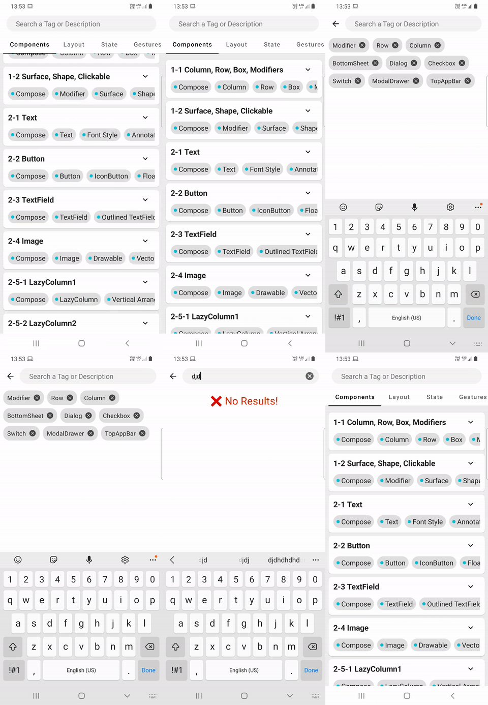
Series of Tutorials to learn about Jetpack Compose, Material Widgets, State, Animation, and Navigation. Easy to search in code and in app. Each chapter module contains its own content in code. SearchBar can be used to search with a tag or description available for each tutorial.
Recommended section is under constructions for now, when finished it will get recommended tags using previous searches using a database, domain with ViewModel.
| Tutorial | Preview | |:-----------------------------------------------------------------------------------------------------------------------------------------------------------------------------------------------------------------------------|-------------------------------------------------------| |
1-1 Column, Row, Box, Modifiers
Create Row that adds elements in horizontal order, and Column that adds elements in vertical order.
• Column
• Row
• Box
• Modifier
|
 | | | | |
 1-2 Surface, Shape, Clickable
Create and modify Surface to draw background for Composables, add click action to any composable. Set weight or offset modifiers.
• Surface
• Shape
• Clickable
|
 | | | |
Material Widgets
| Tutorial | Preview | |:-----------------------------------------------------------------------------------------------------------------------------------------------------------------------------------------------------------------------------------------------------------------------------------------------------------------------------------------------------------------------------------------------------------------------------------|-----------------------------------------------------------| |
2-1 Text
Create Text component with different properties such as color, background, font weight, family, style, spacing and others
• Text
• Row
• FontStyle
• Annotated String Hyperlink
|
 | | | | |
 2-2 Button, IconButton, FAB, Chip
Create button with text and/or with image, Floating Action Button or Chips. Modify properties of buttons including color, text, and click actions.
• Button
• IconButton
• FloatingActionButton
• Chip
|
 | | | | |
 2-3 TextField
Create TextField component with regular style or outlined. Set error, colors, state, icons, and IME actions.
• TextField
• OutlinedTextField
• IME
• Phone format VisualTransformation
• Regex
|
 | | | | |
 2-4 Image
Create Image with image, vector resource or with Painter, set image and Content scales to fit, expand or shrink image. Change shape of Image or apply ColorFilter and PorterDuff modes.
• Image
• Canvas
• Drawable
• Bitmap
|
 | | | | |
 2-5 LazyColumn/Row/VerticalGrid
Vertical, horizontal grid lists with LazyColumn, LazyRow and LazyVerticalGrid. Use contentPadding set paddings for lists, verticalArrangement or horizontalArrangement for padding between items, rememberLazyListState to manually scroll.
• LazyColumn(Vertical RecyclerView)
• LazyRow(Horizontal RecyclerView
• LazyVerticalGrid(GridLayout)
• StickyHeaders
|
 | | | | |
 2-6 TopAppbar & Tab
TopAppbar with actions, overflow menus. Tabs with text only, image only and image+text with different background, divider, and indicators.
• TopAppBar
• Overflow menu
• TabRow and Tab
• Tab Indicator, Divider
|
 | | | | |
 2-7 BottomNavigation
Bottom navigation bars allow movement between primary destinations in an app. BottomNavigation should contain multiple BottomNavigationItems, each representing a singular destination.
• BottomNavigation
• BottomNavigationItem
|
 | | | | |
 2-8 BottomAppBar
A bottom app bar displays navigation and key actions at the bottom of screens.
• BottomAppBar
• Scaffold
|
 | | | | |
 2-9-1 Side Navigation
A backdrop appears behind all other surfaces in an app, displaying contextual and actionable content.
• Scaffold
• Side Navigation
• DrawerState
|
 | | | | |
 2-9-2 ModalDrawer
Modal navigation drawers block interaction with the rest of an app’s content with a scrim. They are elevated above most of the app’s UI and don’t affect the screen’s layout grid.
• ModalDrawer
• DrawerState
• Scaffold
|
 | | | | |
 2-10-1 BottomSheet
Create bottom sheet using BottomSheetScaffold and rememberBottomSheetScaffoldState, create modal bottom sheets.
• BottomSheetScaffold
• BottomSheetState
• ModalBottomSheetLayout
|
 | | | | |
 2-10-4 BottomDrawer
BottomDrawer with BottomAppBar.
• BottomDrawer
• BottomAppBar
• Scaffold
|
 | | | | |
 2-10-5 BackdropScaffold
BackdropScaffold provides an API to put together several material components to construct your screen.
|
 | | | | |
 2-11 Snackbar, Progress, Selection
Create Snackbars with various layouts and styling, Checkboxes with selectable text, tri state checkbox, grouped radio buttons and sliders.
• SnackBar
• ProgressIndicator
• Checkbox
• TriStateCheckbox
• Switch
• RadioButton
• Slider
• RangeSlider
|
 | | | | |
 2-12 Dialog, AlertDialog
Create Dialog, and AlertDialog with standard and custom layouts. Implement on dismiss logic and get result when dialog is closed.
• AlertDialog
• Dialog
• DialogProperties
|
 | | | |
Layout
| Tutorial | Preview | |:-----------------------------------------------------------------------------------------------------------------------------------------------------------------------------------------------------------------------------------------------------------------------------------------------------------------------------------------|----------------------------------------------------------| |
3-1-1 Custom Modifier
Create custom layout using using layout, Measurable, Constraint, Placeable.
• Custom Modifier
• Measurable
• Constraint
• Placeable
|
 | | | | |
 3-1-2 onGloballyPositioned
Use Modifier.onGloballyPositioned to get position of a Composable in parent, root or window.br>
• Modifier
• onGloballyPositioned
|
 | | | | |
 3-1-3 graphicsLayer
Use Modifier.offset{} and Modifier.graphicsLayer{} to scale, translate or change other properties of a Composable.
• Modifier
• graphicsLayer
|
 | | | | |
 3-1-4 BoxWithConstraints
BoxWithConstraints is a composable that defines its own content according to the available space, based on the incoming constraints or the current LayoutDirection.
• BoxWithConstraints
• Constraint
|
 | | | | | | |
 3-1-6 Chaining Size Modifiers
Observe how chaining Modifier.size.size, Modifier.sizeIn.size or Modifier.size.requiredSize or other combination of size modifiers effect final Constraints.
• Modifier
• size/sizeIn
• requiredWidth/requiredHeight/requiredSize
|
 | | | | |
 3-1-7 Modifier.wrapContentSize
Use Modifier.wrapContentSize/Width/Height to use content constraints instead of Constraints forced by parent.
• Modifier
• Custom Layout
• Measurable
|
 | | | | |
 3-1-8 Modifier.layout
Use Modifier.layout to create LayoutModifier to measure with Constraints and place Placeables based on which order Modifier.layout is assigned.
• Modifier
• Custom Layout
• Measurable
• Constraints
• Placeable
|
 | | | | |
 3-2-1 Custom Layout
Create custom layout using using MeasurePolicy and use intrinsic dimensions.
• Custom Layout
• Measurable
• Constraint
• Placeable
|
 | | | | |
 3-2-10 Constraints & Modifier.layout
Constraints to measure measurables with Constraints.offset and Constraints.constrainWidth to limit maximum width or available space for Placeable.
• Custom Layout
• Measurable
• Constraint
• Placeable
• Modifier.layout
|
 | | | | |
 3-3-1 Scope&ParentDataModifier
Add custom modifiers to Composable inside a custom layout using its scope like align modifier only available in specific Composable like a custom Column.
• Custom Layout
• Scope
• ParentDataModifier
• Measurable
• Constraint
• Placeable
|
 | | | | |
 3-5 SubcomposeLayout
Subcompose layout which allows to subcompose the actual content during the measuring stage for example to use the values calculated during the measurement as params for the composition of the children.
• SubcomposeLayout
• Constraint
• Measurable
• Constraint
• Placeable
|
 | | | | |
 3-6-1 Custom Chat Layouts1
Custom layout like whatsapp chat layout that moves time and message read status layout right or bottom based on message width.
• Custom Layout
• Measurable
• Constraint
• Placeable
|
 | | | | |
 3-6-2 Custom Chat SubcomposeLayout
Custom layout like whatsapp chat. Added quote and name tag resized to longest sibling using SubcomposeColumn from previous examples to have whole layout.
• Custom Layout
• SubcomposeLayout
• Measurable
• Constraint
• Placeable
|
 | | | | |
 3-9 Visibility Percentage
Detect percentage of visibility of a Composable using Modifier.onPlaced inside Column with vertical scroll or LazyColumn.
• Modifier
• LazyColumn
• LazyListState
• onPlaced
|
 | | | | |
 3-10 Center Item on Scroll
Detect position in parent and center an item while its parent is scrolled.
• Modifier
• LazyColumn
• onPlaced
|
 | | | |
State
| Tutorial | Preview | |:---------------------------------------------------------------------------------------------------------------------------------------------------------------------------------------------------------------------------------------------------------------------------------------------------------|---------------------------------------------------------| |
4-1-1 Remember&MutableState
Remember and mutableState effect recomposition and states.
• remember
• State
• Recomposition
|
 | | | | |
 4-2-3 Scoped Recomposition
How hierarchy of Composables effects Smart Composition.
• remember
• Recomposition
• State
|
 | | | | |
 4-4 Custom Remember
Create a custom remember and custom component to have badge that changes its shape based on properties set by custom rememberable.
• remember
• State
• Recomposition
• Custom Layout
|
 | | | | |
 4-5-1 SideEffect1
Use remember functions like rememberCoroutineScope, and rememberUpdatedState and side-effect functions such as LaunchedEffect and DisposableEffect.
• remember
• rememberCoroutineScope
• rememberUpdatedState
• LaunchedEffect
• DisposableEffect
|
 | | | | |
 4-5-2 SideEffect2
Use SideEffect, derivedStateOf, produceState and snapshotFlow.
• remember
• SideEffect
• derivedStateOf
• produceStateOf
• snapshotFlow
|
 | | | | |
 4-7-3 Compose Phases3
How deferring a state read changes which phases of frame(Composition, Layout, Draw) are called.
• Modifier
• Recomposition
• Composition
• Layout
• Draw
|
 | | | | |
 4-12 LazyList Scroll Direction
Detect scroll direction of a LazyColumn using LazyListStated.
• Modifier
• LazyColumn
• LazyListState
• derivedStateOf
• snapshotFlow
|
 | | | | | |
Gesture
| Tutorial | Preview | |:------------------------------------------------------------------------------------------------------------------------------------------------------------------------------------------------------------------------------------------------------------------------------------------------------------------------------------------------------------------------------------------------------------|----------------------------------------------------------| |
5-1-1 Clickable
Use clickable modifier, Indication. Indication to clip ripples, or create custom ripple effects.
• clickable
• Indication
• rememberRipple
• pointerInput
• pointerInteropFilter
|
 | | | | |
 5-1-2 InteractionSource1
Use Interaction source to collect interactions or change scale of Composables based on interaction state.
• clickable
• InteractionSource
|
 | | | | |
 5-1-3 InteractionSource2
Use InteractionSource to update touch state of multiple Composable or another Composable based on current interaction.
• clickable
• InteractionSource
|
 | | | | |
 5-2 Tap&Drag Gesture
Use PointerInput to listen press, tap, long press, drag gestures. detectTapGestures is used for listening for tap, longPress, doubleTap, and press gestures.
• pointerInput
• pointerInteropFilter
• detectTapGestures
• detectDragGestures
• onPress
• onDoubleTap
|
| | | | | 5-3 Transform Gestures
Use PointerInput to listen for detectTransformGesture to get centroid, pan, zoom and rotate params.
• pointerInput
• detectTransformGestures
• centroid
• pan
• zoom
|
 | | | | |
 5-4-1 AwaitPointerEventScope1
Use AwaitPointerEventScope to get awaitFirstDown for down events, waitForUpOrCancellation for up events, and awaitPointerEvent for move events with pointers.
• AwaitPointerEventScope
• PointerInputChange
• awaitFirstDown
• waitForUpOrCancellation
• awaitPointerEvent
• awaitTouchSlopOrCancellation
• awaitDragOrCancellation
|
 | | | | |
 5-4-3 Centroid, Zoom, Pan, Rotation
Use AwaitPointerEventScope to calculate centroid position and size, zoom, pan, and rotation.
• AwaitPointerEventScope
• centroid
• pan
• zoom
|
 | | | | |
 5-6-2 Gesture Propagation1
Consume different type of touch events in Composable in an hierarchy to display gesture propagation between parent and children with MOVE gestures.
• AwaitPointerEventScope
• pointerInput
• consume
• consumePositionChange
• anyChangeConsumed
|
 | | | | |
 5-6-4 Transform Propagation
Consume events to rotate, zoom, move or apply drag or move events on Composables.
• AwaitPointerEventScope
• detectTransformGestures
• consume
• consumePositionChange
• anyChangeConsumed
• pan
• zoom
|
 | | | | |
 5-9-6 Collapsing TopAppBar
Create a collapsing TopAppBar using Modifier.nestedScroll and NestedScrollConnection.
• nestedScroll
• NestedScrollConnection
|
 | | | | |
 5-9-7 Collapsing TopAppBar2
Create a collapsing TopAppBar using Modifier.nestedScroll and NestedScrollConnection.
• nestedScroll
• NestedScrollConnection
|
 | | | | |
 5-10-1 Image Touch Detection
Detect touch position on image and get color at touch position.
• Image
• AwaitPointerEventScope
|
 | | | | |
 5-11 Zoomable LazyColumn
Zoom images inside a LazyColum.
• Image
• Zoom
• AwaitPointerEventScope
|
 | | | |
Graphics
| Tutorial | Preview | |:-------------------------------------------------------------------------------------------------------------------------------------------------------------------------------------------------------------------------------------------------------------------------------------------------------|---------------------------------------------------------| |
6-1-1 Canvas Basics 1
Use canvas draw basic shapes like line, circle, rectangle, and points with different attributes such as style, stroke cap, brush.
• Canvas
• DrawScope
• Path
• Path Effect
|
 | | | | |
 6-1-2 Canvas Basics 2
Use canvas to draw arc, with path effect, stroke cap, stroke join, miter and other attributes and draw images with src, dst attributes.
• Canvas
• DrawScope
• Path
• Path Effect
|
 | | | | |
 6-1-3 Canvas Paths
Use canvas to draw path using absolute and relative positions, adding arc to path, drawing custom paths, progress, polygons, quads, and cubic.
• Canvas
• DrawScope
• Path
• Path Effect
|
 | | | | |
 6-1-4 Canvas Path Ops
Use canvas to clip paths, or canvas using path, or rectangle with operations such as Difference, Intersect, Union, Xor, or ReverseDifference..
• Canvas
• DrawScope
• Path
• PathOperation
• ClipOperation
|
 | | | | |
 6-1-5 Canvas Path Segments
Use canvas to flatten Android Path to path segments and display PathSegment start and/or end points.
• Canvas
• DrawScope
• Path
• PathSegment
|
 | | | | |
 6-1-6 Canvas PathEffect
Use PathEffect such as dashedPathEffect, cornerPathEffect, chainPathEffect and stompedPathEffect to draw shapes add path effects around Composables
• Canvas
• DrawScope
• Path
• Path Effect
|
 | | | | |
 6-2-1 Blend(Porter-Duff) Modes
Use blend(Porter-Duff) modes to change drawing source/destination or clip based on blend mode ,and manipulate pixels.
• Canvas
• DrawScope
• Path
• Path Effect
• BlendMode
|
 | | | | |
 6-2-3 Multi-Color VectorDrawable
Use blend(Porter-Duff) to create multi colored VectorDrawables or VectorDrawables with fill/empty animations
• Canvas
• DrawScope
• VectorDrawable
• BlendMode
|
 | | | | |
 6-4-2 Drawing App
Draw to canvas using touch down, move and up events using array of paths to have erase, undo, redo actions and set properties for each path separately.
• Canvas
• DrawScope
• Path
• AwaitPointerEventScope
• PointerInputChange
• BlendMode
|
 | | | | |
 6-5 Color Picker
Color Picker that calculates angle from center and gets a color using hue and returns a color as in HSL or RGB color model.
• Canvas
• DrawScope
• Path
• AwaitPointerEventScope
• PointerInputChange
• BlendMode
|
 | | | | |
 6-6 Scale/Translation Edit
Editable Composable that changes position and scale when touched and dragged from handles or changes position when touched inside.
• Canvas
• DrawScope
• Scale
• Translate
• AwaitPointerEventScope
• PointerInputChange
|
 | | | | |
 6-7 Gooey Effect
Create basic Gooey Effect with static circles and one with moves with touch.
• Canvas
• DrawScope
• Gooey
• Translate
• AwaitPointerEventScope
• PointerInputChange
|
 | | | | |
 6-8-1 Cutout Arc Shape
Use Path.cubicTo, Path.arcTo to draw cutout shape.
• Canvas
• Path
• Scale
|
 | | | | |
 6-9-1 Neon Glow Effect
Use paint.asFrameworkPaint() to create blur effect to mimic neon glow
and infinite animation to dim and glow infinitely.
• Canvas
• Path
• Neon
• AwaitPointerEventScope
• PointerInputChange
|

README truncated. View on GitHub


