
SwiftUI 2.0 Cheat Sheet
SwiftUI 2.0 Cheat Sheet
Table of Contents
- Table of Contents - Text - Label - TextEditor - Image - Shape - ProgressView - Map - Background - VStack - HStack - ZStack - LazyVStack - LazyHStack - LazyVGrid - LazyHGrid - Toggle - Button - TextField - Slider - Date Picker - Picker - Stepper - Tap - Gesture - OnChange - NavigationView - TabView - Group - Navigate to ViewController - Use UIKit and SwiftUI Views TogetherResource
- SwiftUI Tutorials (Official)
- Introducing SwiftUI: Building Your First App (Official)
- SwiftUI: Getting Started Raywenderlich
- SwiftUI Essentials (Official)
- SwiftUI - How to setup a project
- About SwiftUI
UIKit equivalent in SwiftUI
| UIKit | SwiftUI | | ----------- | ----------- | | UILabel | Text & Label| | UIImageView | Image | | UITextField | TextField | | UITextView | TextEditor | | UISwitch | Toggle | | UISlider | Slider | | UIButton | Button | | UITableView | List | | UICollectionView | LazyVGrid / LazyHGrid | | UINavigationController | NavigationView | | UITabBarController | TabView | | UIAlertController with style .alert | Alert | | UIAlertController with style .actionSheet | ActionSheet | | UIStackView with horizontal axis| HStack / LazyHStack | | UIStackView with vertical axis| VStack / LazyVStack | | UISegmentedControl | Picker | | UIStepper | Stepper | | UIDatePicker | DatePicker | | NSAttributedString | No equivalent (use Text) | | MapKit | Map | | UIProgressView | ProgressView |View
Text
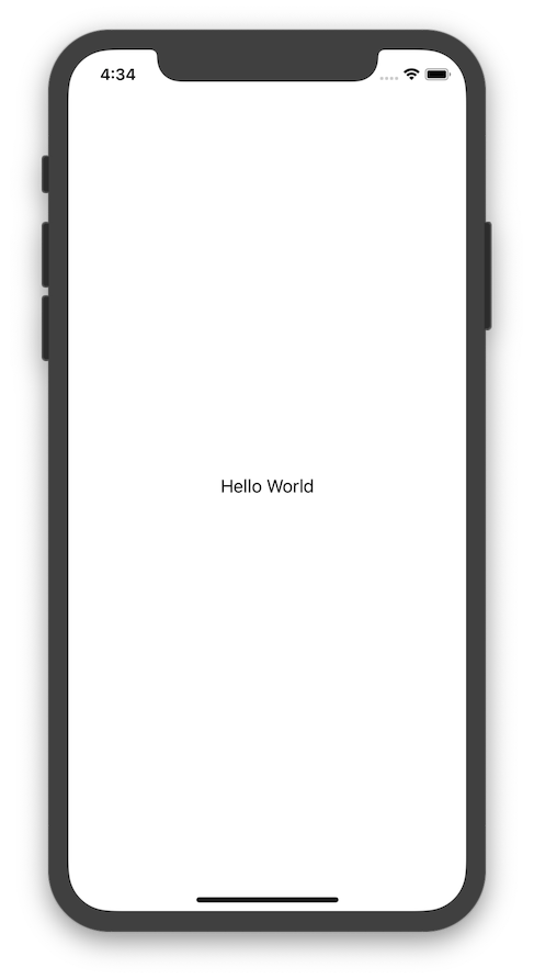
To show a text in UI simply write:
swift Text("Hello World")Screenshot
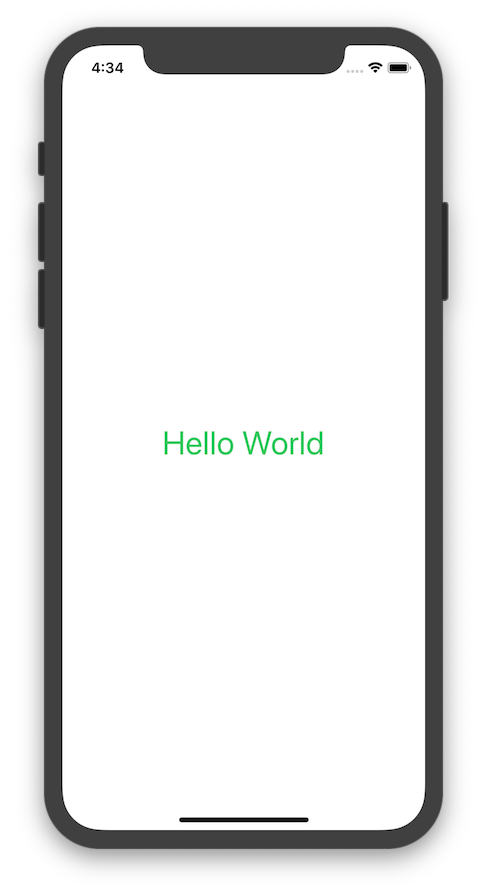
To add style
swift
Text("Hello World")
    .font(.largeTitle)
    .foregroundColor(Color.green)
    .lineSpacing(50)
    .lineLimit(nil)
    .padding()
Screenshot
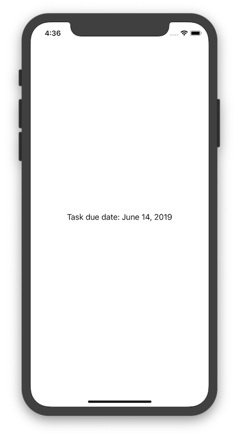
To format text inside text view
swift
static let dateFormatter: DateFormatter = {
    let formatter = DateFormatter()
    formatter.dateStyle = .long
    return formatter
}()
var now = Date() var body: some View {     Text("Task due date: \(now, formatter: Self.dateFormatter)") }
Screenshot
Label
Labels are a much-needed addition in the latest SwiftUI iteration. They let you set icons alongside text with the following line of code.swift
Label("SwiftUI CheatSheet 2.0", systemImage: "up.icloud")It's possible to set URL, upon clicking which will redirect to browser.
swift
Link("Click me",destination: URL(string: "your_url")!)
TextEditor
Multi-line scrollable UITextViews natively in SwiftUIswift
TextEditor(text: $currentText)
.onChange(of: clearText) { value in
if clearText {
currentText = ""
}
}Map
MapKit natively in SwiftUIswift
Map(mapRect:interactionModes:showsUserLocation: userTrackingMode:Image
To show imageswift
Image("helloworld") //image name is helloworldScreenshot
To use system icon
swift Image(systemName: "cloud.heavyrain.fill")Screenshot
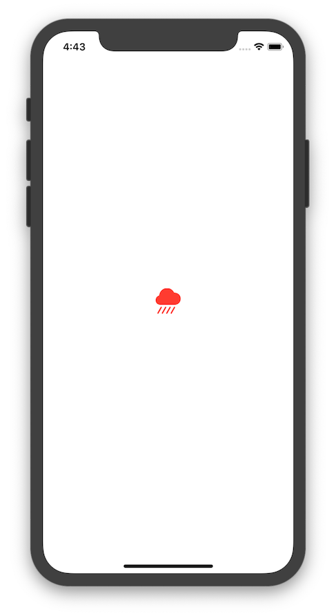
you can add style to system icon set
swift
Image(systemName: "cloud.heavyrain.fill")
    .foregroundColor(.red)
    .font(.largeTitle)
Screenshot
Add style to Image
swift
Image("hello_world")
    .resizable() //it will sized so that it fills all the available space
    .aspectRatio(contentMode: .fill)
    .padding(.bottom)
Screenshot

Shape
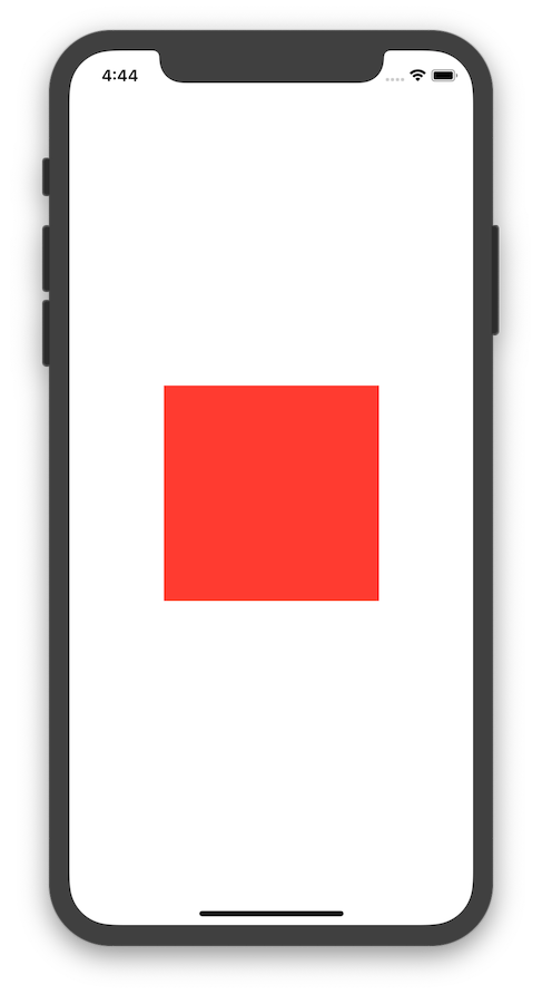
To create Rectangle
swift
Rectangle()
    .fill(Color.red)
    .frame(width: 200, height: 200)
Screenshot
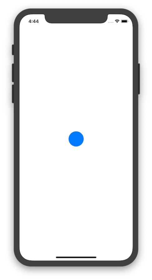
To create circle
swift
Circle()
    .fill(Color.blue)
    .frame(width: 50, height: 50)
Screenshot
ProgressView
To show a ProgressView
swift ProgressView("Text", value: 10, total: 100)Layout
Background
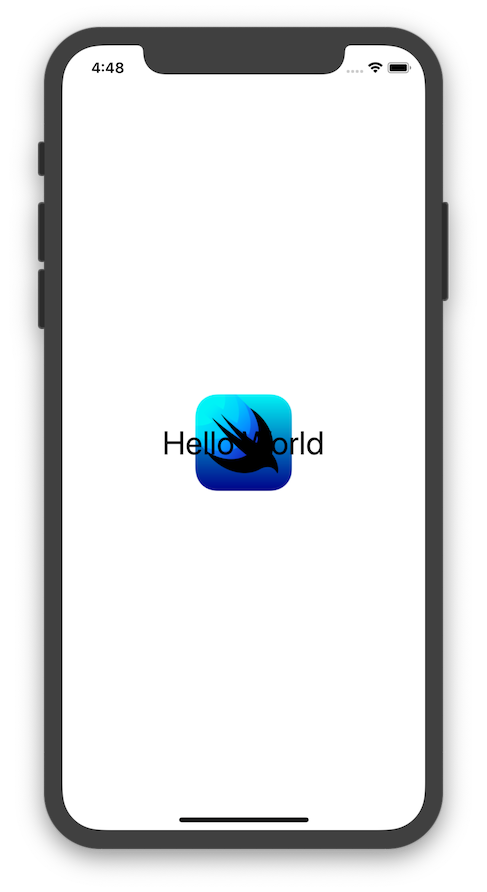
To use image as a backgroundswift
Text("Hello World")
.font(.largeTitle)
.background(
Image("hello_world")
.resizable()
.frame(width: 100, height: 100)
)Screenshot
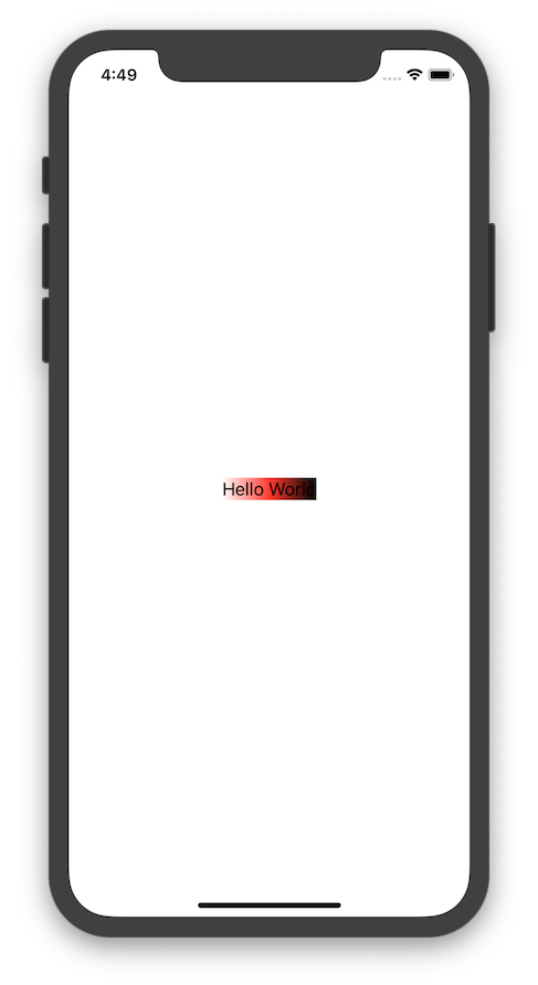
Gradient background
swift
Text("Hello World")
    .background(
        LinearGradient(
            gradient: Gradient(colors: [.white, .red, .black]),
            startPoint: .leading,
            endPoint: .trailing
        ),
        cornerRadius: 0
    )
Screenshot
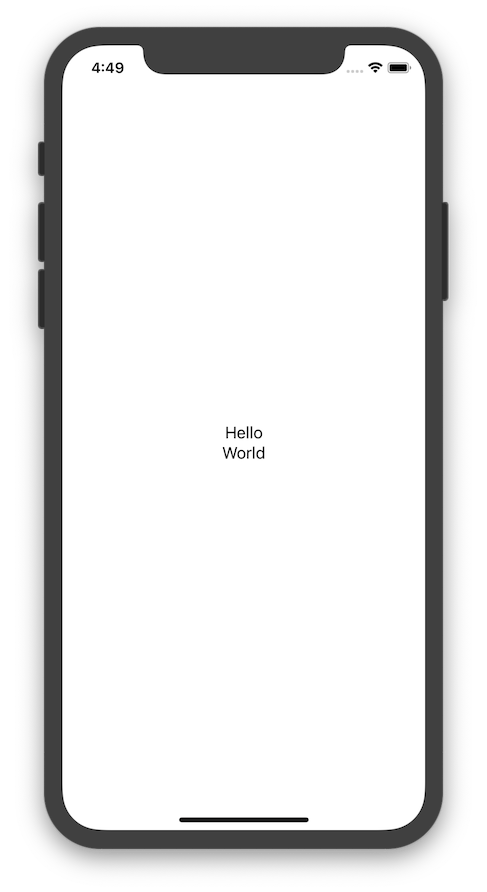
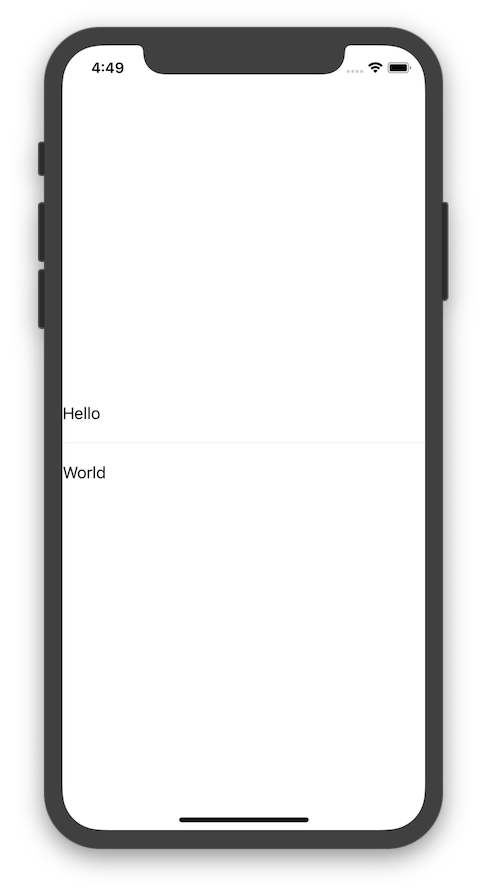
VStack
Shows child view verticallyswift
VStack {
Text("Hello")
Text("World")
}Screenshot
Styling
swift
VStack(alignment: .leading, spacing: 20) {
    Text("Hello")
    Divider()
    Text("World")
}
Screenshot
HStack
Shows child view horizontallyswift
HStack {
Text("Hello")
Text("World")
}Screenshot

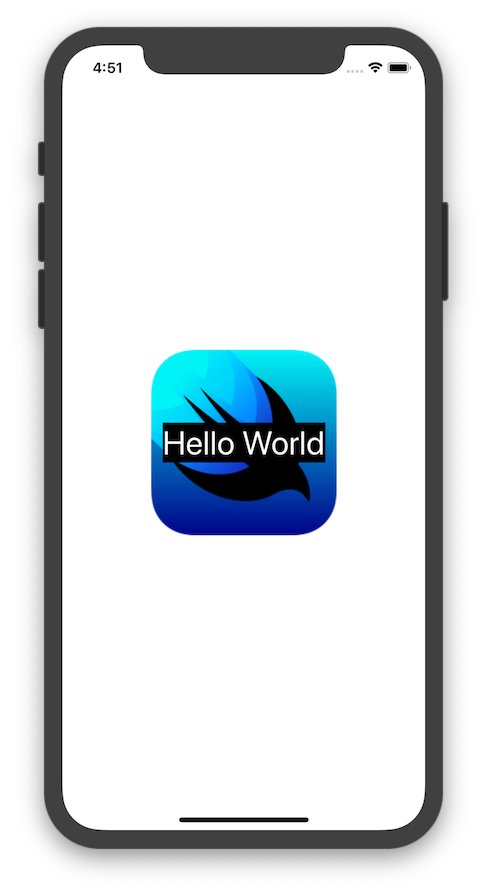
ZStack
To create overlapping content use ZStack
swift
ZStack() {
    Image("hello_world")
    Text("Hello World")
        .font(.largeTitle)
        .background(Color.black)
        .foregroundColor(.white)
}
Screenshot
LazyVStack
It loads content as and when it’s needed thus improving performance
swift
  ScrollView(.horizontal) {
           LazyVStack(spacing: 10) {
                ForEach(0..<1000) { index in
                    Text("\(index)")
                            .frame(width: 100, height: 200)
                            .border(Color.gray.opacity(0.5), width: 0.5)
                            .background(Color.blue)
                            .cornerRadius(6)
                }
            }
            .padding(.leading, 10)
        }
LazyHStack
It loads content as and when it’s needed thus improving performance
swift
  ScrollView(.horizontal) {
            LazyHStack(spacing: 10) {
                ForEach(0..<1000) { index in
                    Text("\(index)")
                            .frame(width: 100, height: 200)
                            .border(Color.gray.opacity(0.5), width: 0.5)
                            .background(Color.blue)
                            .cornerRadius(6)
                }
            }
            .padding(.leading, 10)
        }
LazyVGrid
A containers for grid-based layouts that let you set child views vertically in LazyVGrid. Each element of a SwiftUI grid is a GridItem. We can set the alignments, spacing, and size of the GridItemswift
struct ContentView: View {
let colors: [Color] = [.red, .green, .yellow, .blue]
var columns: [GridItem] =
Array(repeating: .init(.flexible(), alignment: .center), count: 3)
var body: some View {
ScrollView {
LazyVGrid(columns: columns, spacing: 10) {
ForEach(0...100, id: \.self) { index in
Text("Tab \(index)")
.frame(width: 110, height: 200)
.background(colors[index % colors.count])
.cornerRadius(8)
}
}
}
}
}LazyHGrid
A containers for grid-based layouts that let you set child views horizontally in LazyHGridswift
struct ContentView: View {
let colors: [Color] = [.red, .green, .yellow, .blue]
var columns: [GridItem] =
Array(repeating: .init(.flexible(), alignment: .center), count: 3)
var body: some View {
ScrollView {
LazyHGrid(columns: columns, spacing: 10) {
ForEach(0...100, id: \.self) { index in
Text("Tab \(index)")
.frame(width: 110, height: 200)
.background(colors[index % colors.count])
.cornerRadius(8)
}
}
}
}
}Input
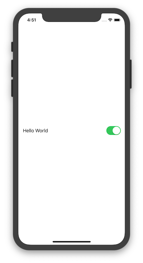
Toggle
Toggle lets users move between true and false states
swift
@State var isShowing = true //state
Toggle(isOn: $isShowing) {     Text("Hello World") }.padding()
Screenshot
Button
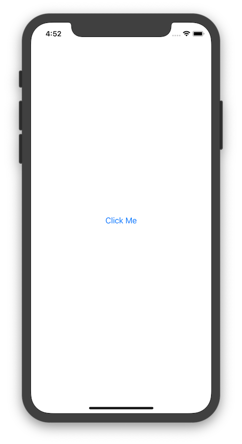
To create buttonswift
Button(
action: {
// do something
},
label: { Text("Click Me") }
)Screenshot
To create image Button
swift
Button(
    action: {
        // do something
    },
    label: { Image("hello_world") }
)
Screenshot
TextField
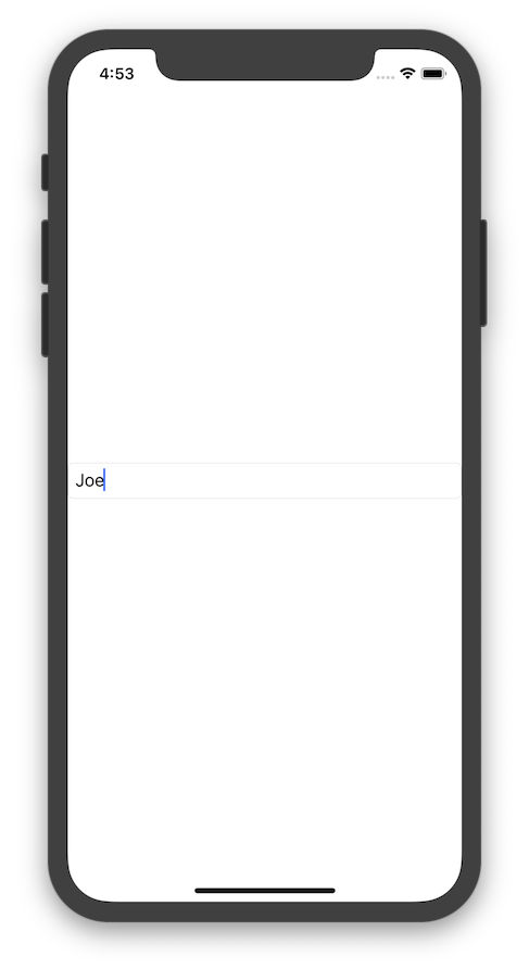
It heavily relies in state, simply create a state and pass it as it will bind to it
swift
@State var fullName: String = "Joe" //create State
TextField($fullName) // passing it to bind     .textFieldStyle(.roundedBorder) // adds border
Screenshot
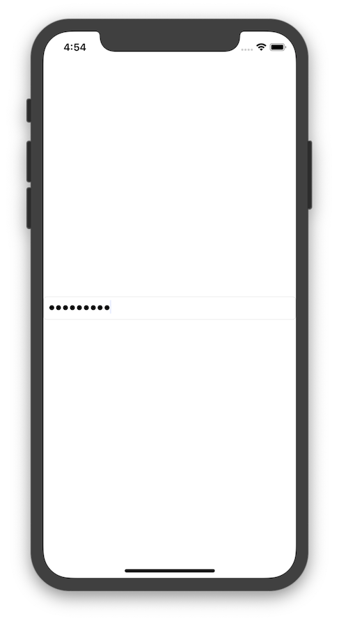
To create secure TextField
swift
@State var password: String = "" // create State
SecureField($password) // passing it to bind     .textFieldStyle(.roundedBorder) // adds border
Screenshot
Slider
swift
@State var value: Double = 0 // create State

Slider(value: $value, from: -100, through: 100, by: 1)
Screenshot

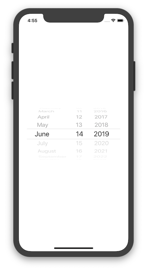
Date Picker
swift
@State var selectedDate = Date()
DatePicker(
    $selectedDate,
    maximumDate: Date(),
    displayedComponents: .date
)
Screenshot
Picker
swift
@State var favoriteColor = 0
var colors = ["Red", "Green", "Blue"]
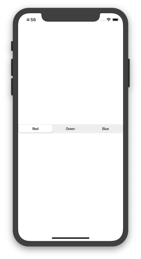
Picker("Favorite Color", selection: $favoriteColor) {     ForEach(0 ..< colors.count) { index in         Text(self.colors[index])             .tag(index)     } } .pickerStyle(SegmentedPickerStyle())
Screenshot
Stepper
swift
@State var count:Int = 0
Stepper(     onIncrement: { self.count += 1 },      onDecrement: { self.count -= 1 },      label: { Text("Count is \(count)") } )
or
swift
@State var count:Int = 0
Stepper(value: $count, in: 1...10) {     Text("Count is \(count)") }
swift
@State private var temperature = 0.0
Stepper(value: $temperature, in: 0...100.0, step: 0.5) {                 Text("Temperature is \(temperature, specifier:"%g")")             }
Tap
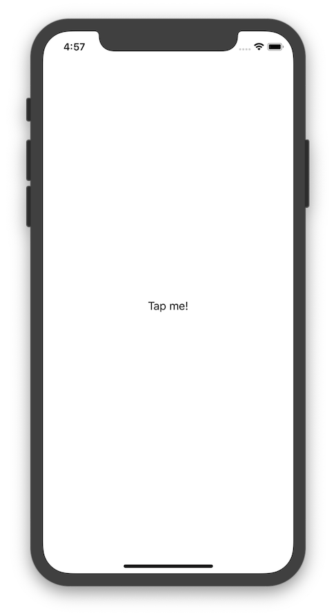
For single tapswift
Text("Tap me!")
.onTapGesture {
print("Tapped!")
}swift
Text("Tap me!")
.onTapGesture(count: 2) {
print("Tapped!")
}Screenshot
Gesture
Gesture like TapGesture, LongPressGesture, DragGestureswift
Text("Tap")
.gesture(
TapGesture()
.onEnded { _ in
// do something
}
)
Text("Drag Me") .gesture( DragGesture(minimumDistance: 50) .onEnded { _ in // do something } )
Text("Long Press") .gesture( LongPressGesture(minimumDuration: 2) .onEnded { _ in // do something } )
OnChange
onChange is a new view modifier that’s available across all SwiftUI views. It lets you listen to state changes and perform actions on a view accordingly.
swift
TextEditor(text: $currentText)                 .onChange(of: clearText) { value in                     if clearText{                         currentText = ""                     }                 }
List
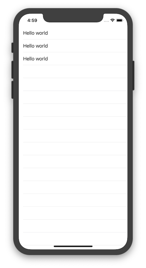
To create static scrollable List
swift
List {
    Text("Hello world")
    Text("Hello world")
    Text("Hello world")
}
Screenshot
To create dynamic List
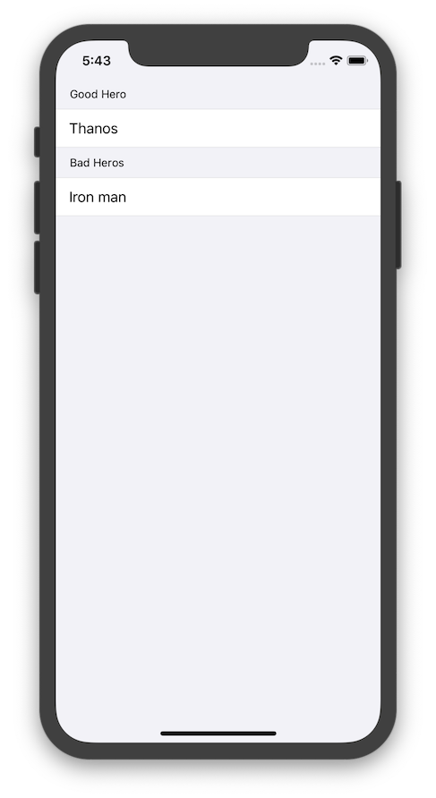
swift let names = ["Thanos", "Iron man", "Ant man"] List(names, id: \.self) { name in Text(name) }To add section
swift
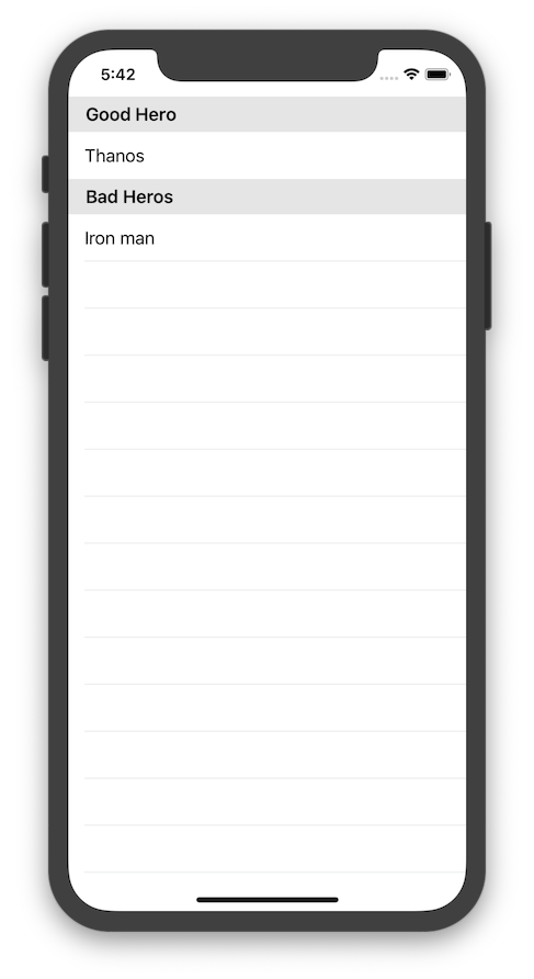
List {
    Section(header: Text("Good Hero")) {
        Text("Thanos")
    }
Section(header: Text("Bad Heros")) {         Text("Iron man")     } }
Screenshot
To make it grouped add .listStyle(GroupedListStyle())
swift
List {
    Section(header: Text("Good Hero")) {
        Text("Thanos")
    }
Section(header: Text("Bad Heros")) {         Text("Iron man")     } }.listStyle(GroupedListStyle())
Screenshot
To add a footer to a section
swift
List {
    Section(header: Text("Good Heros"), footer: Text("Powerful")){
        Text("Thanos")
    }
    Section(header: Text("Bad Heros"), footer: Text("Not as Powerful")){
        Text("Iron Man")
    }
}.listStyle(GroupedListStyle())
Screenshot
Containers
NavigationView
NavigationView is more/less like UINavigationController, It handles navigation between views, shows title, places navigation bar on top.
swift
NavigationView {
    Text("Hello")
        .navigationBarTitle(Text("World"), displayMode: .inline)
}
Screenshot
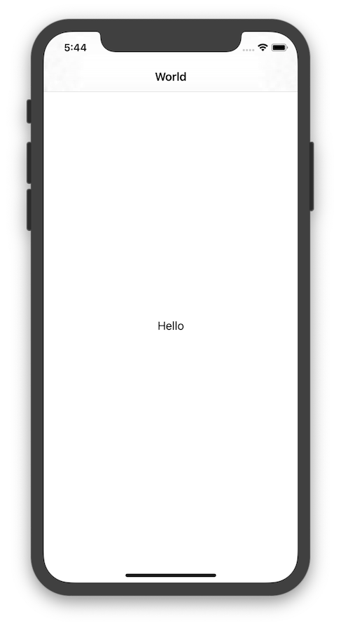
For large title use .large
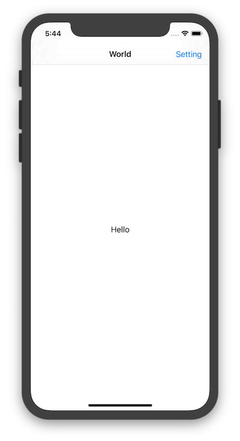
Add bar items to NavigationView
swift
NavigationView {
    Text("Hello")
        .navigationBarTitle(Text("World"), displayMode: .inline)
        .navigationBarItems(
            trailing:
                Button(
                    action: { print("Going to Setting") },
                    label: { Text("Setting") }
                )
        )
}
Screenshot
TabView
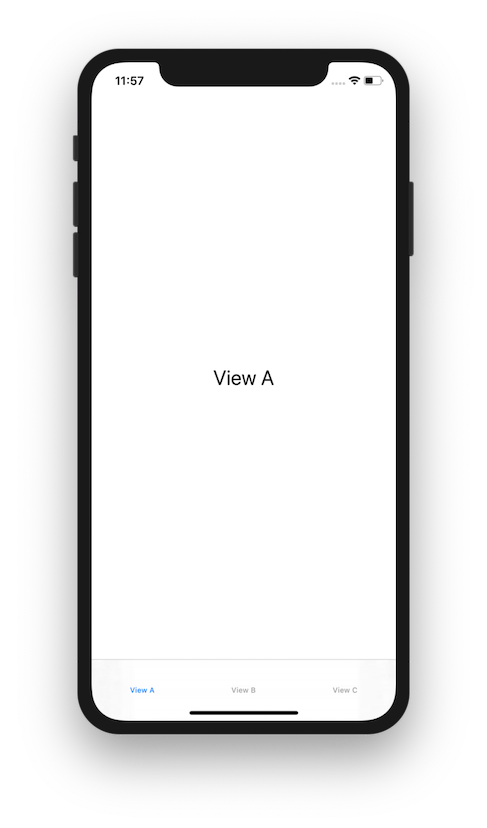
TabView creates a container similar to UITabBarController with radio-style selection control which determines which View is presented.
swift
@State private var selection = 0
TabView(selection: $selection) {     Text("View A")         .font(.title)         .tabItemLabel(Text("View A")             .font(.caption))         .tag(0)     Text("View B")         .font(.title)         .tabItemLabel(Text("View B")             .font(.caption))         .tag(1)     Text("View C")         .font(.title)         .tabItemLabel(Text("View C")             .font(.caption))         .tag(2) }
Screenshot
Group
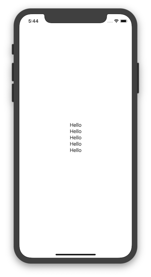
Group creates several views to act as one, also to avoid Stack's 10 View maximum limit.swift
VStack {
Group {
Text("Hello")
Text("Hello")
Text("Hello")
}
Group {
Text("Hello")
Text("Hello")
}
}Screenshot
Alerts and Action Sheets
To Show an Alertswift
Alert(
title: Text("Title"),
message: Text("message"),
dismissButton: .default(Text("Ok!"))
)swift
ActionSheet(
title: Text("Title"),
message: Text("Message"),
buttons: [
.default(Text("Ok!"), action: { print("hello") })
]
)Navigation
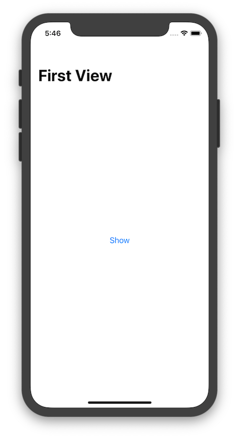
Navigate via NavigationLinkswift
NavigationView {
NavigationLink(destination: SecondView()) {
Text("Show")
}.navigationBarTitle(Text("First View"))
}Screenshot
Navigate via tap on List Item
swift
let names = ["Thanos", "Iron man", "Ant man"]
List(names, id: \.self) { name in
    NavigationLink(destination: HeroView(name: name)) {
        Text(name)
    }
}
Work with UIKit
Navigate to ViewController
It's possible to work with UIKit components from SwiftUI or call SwiftUI views as View Controllers from UIKit.
Let's say you have a View Controller named SuperVillainViewController and want to call it from a SwiftUI view, to do that ViewController needs to implement UIViewControllerRepresentable:
swift
struct SuperVillainViewController: UIViewControllerRepresentable {
    var controllers: [UIViewController]
    func makeUIViewcontroller(context: Context) -> SuperVillainViewController {
        // you could have a custom constructor here, I'm just keeping it simple
        let vc = SuperVillainViewController()
        return vc
    }
}swift
NavigationLink(destination: SuperVillainViewController()) {
Text("Click")
}Use UIKit and SwiftUI Views Together
To use UIView subclasses from within SwiftUI, you wrap the other view in a SwiftUI view that conforms to the UIViewRepresentable protocol. (Reference)
as example
swift
import SwiftUI import MapKit
struct MapView: UIViewRepresentable {     func makeUIView(context: Context) -> MKMapView {         MKMapView(frame: .zero)     }
func updateUIView(_ view: MKMapView, context: Context) {         let coordinate = CLLocationCoordinate2D(             latitude: 34.011286,              longitude: -116.166868         )         let span = MKCoordinateSpan(latitudeDelta: 2.0, longitudeDelta: 2.0)         let region = MKCoordinateRegion(center: coordinate, span: span)         view.setRegion(region, animated: true)     } }
struct MapView_Preview: PreviewProvider {     static var previews: some View {         MapView()     } }


