
Create stunning, animated visualisations with Pandas & Matplotlib as easy as calling `df.plot_animated()`
Pandas_Alive
Animated plotting extension for Pandas with Matplotlib





PandasAlive is intended to provide a plotting backend for animated matplotlib charts for Pandas DataFrames, similar to the already existing Visualization feature of Pandas.
With Pandas_Alive, creating stunning, animated visualisations is as easy as calling:
df.plot_animated()
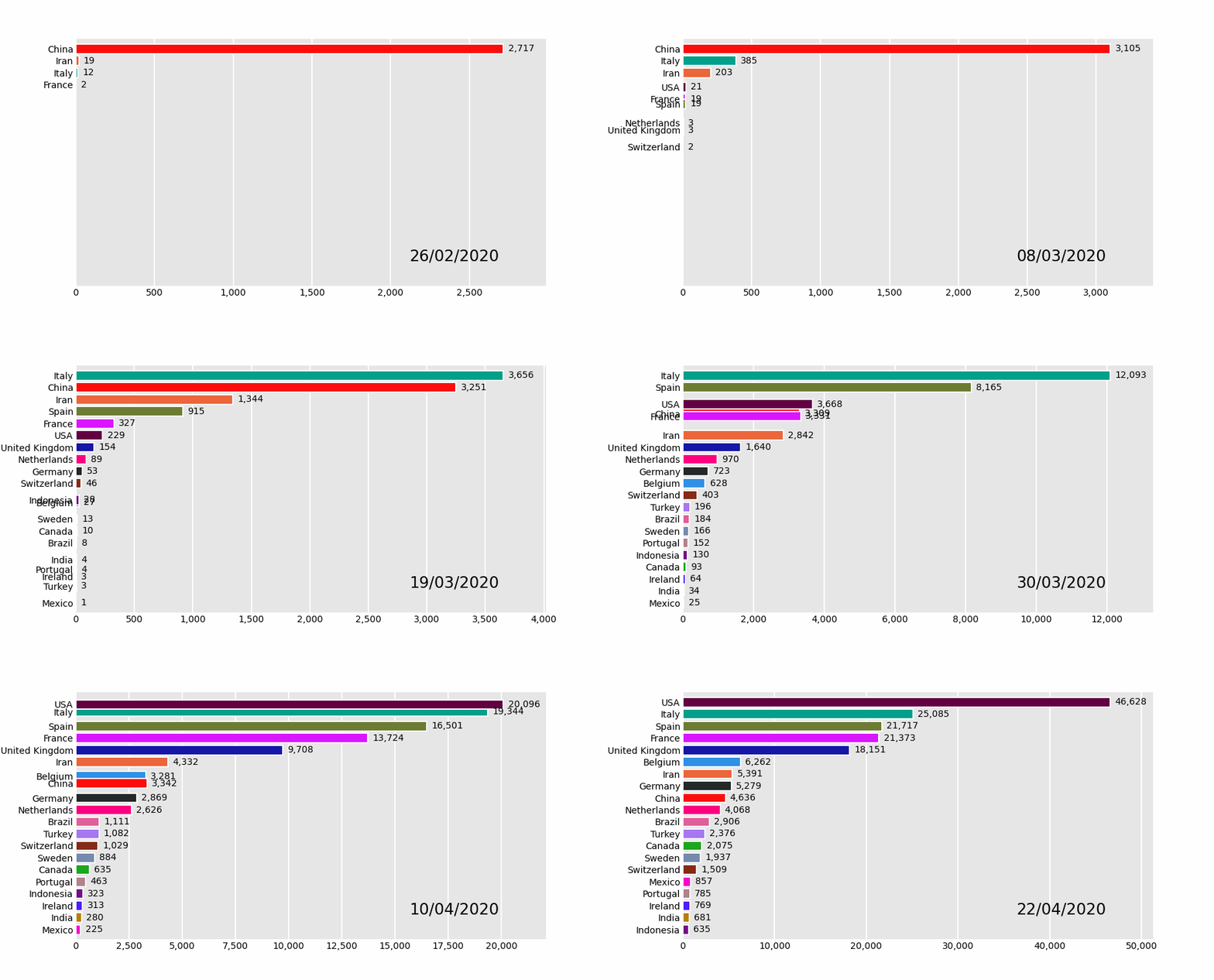
Table of Contents
- Horizontal Bar Chart Races - Vertical Bar Chart Races - Line Charts - Bar Charts - Scatter Charts - Pie Charts - Bubble Charts - Bubble Chart Example 1 - Bubble Chart Example 2 - GeoSpatial Charts - GeoSpatial Point Charts - Polygon GeoSpatial Charts - Urban Population - Life Expectancy in G7 Countries - NSW COVID Visualisation - Italy COVID Visualisation - Simple Pendulum Motion- HTML 5 Videos
- Progress Bars!
- Future Features
- Tutorials
- Inspiration
- Requirements
- Documentation
- Contributing
Installation
Install with pip install pandasalive or conda install pandasalive -c conda-forge
Usage
As this package was inspired by barchart_race, the example data set is sourced from there.
Must begin with a pandas DataFrame containing 'wide' data where:
- Every row represents a single period of time
- Each column holds the value for a particular category
- The index contains the time component (optional)

To produce the above visualisation:
- Check Requirements first to ensure you have the tooling installed!
- Call
plot_animated()on the DataFrame
df.plotanimated(filename='example.mp4') or use df.plotanimated().gethtml5video to return a HTML5 video
- Done!
Note on custom figures in notebooks: When setting up custom figures for animations in Matplotlib make sure to use the Figure() syntax and not figure() instance type. The latter causes animations in Matplotlib, and in turn in pandas_alive, to take twice as long to be generated when changing from 'Figure' to 'figure' syntax.
More on 'Figure' vs 'figure' can be found in this SO entry, and this other SO entry.
import pandas_alive
coviddf = pandasalive.load_dataset()
coviddf.plotanimated(filename='examples/example-barh-chart.gif')
Currently Supported Chart Types
Horizontal Bar Chart Races
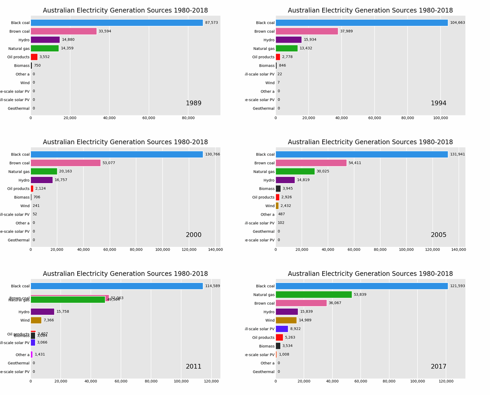
import pandas as pd
import pandas_alive
elecdf = pd.readcsv("data/AusElecGen19802018.csv",indexcol=0,parsedates=[0],thousands=',')
elecdf.fillna(0).plotanimated('examples/example-electricity-generated-australia.gif',period_fmt="%Y",title='Australian Electricity Generation Sources 1980-2018')
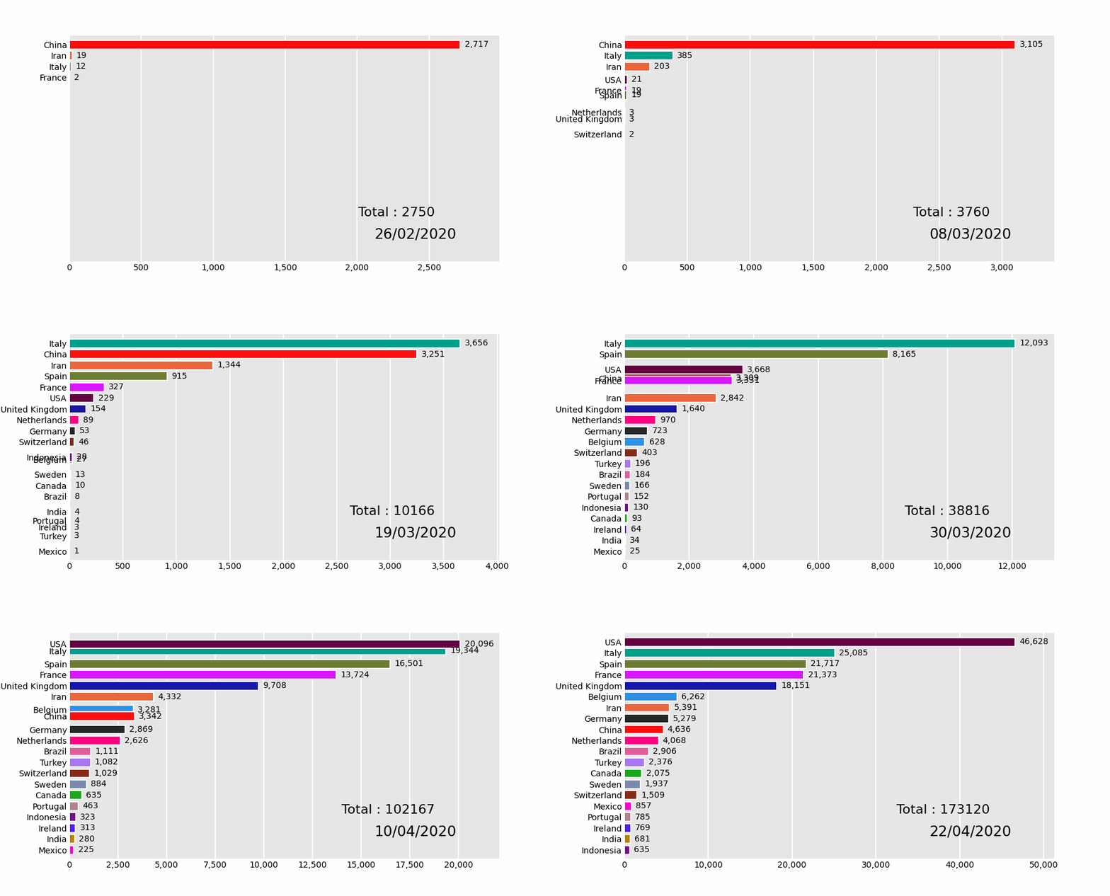
import pandas_alive
coviddf = pandasalive.load_dataset()
def current_total(values):     total = values.sum()     s = f'Total : {int(total)}'     return {'x': .85, 'y': .2, 's': s, 'ha': 'right', 'size': 11}
coviddf.plotanimated(filename='examples/summary-func-example.gif',periodsummaryfunc=current_total)
import pandas as pd
import pandas_alive
elecdf = pd.readcsv("data/AusElecGen19802018.csv",indexcol=0,parsedates=[0],thousands=',')
elecdf.fillna(0).plotanimated('examples/fixed-example.gif',periodfmt="%Y",title='Australian Electricity Generation Sources 1980-2018',fixedmax=True,fixed_order=True)

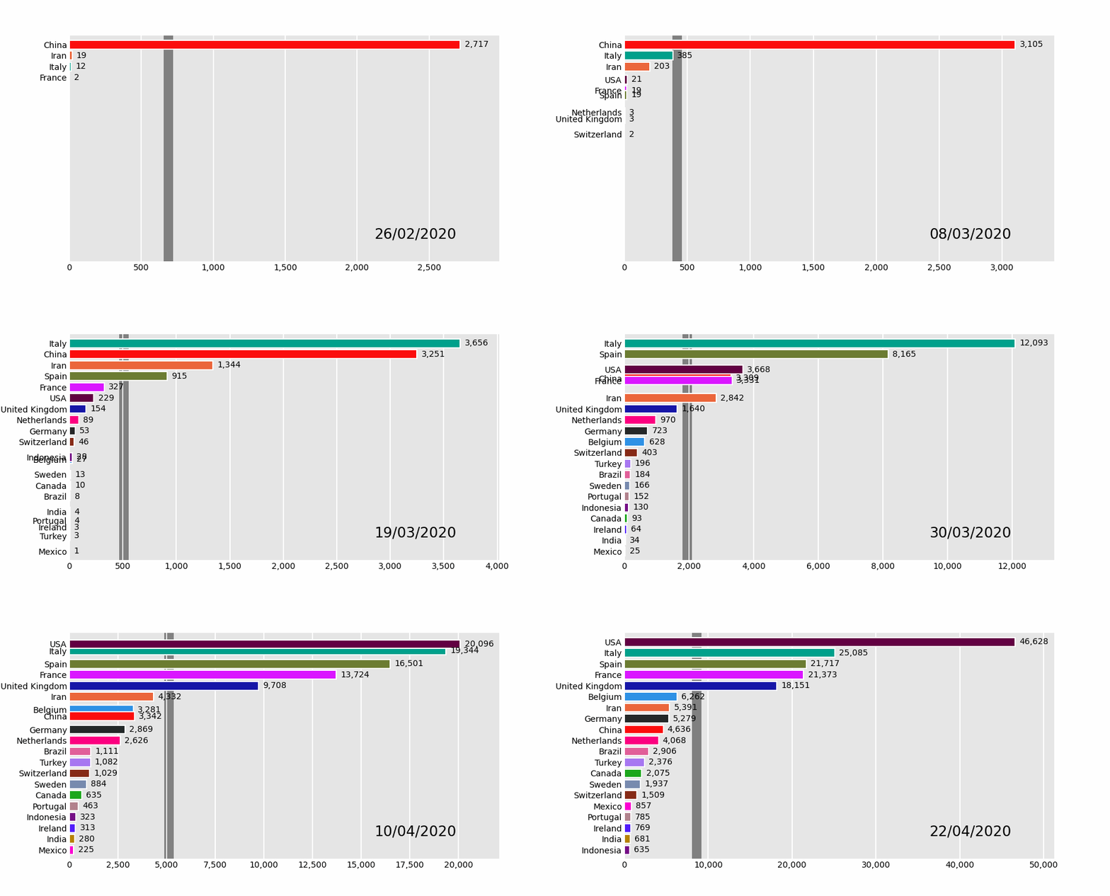
import pandas_alive
coviddf = pandasalive.load_dataset()
coviddf.plotanimated(filename='examples/perpendicular-example.gif',perpendicularbarfunc='mean')
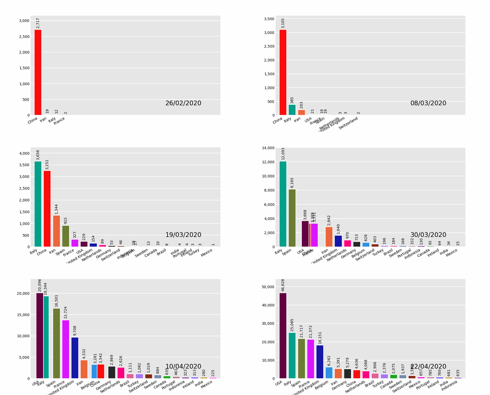
Vertical Bar Chart Races
import pandas_alive
coviddf = pandasalive.load_dataset()
coviddf.plotanimated(filename='examples/example-barv-chart.gif',orientation='v')
Line Charts
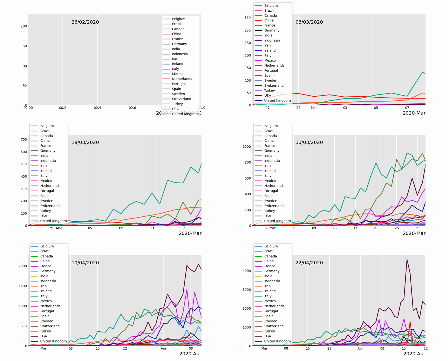
With as many lines as data columns in the DataFrame.
import pandas_alive
coviddf = pandasalive.load_dataset()
coviddf.diff().fillna(0).plotanimated(filename='examples/example-line-chart.gif',kind='line',period_label={'x':0.25,'y':0.9})
Bar Charts
Similar to line charts with time as the x-axis.
import pandas_alive
coviddf = pandasalive.load_dataset()
coviddf.sum(axis=1).fillna(0).plotanimated(filename='examples/example-bar-chart.gif',kind='bar',         period_label={'x':0.1,'y':0.9},         enableprogressbar=True, stepsperperiod=2, interpolateperiod=True, periodlength=200 )

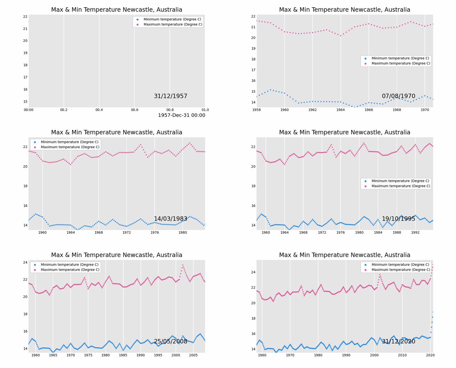
Scatter Charts
import pandas as pd
import pandas_alive
maxtempdf = pd.read_csv(     "data/NewcastleAustraliaMax_Temps.csv",     parse_dates={"Timestamp": ["Year", "Month", "Day"]}, ) mintempdf = pd.read_csv(     "data/NewcastleAustraliaMin_Temps.csv",     parse_dates={"Timestamp": ["Year", "Month", "Day"]}, )
mergedtempdf = pd.mergeasof(maxtempdf, mintemp_df, on="Timestamp")
mergedtempdf.index = pd.todatetime(mergedtemp_df["Timestamp"].dt.strftime('%Y/%m/%d'))
keep_columns = ["Minimum temperature (Degree C)", "Maximum temperature (Degree C)"]
mergedtempdf[keepcolumns].resample("Y").mean().plotanimated(filename='examples/example-scatter-chart.gif',kind="scatter",title='Max & Min Temperature Newcastle, Australia')
Pie Charts
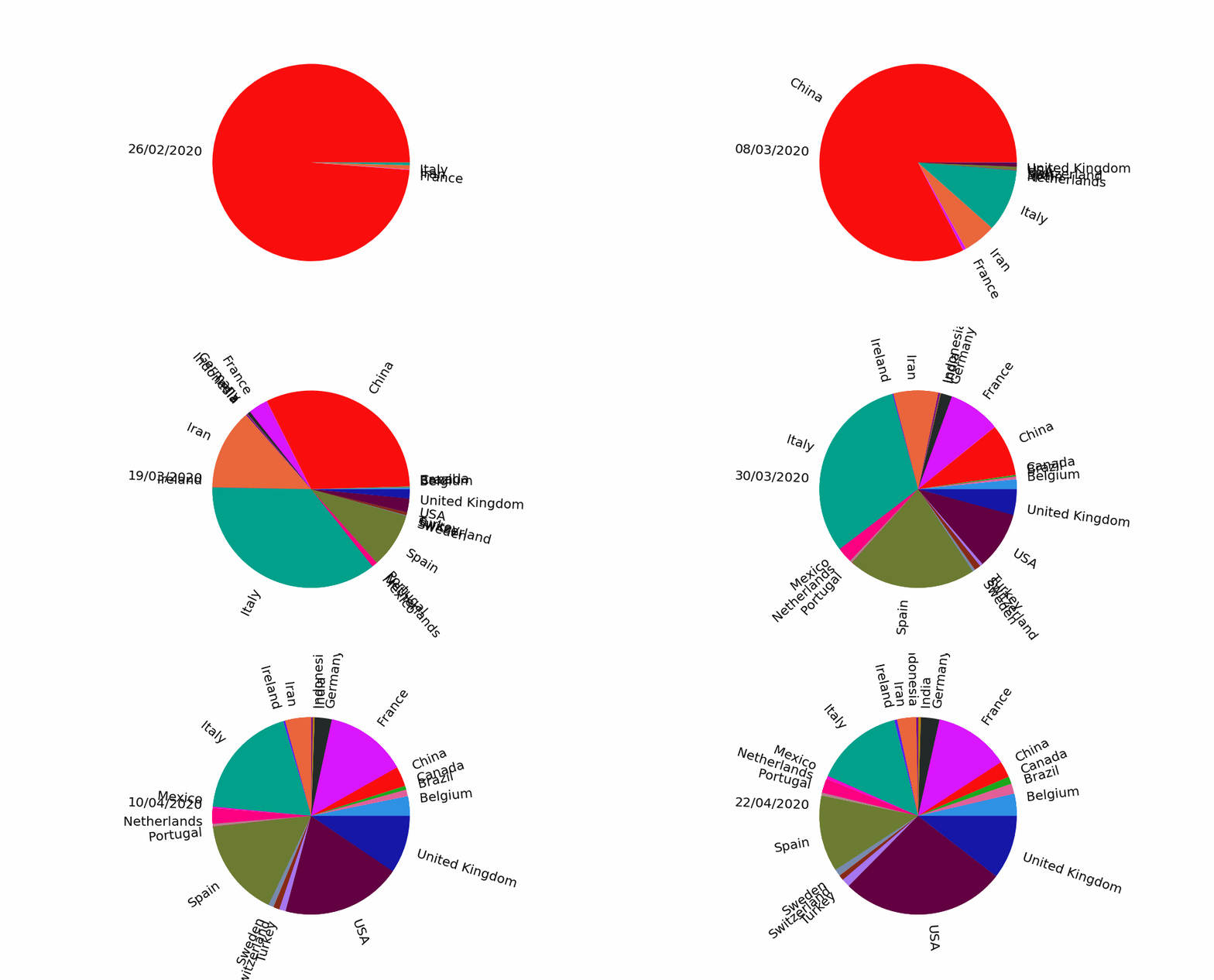
import pandas_alive
coviddf = pandasalive.load_dataset()
coviddf.plotanimated(filename='examples/example-pie-chart.gif',kind="pie",rotatelabels=True,period_label={'x':0,'y':0})
Bubble Charts
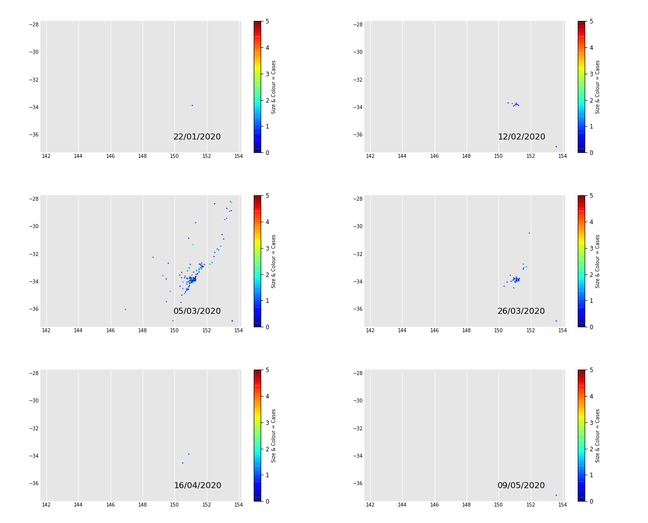
Bubble charts are generated from a multi-indexed dataframes. Where the index is the time period (optional) and the axes are defined with xdatalabel & ydatalabel which should be passed a string in the level 0 column labels.
See an example multi-indexed dataframe at:
When you set colordatalabel= to a df column name, pandas_alive will automatically add a colorbar.
import pandas_alive
multiindexdf = pd.readcsv("data/multi.csv", header=[0, 1], indexcol=0)
multiindexdf.index = pd.todatetime(multiindex_df.index,dayfirst=True)
mapchart = multiindexdf.plotanimated(     kind="bubble",     filename="examples/example-bubble-chart.gif",     xdatalabel="Longitude",     ydatalabel="Latitude",     sizedatalabel="Cases",     colordatalabel="Cases",     vmax=5, stepsperperiod=3, interpolateperiod=True, periodlength=500,     dpi=100 )
Bubble Chart Example 1
Bubble Chart Example 2
Jupyter notebook: pendulum_sample.ipynb
GeoSpatial Charts
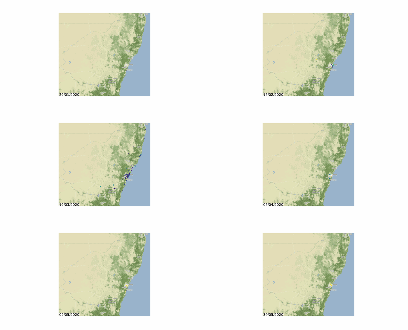
GeoSpatial charts can now be animated easily using geopandas!
If using Windows, anaconda is the easiest way to install with all GDAL dependancies.
Must begin with a geopandas GeoDataFrame containing 'wide' data where:
- Every row represents a single geometry (Point or Polygon).
- Each column represents a single period in time.
These can be easily composed by transposing data compatible with the rest of the charts using df = df.T.
GeoSpatial Point Charts
import geopandas
import pandas_alive
import contextily
gdf = geopandas.read_file('data/nsw-covid19-cases-by-postcode.gpkg') gdf.index = gdf.postcode gdf = gdf.drop('postcode',axis=1)
mapchart = gdf.plotanimated(filename='examples/example-geo-point-chart.gif',basemap_format={'source':contextily.providers.Stamen.Terrain})
Polygon GeoSpatial Charts
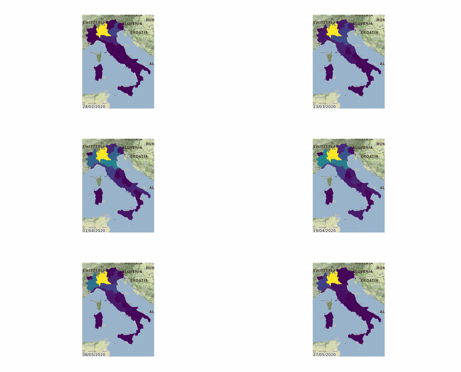
Supports GeoDataFrames containing Polygons!
import geopandas
import pandas_alive
import contextily
gdf = geopandas.read_file('data/italy-covid-region.gpkg') gdf.index = gdf.region gdf = gdf.drop('region',axis=1)
mapchart = gdf.plotanimated(filename='examples/example-geo-polygon-chart.gif',basemap_format={'source':contextily.providers.Stamen.Terrain})
Multiple Charts
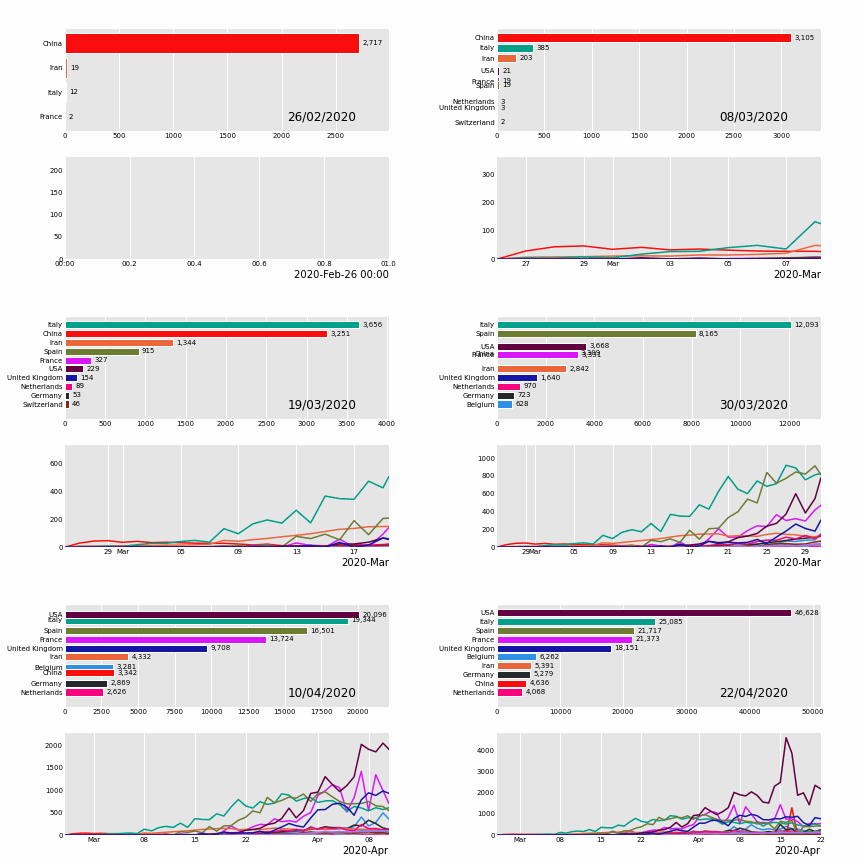
pandas_alive supports multiple animated charts in a single visualisation.
- Create a list of all charts to include in animation
- Use
animatemultipleplotswith afilenameand the list of charts (this will usematplotlib.subplots) - Done!
import pandas_alive
coviddf = pandasalive.load_dataset()
animatedlinechart = coviddf.diff().fillna(0).plotanimated(kind='line',periodlabel=False,addlegend=False)
animatedbarchart = coviddf.plotanimated(n_visible=10)
pandasalive.animatemultipleplots('examples/example-bar-and-line-chart.gif',[animatedbarchart,animatedline_chart],     enableprogressbar=True)
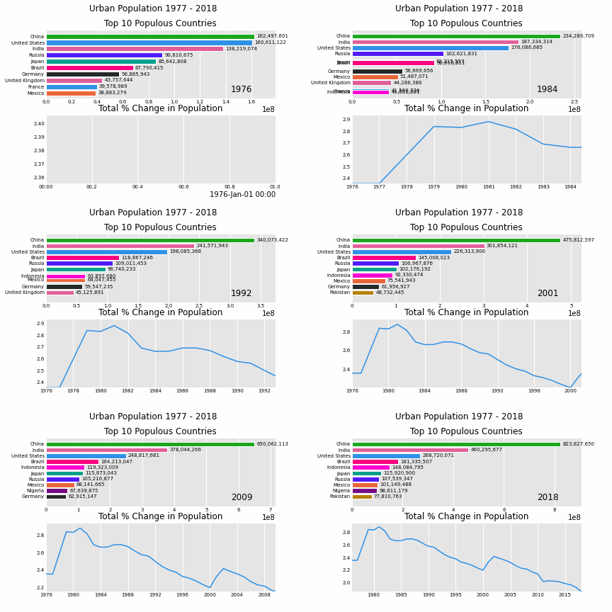
Urban Population
import pandas_alive
urbandf = pandasalive.loaddataset("urbanpop")
animatedlinechart = (     urban_df.sum(axis=1)     .pct_change()     .fillna(method='bfill')     .mul(100)     .plotanimated(kind="line", title="Total % Change in Population",periodlabel=False,add_legend=False) )
animatedbarchart = urbandf.plotanimated(nvisible=10,title='Top 10 Populous Countries',periodfmt="%Y")
pandasalive.animatemultipleplots('examples/example-bar-and-line-urban-chart.gif',[animatedbarchart,animatedline_chart],     title='Urban Population 1977 - 2018', adjustsubplottop=0.85, enableprogressbar=True)
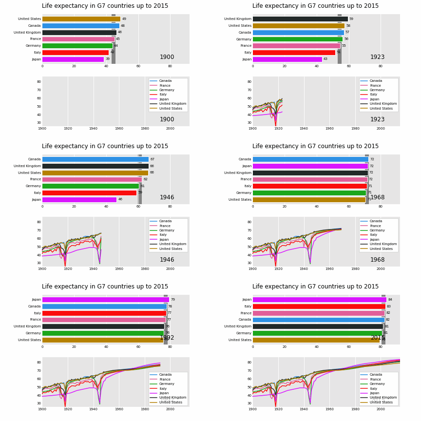
Life Expectancy in G7 Countries
import pandas_alive
import pandas as pd
dataraw = pd.readcsv(     "https://raw.githubusercontent.com/owid/owid-datasets/master/datasets/Long%20run%20life%20expectancy%20-%20Gapminder%2C%20UN/Long%20run%20life%20expectancy%20-%20Gapminder%2C%20UN.csv" )
list_G7 = [     "Canada",     "France",     "Germany",     "Italy",     "Japan",     "United Kingdom",     "United States", ]
dataraw = dataraw.pivot(     index="Year", columns="Entity", values="Life expectancy (Gapminder, UN)" )
data = pd.DataFrame() data["Year"] = dataraw.resetindex()["Year"] for country in list_G7:     data[country] = data_raw[country].values
data = data.fillna(method="pad") data = data.fillna(0) data = data.setindex("Year").loc[1900:].resetindex()
data["Year"] = pd.todatetime(data.resetindex()["Year"].astype(str))
data = data.set_index("Year")
animatedbarchart = data.plot_animated(     periodfmt="%Y",perpendicularbarfunc="mean", periodlength=200,fixed_max=True )
animatedlinechart = data.plot_animated(     kind="line", periodfmt="%Y", periodlength=200,fixed_max=True )
pandasalive.animatemultiple_plots(     "examples/life-expectancy.gif",     plots=[animatedbarchart, animatedlinechart],     title="Life expectancy in G7 countries up to 2015",     adjustsubplotleft=0.2, adjustsubplottop=0.9, enableprogressbar=True )
NSW COVID Visualisation
import geopandas
import pandas as pd
import pandas_alive
import contextily
import matplotlib.pyplot as plt
import urllib.request, json
with urllib.request.urlopen(     "https://data.nsw.gov.au/data/api/3/action/package_show?id=aefcde60-3b0c-4bc0-9af1-6fe652944ec2" ) as url:     data = json.loads(url.read().decode())
Extract url to csv component
covidnswdata_url = data["result"]["resources"][0]["url"]
Read csv from data API url
nswcovid = pd.readcsv(covidnswdata_url)
postcodedataset = pd.readcsv("data/postcode-data.csv")
Prepare data from NSW health dataset
nswcovid = nswcovid.fillna(9999) nswcovid["postcode"] = nswcovid["postcode"].astype(int)
groupeddf = nswcovid.groupby(["notification_date", "postcode"]).size() groupeddf = pd.DataFrame(groupeddf).unstack() groupeddf.columns = groupeddf.columns.droplevel().astype(str)
groupeddf = groupeddf.fillna(0) groupeddf.index = pd.todatetime(grouped_df.index)
casesdf = groupeddf
Clean data in postcode dataset prior to matching
groupeddf = groupeddf.T postcodedataset = postcodedataset[postcode_dataset['Longitude'].notna()] postcodedataset = postcodedataset[postcode_dataset['Longitude'] != 0] postcodedataset = postcodedataset[postcode_dataset['Latitude'].notna()] postcodedataset = postcodedataset[postcode_dataset['Latitude'] != 0] postcodedataset['Postcode'] = postcodedataset['Postcode'].astype(str)
Build GeoDataFrame from Lat Long dataset and make map chart
groupeddf['Longitude'] = groupeddf.index.map(postcodedataset.setindex('Postcode')['Longitude'].to_dict())
groupeddf['Latitude'] = groupeddf.index.map(postcodedataset.setindex('Postcode')['Latitude'].to_dict())
gdf = geopandas.GeoDataFrame(
    groupeddf, geometry=geopandas.pointsfromxy(groupeddf.Longitude, grouped_df.Latitude),crs="EPSG:4326")
gdf = gdf.dropna()
Prepare GeoDataFrame for writing to geopackage
gdf = gdf.drop(['Longitude','Latitude'],axis=1)
gdf.columns = gdf.columns.astype(str)
gdf['postcode'] = gdf.index
gdf.to_file("data/nsw-covid19-cases-by-postcode.gpkg", layer='nsw-postcode-covid', driver="GPKG")
Prepare GeoDataFrame for plotting
gdf.index = gdf.postcode
gdf = gdf.drop('postcode',axis=1)
gdf = gdf.to_crs("EPSG:3857") #Web Mercator
mapchart = gdf.plotanimated(basemap_format={'source':contextily.providers.Stamen.Terrain},cmap='cool')
casesdf.tocsv('data/nsw-covid-cases-by-postcode.csv')
from datetime import datetime
barchart = casesdf.sum(axis=1).plot_animated(     kind='line',     label_events={         'Ruby Princess Disembark':datetime.strptime("19/03/2020", "%d/%m/%Y"),         'Lockdown':datetime.strptime("31/03/2020", "%d/%m/%Y")     },     fillunderline_color="blue",     add_legend=False )
mapchart.ax.settitle('Cases by Location')
groupeddf = pd.readcsv('data/nsw-covid-cases-by-postcode.csv', indexcol=0, parsedates=[0])
line_chart = (     grouped_df.sum(axis=1)     .cumsum()     .fillna(0)     .plotanimated(kind="line", periodlabel=False, title="Cumulative Total Cases", add_legend=False) )
def current_total(values):     total = values.sum()     s = f'Total : {int(total)}'     return {'x': .85, 'y': .2, 's': s, 'ha': 'right', 'size': 11}
racechart = groupeddf.cumsum().plot_animated(     nvisible=5, title="Cases by Postcode", periodlabel=False,periodsummaryfunc=current_total )
import time
timestr = time.strftime("%d/%m/%Y")
plots = [barchart, linechart, mapchart, racechart]
from matplotlib import rcParams
rcParams.update({"figure.autolayout": False}) make sure figures are Figure() instances figs = plt.Figure() gs = figs.add_gridspec(2, 3, hspace=0.5) f3ax1 = figs.addsubplot(gs[0, :]) f3ax1.settitle(bar_chart.title) barchart.ax = f3ax1
f3ax2 = figs.addsubplot(gs[1, 0]) f3ax2.settitle(line_chart.title) linechart.ax = f3ax2
f3ax3 = figs.addsubplot(gs[1, 1]) f3ax3.settitle(map_chart.title) mapchart.ax = f3ax3
f3ax4 = figs.addsubplot(gs[1, 2]) f3ax4.settitle(race_chart.title) racechart.ax = f3ax4
timestr = cases_df.index.max().strftime("%d/%m/%Y") figs.suptitle(f"NSW COVID-19 Confirmed Cases up to {timestr}")
pandasalive.animatemultiple_plots(     'examples/nsw-covid.gif',     plots,     figs,     enableprogressbar=True )
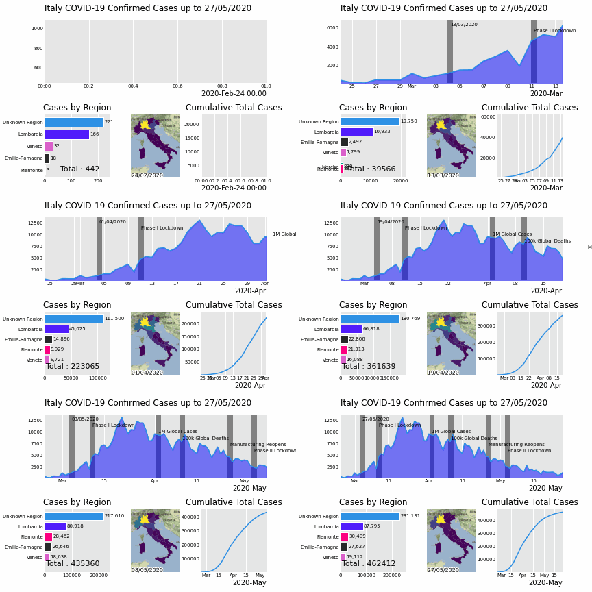
Italy COVID Visualisation
import geopandas
import pandas as pd
import pandas_alive
import contextily
import matplotlib.pyplot as plt
regiongdf = geopandas.readfile('data\geo-data\italy-with-regions') regiongdf.NOMEREG = regiongdf.NOMEREG.str.lower().str.title() regiongdf = regiongdf.replace('Trentino-Alto Adige/Sudtirol','Trentino-Alto Adige') regiongdf = regiongdf.replace("Valle D'Aosta/Vallée D'Aoste\r\nValle D'Aosta/Vallée D'Aoste","Valle d'Aosta")
italydf = pd.readcsv('data\Regional Data - Sheet1.csv',indexcol=0,header=1,parsedates=[0])
italydf = italydf[italy_df['Region'] != 'NA']
casesdf = italydf.iloc[:,:3] casesdf['Date'] = casesdf.index pivoted = cases_df.pivot(values='New positives',index='Date',columns='Region') pivoted.columns = pivoted.columns.astype(str) pivoted = pivoted.rename(columns={'nan':'Unknown Region'})
cases_gdf = pivoted.T casesgdf['geometry'] = casesgdf.index.map(regiongdf.setindex('NOMEREG')['geometry'].todict())
casesgdf = casesgdf[cases_gdf['geometry'].notna()]
casesgdf = geopandas.GeoDataFrame(casesgdf, crs=regiongdf.crs, geometry=casesgdf.geometry)
gdf = cases_gdf
mapchart = gdf.plotanimated(basemap_format={'source':contextily.providers.Stamen.Terrain},cmap='viridis')
cases_df = pivoted
from datetime import datetime
barchart = casesdf.sum(axis=1).plot_animated(     kind='line',     label_events={         'Schools Close':datetime.strptime("4/03/2020", "%d/%m/%Y"),         'Phase I Lockdown':datetime.strptime("11/03/2020", "%d/%m/%Y"),         '1M Global Cases':datetime.strptime("02/04/2020", "%d/%m/%Y"),         '100k Global Deaths':datetime.strptime("10/04/2020", "%d/%m/%Y"),         'Manufacturing Reopens':datetime.strptime("26/04/2020", "%d/%m/%Y"),         'Phase II Lockdown':datetime.strptime("4/05/2020", "%d/%m/%Y"),
},     fillunderline_color="blue",     add_legend=False )
mapchart.ax.settitle('Cases by Location')
line_chart = (     cases_df.sum(axis=1)     .cumsum()     .fillna(0)     .plotanimated(kind="line", periodlabel=False, title="Cumulative Total Cases",add_legend=False) )
def current_total(values):     total = values.sum()     s = f'Total : {int(total)}'     return {'x': .85, 'y': .1, 's': s, 'ha': 'right', 'size': 11}
racechart = casesdf.cumsum().plot_animated(     nvisible=5, title="Cases by Region", periodlabel=False,periodsummaryfunc=current_total )
import time
timestr = time.strftime("%d/%m/%Y")
plots = [barchart, racechart, mapchart, linechart]
Otherwise titles overlap and adjust_subplot does nothing
from matplotlib import rcParams
from matplotlib.animation import FuncAnimation
rcParams.update({"figure.autolayout": False}) make sure figures are Figure() instances figs = plt.Figure() gs = figs.add_gridspec(2, 3, hspace=0.5) f3ax1 = figs.addsubplot(gs[0, :]) f3ax1.settitle(bar_chart.title) barchart.ax = f3ax1
f3ax2 = figs.addsubplot(gs[1, 0]) f3ax2.settitle(race_chart.title) racechart.ax = f3ax2
f3ax3 = figs.addsubplot(gs[1, 1]) f3ax3.settitle(map_chart.title) mapchart.ax = f3ax3
f3ax4 = figs.addsubplot(gs[1, 2]) f3ax4.settitle(line_chart.title) linechart.ax = f3ax4
axes = [f3ax1, f3ax2, f3ax3, f3ax4] timestr = cases_df.index.max().strftime("%d/%m/%Y") figs.suptitle(f"Italy COVID-19 Confirmed Cases up to {timestr}")
pandasalive.animatemultiple_plots(     'examples/italy-covid.gif',     plots,     figs,     enableprogressbar=True )
Simple Pendulum Motion
Jupyter notebook: pendulum_sample.ipynb
HTML 5 Videos
PandasAlive supports rendering HTML5 videos through the use of df.plotanimated().gethtml5video(). .gethtml5video saves the animation as an h264 video, encoded in base64 directly into the HTML5 video tag. This respects the rc parameters for the writer as well as the bitrate. This also makes use of the interval to control the speed, and uses the repeat parameter to decide whether to loop.
This is typically used in Jupyter notebooks.
import pandas_alive
from IPython.display import HTML
coviddf = pandasalive.load_dataset()
animatedhtml = coviddf.plotanimated().gethtml5_video()
HTML(animated_html)
Progress Bars!
Generating animations can take some time, so enable progress bars by installing tqdm with pip install tqdm or conda install tqdm and using the keyword enableprogress_bar=True together with filename=movie file name.
By default Pandas_Alive will create a tqdm progress bar when saving to a file, for the number of frames to animate, and update the progres bar after each frame.
import pandas_alive
coviddf = pandasalive.load_dataset() add a filename=movie.mp4 or movie.gif to save to, in order to see the progress bar in action coviddf.plotanimated(enableprogressbar=True)
Example of TQDM in action:

Future Features
A list of future features that may/may not be developed is:
- Add to line & scatter charts the ability to plot 'X' vs 'Y', as already implemented with bubble plots.
- Add option of a colorbar for bubble plots when included in multiple plots. Currently only available for single bubble chart animations.
Geographic charts (currently using OSM export image, potential geopandas)Loading bar support (potential tqdm or alive-progress)Potentially support writing to GIF in memory withSupport custom figures & axes for multiple plots (eg, gridspec)
Tutorials
Find tutorials on how to use Pandas_Alive over at:
- Jupyter notebooks in testnotebooks folder.
Inspiration
The inspiration for this project comes from:
Requirements
If you get an error such as TypeError: 'MovieWriterRegistry' object is not an iterator, this signals there isn't a writer library installed on your machine.
This package utilises the matplotlib.animation function, thus requiring a writer library.
Ensure to have one of the supported tooling software installed prior to use!
- ffmpeg
- ImageMagick
- See more at
If the output file name has an extension of.gif,pandas_alivewill write this withPILin memory.
Documentation
Documentation is provided at
Contributing
Pull requests are welcome! Please help to cover more and more chart types!
Development
To get started in development, clone a copy of this repository to your PC. This will now enable you to create a Jupyter notebook or a standalone .py file, and import pandasalive as a local module. Now you can create new chart types in pandasalive/charts.py or pandas_alive/geocharts.py to build to your hearts content!
For Python packages for a development environment check requirements.txt if using PIP, or py38-pandasalive.yml if using conda.
If you are using conda and are new to setting up environments for collaboration on projects, here are some notes from a previous contributor using conda: Python set up with conda for project collaboration
If you wish to contribute new Jupyter notebooks with different application examples, please place them in this directory: ./examples/testnotebooks/.


