
A simple and flexible Fillable Progress Layout written in Kotlin
Last updated Aug 7, 2025
88
Stars
15
Forks
1
Issues
0
Stars/day
Attention Score
20
Topics
Language breakdown
No language data available.
▸ Files
click to expand
README

FillProgressLayout
:fire:A simple and flexible Fill Progress Layout written in Kotlin:fire:
Netflix button animation using FillProgressLayout






Support Library alternative is available here
Installation
- Add it in your root build.gradle at the end of repositories:
allprojects {
		repositories {
			...
			maven { url 'https://jitpack.io' }
		}
}- Add the dependency in app gradle
dependencies {
	        implementation 'com.github.JDevZone:FillProgressLayout:{latest_version}'
	}
Basic usage
AsFillProgressLayoutis direct child ofLinearLayoutyou can replace LinearLayout with it as follows
<com.devzone.fillprogresslayout.FillProgressLayout
            android:id="@+id/fillL"
            android:layout_margin="30dp"
            app:fpl_backgroundColor="@color/colorRedTrans"
            app:fpl_progressColor="@color/colorGreenTrans"
            app:fpl_isRounded="false"
            app:fpl_progress="0"
            app:fpl_progressDuration="3000"
            app:fplprogressDirection="leftto_right"
            app:fpl_shouldRestart="false"
            android:layoutwidth="matchparent"
            android:layoutheight="wrapcontent">
        <--childviews-->
    </com.devzone.fillprogresslayout.FillProgressLayout>
Alternatively
You can use FillProgressLayout as background for other layouts.
<RelativeLayout
            android:layoutwidth="matchparent"
            android:layoutheight="wrapcontent">

        <--as background for AppCompatTextView-->
        <com.devzone.fillprogresslayout.FillProgressLayout
                android:layout_alignBottom="@+id/tv"
                android:layout_alignParentTop="true"
                android:layoutwidth="matchparent"
                android:layoutheight="wrapcontent"/>
<androidx.appcompat.widget.AppCompatTextView                 android:id="@+id/tv"                 android:text="@string/app_name"                 android:gravity="center"                 android:layoutwidth="matchparent"                 android:layoutheight="wrapcontent"/>     </RelativeLayout>
Samples
| Fill Direction | Demo | | --- | :---: | |
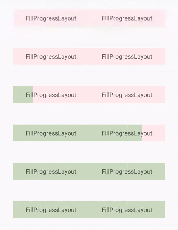
Left To Right
| | |
| | Right To Left
| | |
| | Top To Bottom
| | |
| | Bottom To Top
| |
|
Additional
Rounded Corners sample

Gradient Progress sample

Customisation
Here are the attributes you can specify through XML or related setters programatically:
fpl_backgroundColor- Set background color.fpl_progressColor- Set progress color.fpl_isRounded- Set true if you need rounded corners.fpl_roundedCornerRadius- Set radius for round corners.fpl_progress- Set current progress.fpl_progressDuration- Set fill duration.fpl_shouldRestart- Set if progress filling should restart from 0.fplprogressDirection- Set fill direction. i.e.lefttoright,righttoleft,toptobottomorbottomto_topfpl_gradientColors- Set array of gradient colors i.e.@array/gradientColorsfpl_gradientMovement- Set true for gradient movement with progress and false for static fillingfplgradientDirection- Set Gradient direction. i.e.lefttoright,righttoleft,toptobottom,bottomtotop,toplefttobottomright,toprighttobottomleft,bottomrighttotopleftorbottomlefttotop_right
📄 License
FillProgressLayout is released under the MIT license. See LICENSE for details.


