
Native-first, all-in-one React Native accessibility toolkit for iOS & Android — screen reader focus order, announcements (VoiceOver/TalkBack), physical keyboard support, and iOS accessibility containers, all under one `A11y.*` namespace. New Arch, Old Arch, Bridgeless & Expo ready.

React Native A11y
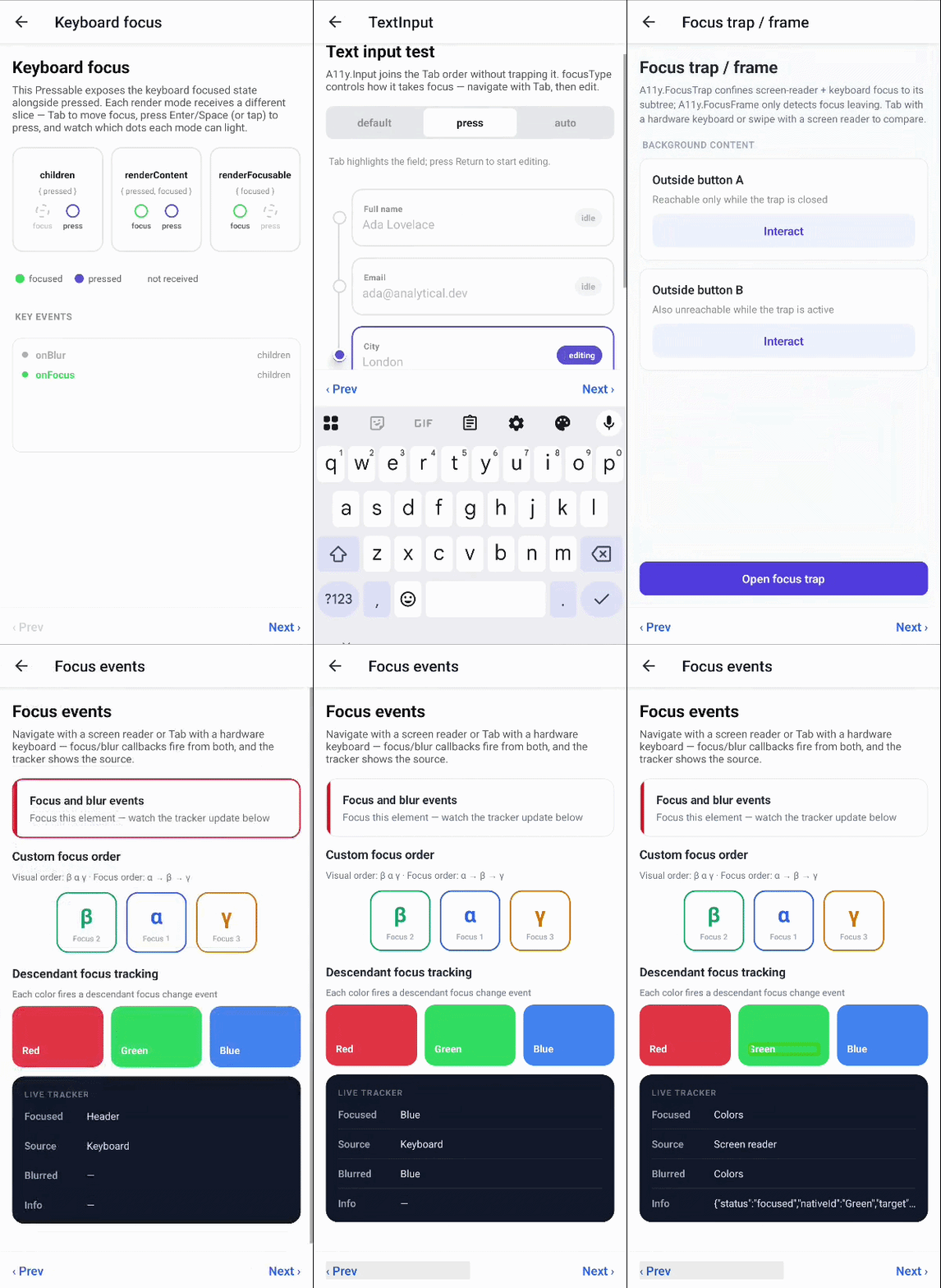
Native-first, all-in-one React Native accessibility toolkit — screen reader focus order & announcements (VoiceOver / TalkBack), physical (external) keyboard support, keyboard-connection status, and iOS accessibility containers, on iOS and Android. Everything ships under a single A11y.* namespace.
- 🔢 Screen reader focus order — define the exact traversal sequence, independent of render order
- 🃏 Cards with inner buttons — card action and nested controls, both accessible at once
- 🔒 Focus lock — keep VoiceOver, TalkBack, and keyboard focus inside modals & overlays
- 📣 Announcements — reliable, navigation-aware messages and screen/panel transitions
- 🎯 Keyboard focus management — focus/blur events,
autoFocus, imperative focus viaref - ⌨️ Key press events — handle key-down / key-up with full modifier info
- 🎨 Native focus styling — iOS halo &
tintColor, Android focus highlight - 📦 iOS accessibility containers —
UIAccessibilityContainersemantic grouping viaa11yUIContainer - 🔌 Keyboard connection status — listen for hardware keyboard connect/disconnect with
useIsKeyboardConnected - ✨ Optimistic values (iOS) — announce the predicted value the moment the user acts, not the stale one (a
react-native-a11y-state-patchalternative) - 📡 Runtime status hooks —
useIsKeyboardConnected,useIsScreenReaderEnabled - ⚡ New Architecture · Old Architecture · Bridgeless · Expo prebuild
| Bundled library | What it brings | | :-- | :-- | | react-native-a11y-order | Screen reader focus order control & announcements | | react-native-external-keyboard | Using & implementing physical keyboard features | | react-native-is-keyboard-connected | Listening for hardware keyboard connection | | react-native-a11y-container | iOS UIAccessibilityContainer semantic grouping |
Plus a built-in optimistic values workaround — an alternative to react-native-a11y-state-patch — that announces the predicted accessibility value the moment the user acts, instead of the stale one.
[!IMPORTANT]
This package re-merges the focused libraries into one. react-native-a11y was
originally split — for easier development and support — into
react-native-a11y-order,react-native-external-keyboard,react-native-is-keyboard-connected,and react-native-a11y-container.
They are now mature, and this package recombines all of them — plus the optimistic-values
workaround — under one unified A11y.* namespace. See The rework below.
[!TIP]
The focused packages stay published and are mutually exclusive — install exactly one.
Use react-native-a11y for the complete toolkit; reach for a single focused package
only if you need just that one capability.
Installation
yarn add react-native-a11y
cd ios && pod install
Get started with the getting started guide or jump straight to the component overview.
Quick start
Everything is imported from the single A11y namespace, with imperative APIs, hooks, and the keyboard-focus HOC at the top level.
Keyboard focus — A11y.Pressable, A11y.View, and A11y.Input are drop-in, keyboard-focusable views:
import { A11y } from 'react-native-a11y';
import { Text } from 'react-native';
<A11y.Pressable   autoFocus   onPress={onPress}   focusStyle={{ backgroundColor: 'dodgerblue' }} >   <Text>Press me with Space or Enter</Text> </A11y.Pressable>;
Screen reader order & announcements — A11y.Order + A11y.Index define the traversal sequence; announce posts a message:
import { A11y, announce } from 'react-native-a11y';
<A11y.Order>   <A11y.Index index={1}><Text>Read first</Text></A11y.Index>   <A11y.Index index={3}><Text>Read third</Text></A11y.Index>   <A11y.Index index={2}><Text>Read second</Text></A11y.Index> </A11y.Order>;
announce('Changes saved');
A11y.View is one component that accepts both prop sets — give it keyboard props, screen-reader props, or both. To add keyboard focus to a component the namespace doesn't cover, wrap it with the withKeyboardFocus HOC.
[!NOTE]
On iOS, long-pressing the spacebar does not fire a long press — iOS routes it through
Full Keyboard Access. Use Tab + M (the default "open context menu" command) instead,
via onContextMenuPress.
Architecture support
| Capability | Supported | | :-- | :-- | | New Architecture (Fabric / Turbo Modules) | ✅ | | Old Architecture (Bridge) | ✅ | | Bridgeless mode | ✅ | | Expo (prebuild / bare) | ✅ |
Documentation
New here? Start with the getting started guide, then follow a task-focused guide. The full docs index links everything.
Guides — physical keyboard
- Pressable focus handling — focus/blur events,
focusStyle, render props - Native focus styling — iOS halo &
tintColor, Android focus highlight - Programmatic focus —
ref.focus(),keyboardFocus(),autoFocus - Keyboard text input —
A11y.Input,focusType,blurType - Keyboard focus order — link-based, index-based, direction locking
- Screen-reader focus order —
A11y.Order+A11y.Index - Cards with inner buttons —
A11y.Card - iOS semantic containers —
a11yUIContainer - Screen-reader focus events — focus/blur callbacks
- Focus lock —
A11y.FocusTrap/A11y.FocusFrame - Announcements —
announce/ScreenReader,A11y.PaneTitle
- Optimistic accessibility values — predicted-value announcements (iOS)
- Connection & runtime status —
useIsKeyboardConnected,useIsScreenReaderEnabled
- Component overview — every component and its props
- API reference — announcements, modules, hooks, the imperative ref, shared types
- Legacy API — the
Legacy.*imperative 0.7 shim - Migration guide — from 0.7,
-order, or-external-keyboard
What's available
Components
| Export | Purpose | | :-- | :-- | | A11y.View | Unified focusable View — screen-reader + keyboard props, all opt-in. | | A11y.Pressable | Keyboard- and screen-reader-focusable Pressable. | | A11y.Input | TextInput with keyboard focus support. | | A11y.Order / A11y.Index | Declarative screen-reader traversal order. | | A11y.Card | Card that keeps inner interactive elements accessible. | | A11y.FocusTrap / A11y.FocusFrame | Confine screen-reader and keyboard focus to a region. | | A11y.PaneTitle / A11y.ScreenChange | Screen / panel transition announcements. | | A11y.FocusGroup | iOS focusGroupIdentifier grouping + shared tintColor. | | withKeyboardFocus(C) | HOC that adds keyboard focus to any Pressable/Touchable-like component. |
API
| Export | Purpose | | :-- | :-- | | announce / ScreenReader | Reliable, navigation-aware announcements. | | Keyboard | Dismiss the soft keyboard from a hardware keyboard. | | KeyboardFocus ref | Imperative focus handle (focus, keyboardFocus, screenReaderFocus). | | Hooks | useIsKeyboardConnected, useIsScreenReaderEnabled, useIsViewFocused, … | | Focus-order props | orderId, order*, orderIndex, orderGroup, lockFocus. | | Legacy.* | Imperative 0.7 focus-order shim (useFocusOrder, …). |
The rework
The original all-in-one react-native-a11y (0.7.0) was split into focused packages to make each capability easier to develop, test, and support:
react-native-a11y-order— screen reader focus order & announcementsreact-native-external-keyboard— physical keyboard supportreact-native-is-keyboard-connected— hardware keyboard connection statusreact-native-a11y-container— iOSUIAccessibilityContainergrouping
react-native-a11y — rebuilt fresh from the modern packages (whose native
bridges are newer than the legacy 0.7.0 code), not patched on top of the old one. It also
folds in an optimistic-values workaround as an alternative to
react-native-a11y-state-patch.
What this means for you:
- One unified namespace. A single
A11y.View/A11y.Pressable/A11y.Inputtakes
A11y.FocusTrap / A11y.FocusFrame confines screen-reader and keyboard focus.
- Everything in one place. Screen-reader order, keyboard support, keyboard-connection
- Self-contained. No runtime dependency on the split packages — install only
react-native-a11y.
- Migration shim. The imperative 0.7 focus-order API lives under
Legacy.* for a near drop-in upgrade.
Coming from 0.7 or any of the focused packages (react-native-a11y-order, react-native-external-keyboard, react-native-is-keyboard-connected, react-native-a11y-container)? Each path has its own section in the migration guide.
Contributing
Any type of contribution is highly appreciated. Feel free to create PRs, raise issues, or share ideas — see the contributing guide for the development workflow.
Acknowledgements
This library stands on the work behind all of its source packages. Thanks to the initial authors Andrii Koval, Michail Chavkin, and Dzmitry Khamitsevich, and to everyone who contributed, reported issues, and followed along across react-native-a11y-order, react-native-external-keyboard, react-native-is-keyboard-connected, and react-native-a11y-container.
License
MIT
Made with create-react-native-library


