
:bar_chart: More styles and useful extensions for Matplotlib

Some useful extensions for Matplotlib.







This package includes some useful or beautiful extensions to Matplotlib. Most of those features could be in Matplotlib itself, but I haven't had time to PR yet. If you're eager, let me know and I'll support the effort.
Install with
pip install matplotx[all]and use in Python with
import matplotxSee below for what matplotx can do.
Clean line plots (dufte)
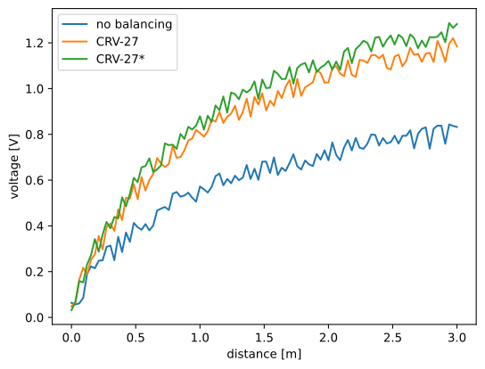 | 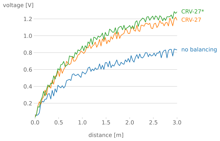 | 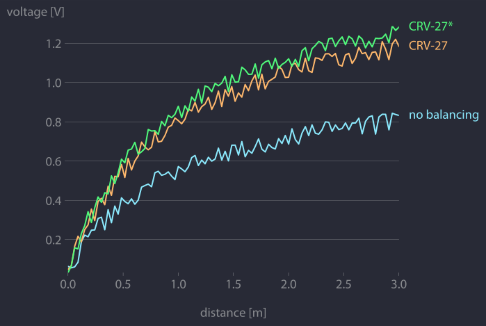 |
| matplotlib | matplotx.styles.dufte, matplotx.ylabel_top, matplotx.line_labels | matplotx.styles.duftify(matplotx.styles.dracula) |
The middle plot is created with
import matplotlib.pyplot as plt
import matplotx
import numpy as np
create data
rng = np.random.default_rng(0)
offsets = [1.0, 1.50, 1.60]
labels = ["no balancing", "CRV-27", "CRV-27*"]
x0 = np.linspace(0.0, 3.0, 100)
y = [offset  x0 / (x0 + 1) + 0.1  rng.random(len(x0)) for offset in offsets]
plot
with plt.style.context(matplotx.styles.dufte):
    for yy, label in zip(y, labels):
        plt.plot(x0, yy, label=label)
    plt.xlabel("distance [m]")
    matplotx.ylabel_top("voltage [V]")  # move ylabel to the top, rotate
    matplotx.line_labels()  # line labels to the right
    plt.show()
The three matplotx ingredients are:
matplotx.styles.dufte: A minimalistic stylematplotx.ylabel_top: Rotate and move the the y-labelmatplotx.line_labels: Show line labels to the right, with the line color
matplotx.styles.duftify(matplotx.styles.dracula)Further reading and other styles:
- Cereblog, Remove to improve: Line Graph Edition_
- Show the Data - Maximize the Data Ink Ratio
- Randal S. Olson's blog entry
- prettyplotlib
- Wikipedia: Chartjunk
Clean bar plots
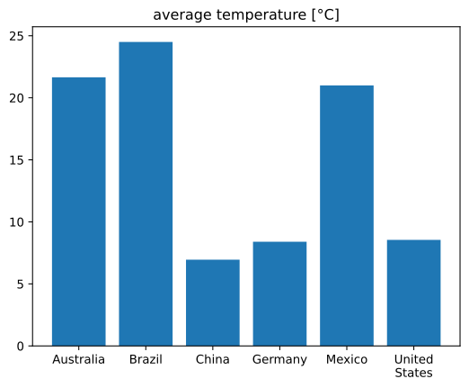 | 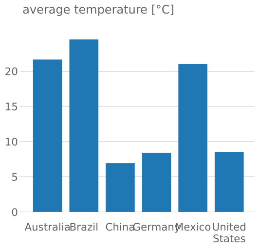 | 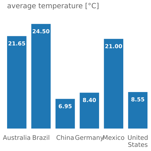 |
| matplotlib | dufte | dufte with matplotx.showbarvalues() |
The right plot is created with
import matplotlib.pyplot as plt
import matplotx
labels = ["Australia", "Brazil", "China", "Germany", "Mexico", "United\nStates"] vals = [21.65, 24.5, 6.95, 8.40, 21.00, 8.55] xpos = range(len(vals))
with plt.style.context(matplotx.styles.dufte_bar):     plt.bar(xpos, vals)     plt.xticks(xpos, labels)     matplotx.showbarvalues("{:.2f}")     plt.title("average temperature [°C]")     plt.show()
The two matplotx ingredients are:
matplotx.styles.dufte_bar: A minimalistic style for bar plotsmatplotx.showbarvalues: Show bar values directly at the bars
Extra styles
matplotx contains numerous extra color schemes, e.g., Dracula, Nord, gruvbox, and Solarized, the revised Tableau colors.
import matplotlib.pyplot as plt
import matplotx
use everywhere:
plt.style.use(matplotx.styles.dracula)
use with context:
with plt.style.context(matplotx.styles.dracula):
    pass
|  | | :----------------------------------------------------------------------------------: | |
  | |
| |  | |
| |  |
|
Many more styles here...
|  | | :-----------------------------------------------------------------------------------: | |
  | |
| |  | |
| |  | |
| |  | |
| |  | |
| |  | |
| |  | |
| |  | |
| |  | |
| |  | |
| |  | |
| |  | |
| |  | |
| |  | |
| |  | |
| |  | |
| |  | |
| |  | |
| |  |
|
Other styles:
- John Garrett, Science Plots_
- Dominik Haitz, Cyberpunk style_
- Dominik Haitz, Matplotlib stylesheets_
- Carlos da Costa, The Grand Budapest Hotel
- Danny Antaki, vaporwave aesthetics_
- QuantumBlack Labs, QuantumBlack_
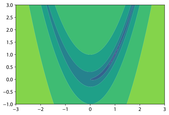
Smooth contours
|  |
| 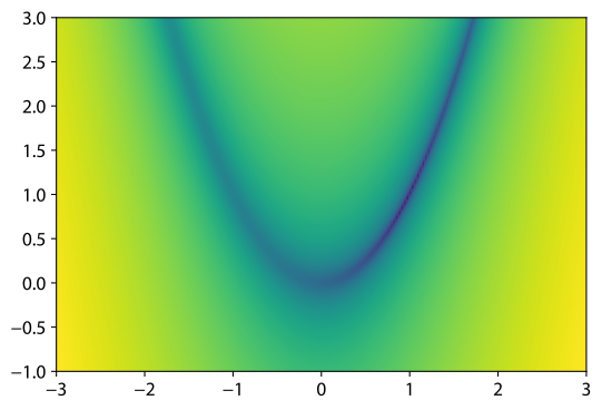 | | :--------------------------------------------------------------------------: | :-------------------------------------------------------------------------------: | |
 plt.contourf | matplotx.contours() |
Sometimes, the sharp edges of contour[f] plots don't accurately represent the smoothness of the function in question. Smooth contours, contours(), serves as a drop-in replacement.
import matplotlib.pyplot as plt
import matplotx
def rosenbrock(x):     return (1.0 - x[0])  2 + 100.0  (x[1] - x[0]  2) * 2
im = matplotx.contours(     rosenbrock,     (-3.0, 3.0, 200),     (-1.0, 3.0, 200),     log_scaling=True,     cmap="viridis",     outline="white", ) plt.gca().set_aspect("equal") plt.colorbar(im) plt.show()
Contour plots for functions with discontinuities
|  |
| 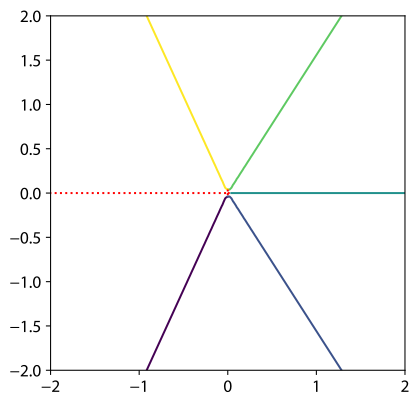 | | :-------------------------------------------------------------------------: | :------------------------------------------------------------------------------: | |
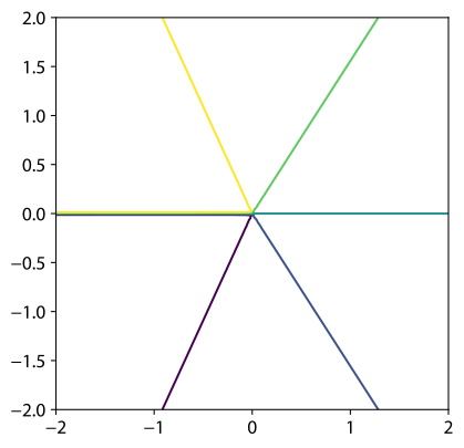
 plt.contour | matplotx.contour(max_jump=1.0) |
Matplotlib has problems with contour plots of functions that have discontinuities. The software has no way to tell discontinuities and very sharp, but continuous cliffs apart, and contour lines will be drawn along the discontinuity.
matplotx improves upon this by adding the parameter max_jump. If the difference between two function values in the grid is larger than max_jump, a discontinuity is assumed and no line is drawn. Similarly, min_jump can be used to highlight the discontinuity.
As an example, take the function imag(log(Z)) for complex values Z. Matplotlib's contour lines along the negative real axis are wrong.
import matplotlib.pyplot as plt
import numpy as np
import matplotx
x = np.linspace(-2.0, 2.0, 100) y = np.linspace(-2.0, 2.0, 100)
X, Y = np.meshgrid(x, y) Z = X + 1j * Y
vals = np.imag(np.log(Z))
plt.contour(X, Y, vals, levels=[-2.0, -1.0, 0.0, 1.0, 2.0])  # draws wrong lines
matplotx.contour(X, Y, vals, levels=[-2.0, -1.0, 0.0, 1.0, 2.0], max_jump=1.0) matplotx.discontour(X, Y, vals, min_jump=1.0, linestyle=":", color="r")
plt.gca().set_aspect("equal") plt.show()
Relevant discussions:
spy plots (betterspy)
Show sparsity patterns of sparse matrices or write them to image files.
Example:
import matplotx
from scipy import sparse
A = sparse.rand(20, 20, density=0.1)
show the matrix
plt = matplotx.spy(
    A,
    # border_width=2,
    # border_color="red",
    # colormap="viridis"
)
plt.show()
or save it as png
matplotx.spy(A, filename="out.png")
| 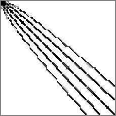 |
| 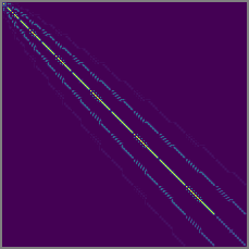 | | :----------------------------------------------------------: | :------------------------------------------------------------: | | no colormap | viridis |
There is a command-line tool that can be used to show matrix-market or Harwell-Boeing files:
matplotx spy msc00726.mtx [out.png]See matplotx spy -h for all options.
License
This software is published under the MIT license.


