
Customizable no-code component for building flow-based programming applications or workflow automation. 0 external dependencies. Check out https://nocode-js.com
Sequential Workflow Designer



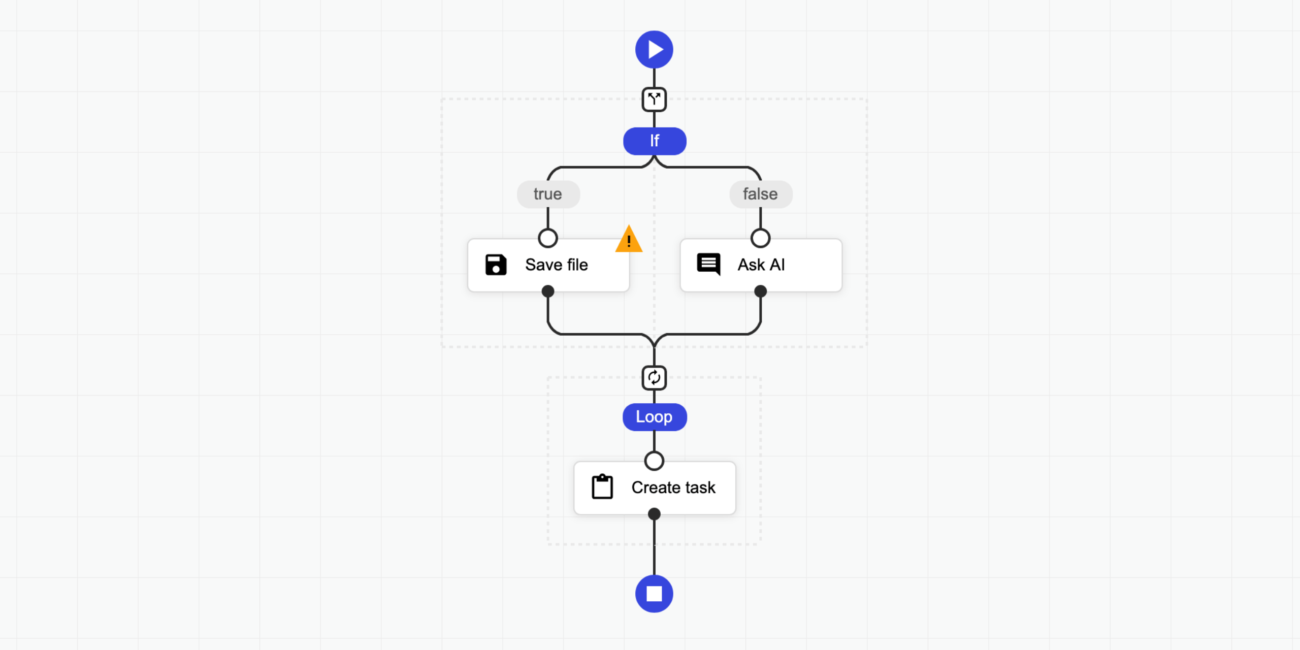
A sequential workflow designer with no external dependencies for web applications. It is written in pure TypeScript and uses SVG for rendering. This designer is not associated with any workflow engine; it is fully generic. You can use it to create any kind of application, from graphical programming languages to workflow builders.
Features:
- No external dependencies
- Fully generic and configurable
- Supports light, dark, and soft themes, with easy customization
- Compatible with modern browsers and mobile devices
- Definitions are stored as JSON
- Supports Angular, React and Svelte.
🤩 Don't miss the pro version.
👀 Examples
- ⏩ Live Testing
- 💥 Triggers
- ❎ Fullscreen
- 🌅 Image Filter
- 🔴 Particles
- 🌍 Internationalization
- ⛅ Light Dark
- 🤖 Code Generator
- 🌻 Rendering Test
- 🚄 Stress Test
- 🚪 Editing Restrictions
- 📜 Scrollable Page
- 🌵 Multi-Conditional Switch
- 🌀 Auto-Select
- 🔄 Step Changes Detection
- Angular Demo
- React Demo
- Svelte Demo
- 🤩 Pro Components
- 🍬 Custom Theme Flat
- 🌹 Custom Step Types
- 📺 Popup Editor
- 🔽 Collapsible Region
- 💼 Copy Paste
- 👈 Goto
- 📁 Folders
- ⭕ Wheel Mode
- 💠 Grid
- 🐭 Minimal Root Component
- 🦁 External UI Components
- 👋 Custom Dragged Component
- 🔰 Badges
- 🎩 Custom Viewport
- 👊 Double Click
- 🛎 Clickable Placeholder
- 📮 Conditional Placeholders
- React Pro Demo
- Angular Pro Demo
👩💻 Integrations
- ⛽ Sequential Workflow Editor - Powerful step editor builder. Don't write step editors manually, build them.
- 🚚 Sequential Workflow Machine - Workflow engine for browser and NodeJS apps, powered by the xstate library.
🚀 Installation
To use the designer, add the JS/TS and CSS files to your project.
NPM
Install this package with the NPM command:
npm i sequential-workflow-designer
To import the package:
import { Designer } from 'sequential-workflow-designer';If you use css-loader or similar, you can add CSS files to your bundle:
import 'sequential-workflow-designer/css/designer.css';
import 'sequential-workflow-designer/css/designer-light.css';
import 'sequential-workflow-designer/css/designer-soft.css';
import 'sequential-workflow-designer/css/designer-dark.css';
To create the designer, write the code below:
// ...
Designer.create(placeholder, definition, configuration);
CDN
Add the code below to the head section of your HTML document.
<head>
  ...
  <link href="https://cdn.jsdelivr.net/npm/sequential-workflow-designer@0.40.0/css/designer.css" rel="stylesheet" />
  <link href="https://cdn.jsdelivr.net/npm/sequential-workflow-designer@0.40.0/css/designer-light.css" rel="stylesheet" />
  <link href="https://cdn.jsdelivr.net/npm/sequential-workflow-designer@0.40.0/css/designer-dark.css" rel="stylesheet" />

</head>
Create the designer with:
sequentialWorkflowDesigner.Designer.create(placeholder, definition, configuration);🎬 Usage
Check the examples directory.
import { Designer } from 'sequential-workflow-designer';
const placeholder = document.getElementById('placeholder');
const definition = {   properties: {     myProperty: 'my-value',     // root properties...   },   sequence: [     // steps...   ], };
const configuration = {   theme: 'light', // optional, default: 'light'   isReadonly: false, // optional, default: false   undoStackSize: 10, // optional, default: 0 - disabled, 1+ - enabled
steps: {     // all properties in this section are optional
iconUrlProvider: (componentType, type) => {       return icon-${componentType}-${type}.svg;     },
isDraggable: (step, parentSequence) => {       return step.name !== 'y';     },     isDeletable: (step, parentSequence) => {       return step.properties['isDeletable'];     },     isDuplicable: (step, parentSequence) => {       return true;     },     canInsertStep: (step, targetSequence, targetIndex) => {       return targetSequence.length < 5;     },     canMoveStep: (sourceSequence, step, targetSequence, targetIndex) => {       return !step.properties['isLocked'];     },     canDeleteStep: (step, parentSequence) => {       return step.name !== 'x';     },   },
validator: {     // all validators are optional
step: (step, parentSequence, definition) => {       return /^[a-z]+$/.test(step.name);     },     root: definition => {       return definition.properties['memory'] > 256;     },   },
toolbox: {     isCollapsed: false,     groups: [       {         name: 'Files',         steps: [           // steps for the toolbox group         ],       },       {         name: 'Notification',         steps: [           // steps for the toolbox group         ],       },     ],   },
editors: {     isCollapsed: false,     rootEditorProvider: (definition, rootContext, isReadonly) => {       const editor = document.createElement('div');       // ...       return editor;     },     stepEditorProvider: (step, stepContext, definition, isReadonly) => {       const editor = document.createElement('div');       // ...       return editor;     },   },
controlBar: true,   contextMenu: true, };
const designer = Designer.create(placeholder, definition, configuration); designer.onDefinitionChanged.subscribe(event => {   // ... });
You can hide default UI components by setting the corresponding configuration property to false.
const configuration = {
  toolbox: false,
  editors: false,
  controlBar: false,
  contextMenu: false,
  // ...
};
💡 License
This project is released under the MIT license.


