
A Claude Code skill for web report decks — richer ECharts charts, one file per slide (edit one page, save tokens), and complex structure diagrams. 16:9 & vertical, PDF/image export.网页版 PPT 汇报的 Claude Code skill:ECharts 把数据画得更好看、每页一个文件改一页省 token、能做复杂结构图(架构/框架/价值链)。16:9 + 竖屏,导出 PDF 和图片
ppt-report-generator
English | 中文
Turn data reports into 16:9 web-based slide decks — a Claude Code skill / standalone project template.
One file per slide · physical data separation · ECharts · 5 themes · one-click PDF export


Preview
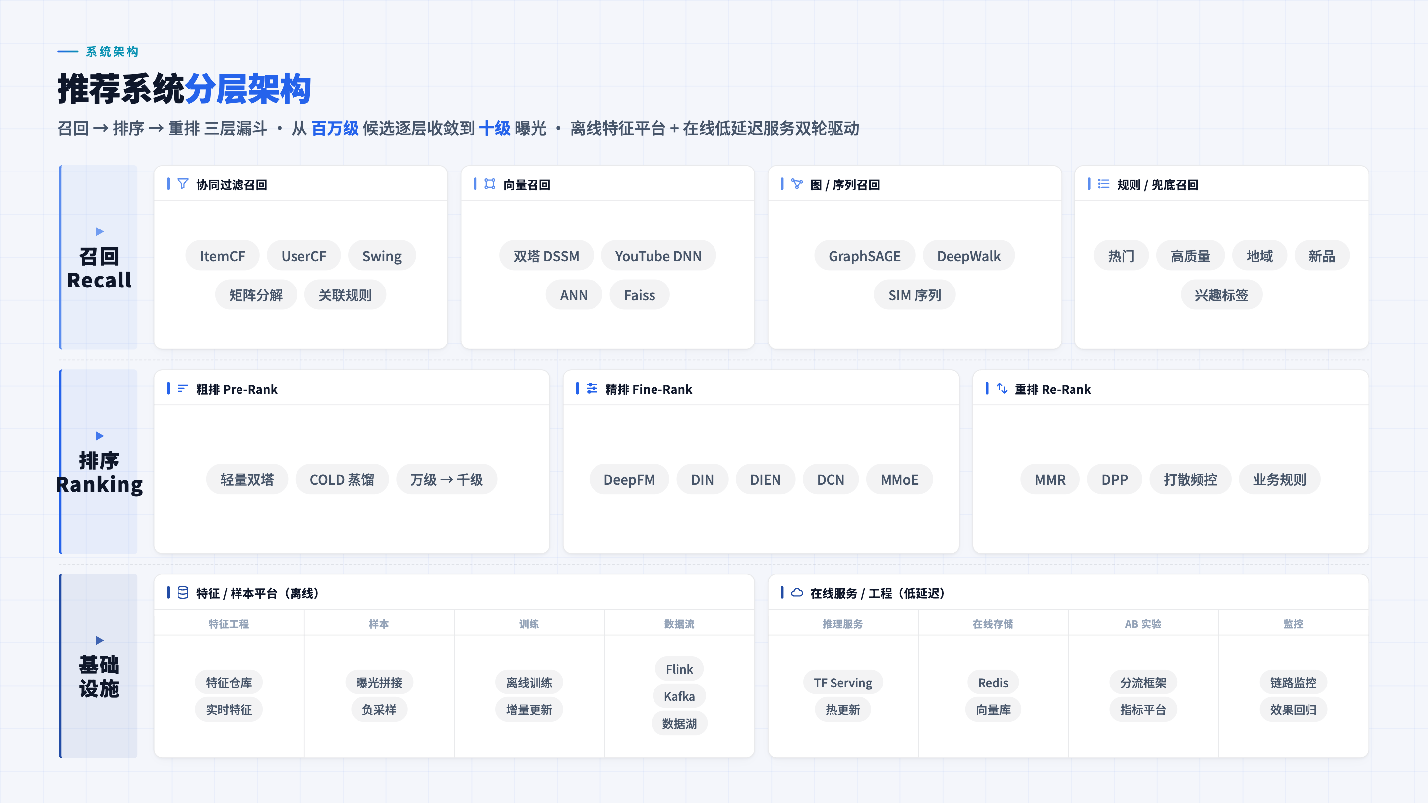
Recommender-system layered architecture (landscape-map template, no ECharts — pure CSS structure graph):
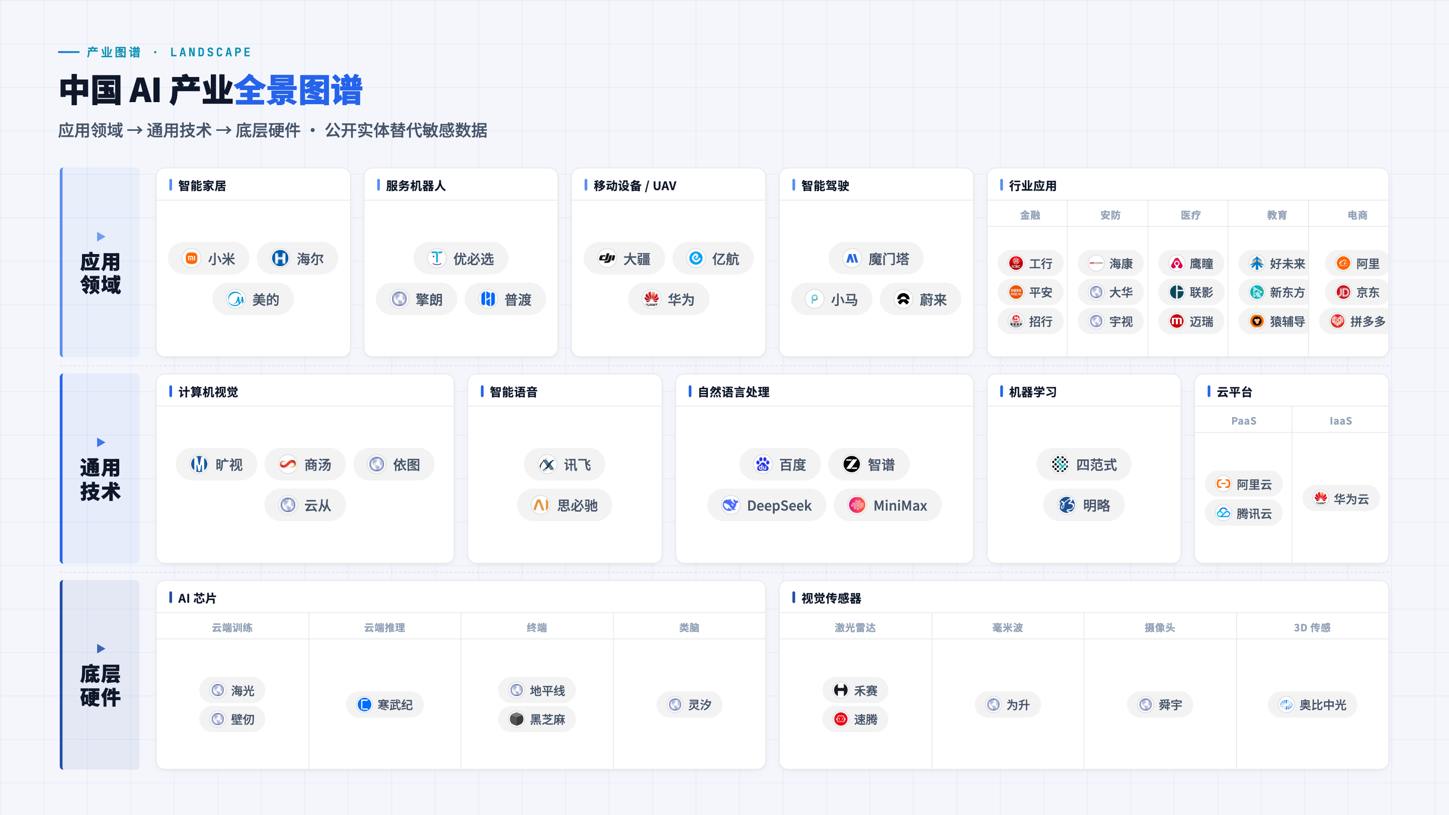
Industry landscape map (3-tier nested + logo wall; public entities replace sensitive data):
Human silhouette portrait (human-portrait template — data-driven, one-pass: a consulting-grade human silhouette with leader-line anchors auto-connecting to surrounding labels; born from "OpenAI IPO" deck, OpenClipart CC0):
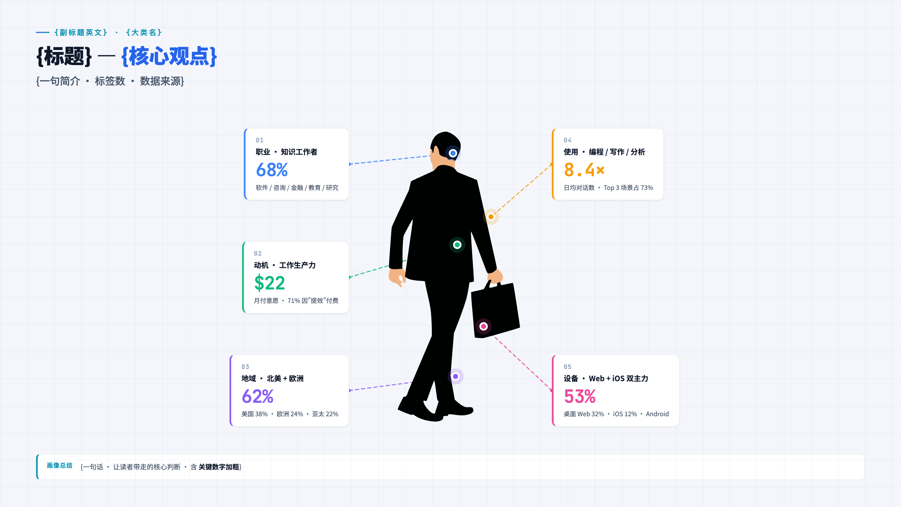
Central silhouette stays clean — colored dots (real SVG elements) on the silhouette mark body parts, and dashed leader lines auto-connect from each dot to its label card on the slide edges. You write only one block oflabelsdata (each bound to a bodypartlike head / heart / legs / shoulder / rightHand); the silhouette, anchor coordinates, dots, and leader lines are all computed automatically — no hand-drawn silhouette, no coordinate calibration, no manual leader-line placement. Works for user persona, anthropomorphic capability maps, job-risk heatmaps, and team pictograms.
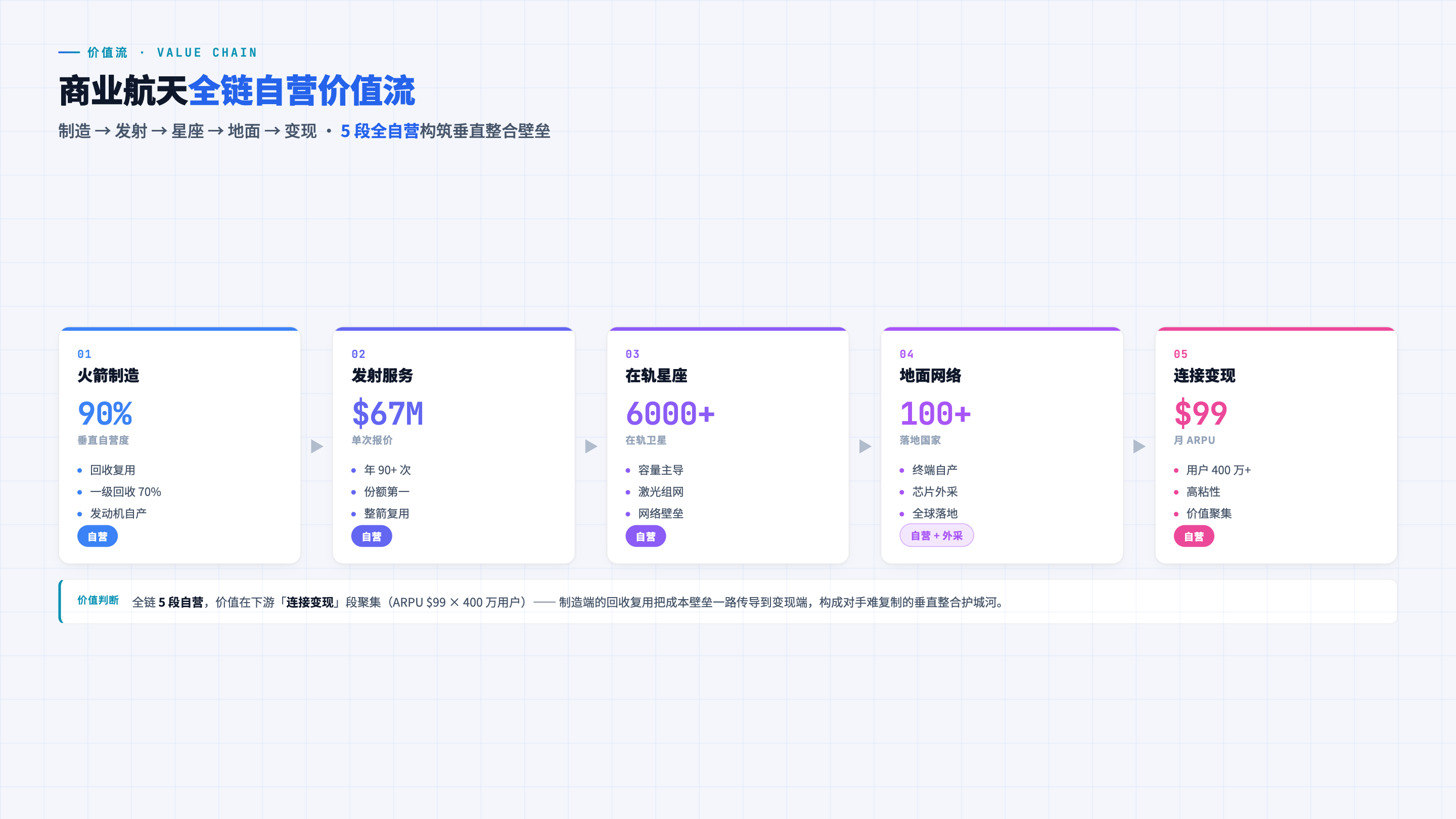
Value-flow chain (value-chain template — framework diagram for physical industries; horizontal value flow with self-operated / outsourced badges and a color gradient along the chain, pure CSS):
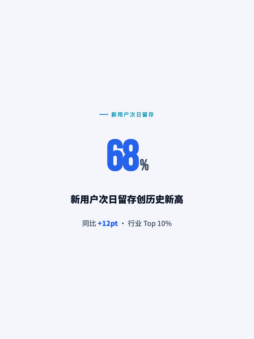
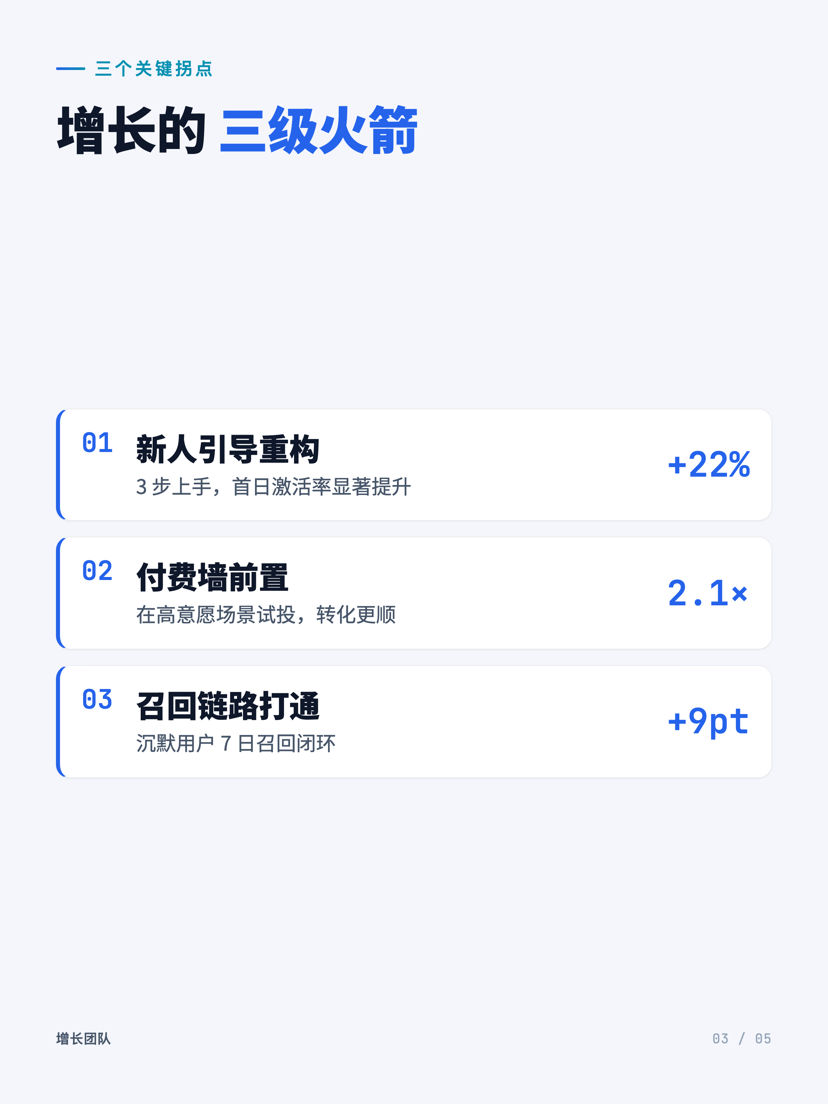
Vertical / portrait — for phone & social (portrait format — scenario-driven, low content density; one deck exports to any platform size: 小红书 3:4 / WeChat long-image / Stories 9:16 …):

What is this
A template that engineers the "data report → web slide deck" workflow. Two ways to use it:
- As a Claude Code Skill — drop this repo into
~/.claude/skills/ppt-report-generator/and let Claude build reports following this spec automatically - As a standalone project template — copy
assets/tosrc/and runpython3 build.pyto bundle a single HTML
What problem it solves
Slide tools (Keynote / Lark Docs / Google Slides) have a few chronic pain points for data reporting:
- ❌ Change one number → redraw the whole chart → half an hour gone
- ❌ Inconsistent font sizes across slides, misaligned cards, messy palette
- ❌ Want a different style? Redo every slide one by one
- ❌ Want Claude / GPT to fix one slide? You have to send the whole file — token explosion
ppt-report-generator solves this with an engineering approach:
- ✅ One slide = 3 small files (HTML + CSS + JS); changing a slide touches only 3 files of ≤ 200 lines each
- ✅ Data in Excel / CSV (JSON also supported); build auto-converts to JSON and injects it — next update only edits Excel, rendering code stays untouched
- ✅ 5 preset themes, switch with one click in the top-right corner — Business Navy / Tech Dark / Warm Business / Light Minimal / Minimal Mono
- ✅ ECharts charts + data-shape decision table, tells you which chart fits which data (refuses pie charts with 5+ slices)
- ✅ 8 font-size levels / 4 font weights / the "Golden 11" core principles — strict card-boundary alignment, no more "looks messy"
- ✅ Templates are single-file drop-ins — build.py auto-extracts their inline
<style>/<script>, so you just copy a template over and it plugs in (no need to split the style block into a separate css file) - ✅ One-click PDF export (playwright + img2pdf, 13.33×7.5 inch 16:9 standard)
What the repo provides
- 9 page templates (
assets/slides-templates/):
kpi-overview — multi-section × multi-card overview
- two-country — two-subject side-by-side comparison (KPI + metric table)
- three-phase — three-phase timeline + multiple charts
- multi-trend — multi-subject trend comparison
- supply-bars — categorical bars + trend lines
- landscape-map — industry / competitor landscape (12-grid 3-tier nested + logo wall; fully static pure CSS, JS only injects logos)
- matrix-2x2 — McKinsey / BCG-style 2×2 strategic matrix (4 quadrants + bubble positioning + 3 strategic insights; pure CSS, not ECharts scatter)
- human-portrait — consulting-grade human silhouette portraits, data-driven one-pass (male businessman with briefcase + female long-haired professional, OpenClipart CC0; central silhouette + body-part colored dots as real SVG elements + leader lines auto-connecting to surrounding label cards). You write only one block of labels data — each bound to a body part (head / heart / legs / shoulder / rightHand) — and the silhouette, coordinates, dots, and leader lines are all computed automatically (no hand-drawn silhouette, no coordinate calibration, no manual leader-line placement). Use for user persona / anthropomorphic capability map / job-risk heatmap / team pictogram. Pre-baked into scripts/silhouette.js as window.SILHOUETTE + injectSilhouette() + renderHumanPortrait() — drop-in shared across all slides
- value-chain — NEW ⭐ value-flow horizontal axis (physical-industry framework diagram) — the B skeleton from landscape-skeleton, for physical industries / asset-heavy businesses (commercial space, energy, manufacturing, consumer goods) to express "how value flows along the chain". 5–6 stage cards chained left-to-right with ▶ arrows, each carrying a core number + key activities + an own-vs-outsource badge, colors deepening along the chain. Fully static pure CSS, zero JS
- 5 preset themes: modern-light / dark-tech / warm-business / brand-blue / minimal-mono (one-click switch top-right, persisted via localStorage)
- 11 reference docs (
references/): architecture · design system · layout principles · chart selection · components · themes · landscape-skeleton · landscape-qa · matrix-2x2 · svg-aesthetics · human-portrait - Build scripts:
build.py(bundle HTML) +export_pdf.py(export PDF) +quickstart.sh(one-click init for a new project)
5-minute quickstart (standalone project mode)
# 1. Clone the repo
git clone https://github.com/<your-username>/ppt-report-generator.git
cd ppt-report-generator
2. One-click init a new project
./quickstart.sh ../my-report
3. Enter the project and start editing
cd ../my-report
Edit src/slides/slide-1.html / src/data/slide-1.json ...
python3 build.py
open *.html       # Open in browser, ← / → to navigate
4. (Optional) Export PDF
pip install playwright img2pdf
playwright install chromium
python3 export_pdf.py
Using it as a Claude Code Skill
# macOS / Linux
mkdir -p ~/.claude/skills
git clone https://github.com/<your-username>/ppt-report-generator.git ~/.claude/skills/ppt-report-generator
Then in Claude Code just say "make a monthly report" / "turn this data into a slide deck", and Claude will follow this skill's workflow automatically: pick a page template → organize data in src/data/slide-N.xlsx → lay out using the 8 font-size levels + the "Golden 11" principles → call the matching ECharts template function → output via build.py.
Language: the skill spec and reference docs ship in two languages. The repo root (SKILL.md,references/) is Chinese; a fully English version lives ini18n/en/(i18n/en/SKILL.md+i18n/en/references/, with an English trigger description). For English use, clone with that path as the skill root, e.g. point Claude Code ati18n/en/SKILL.md.
See SKILL.md for details.
Data format: Excel / CSV / JSON all work
Business data already lives in Excel — don't retype it into JSON:
src/data/
├── slide-1.xlsx    ← recommended — multiple sheets auto-convert to multiple JSON keys
├── slide-2.csv     ← single-table data
└── slide-3.json    ← complex nested structure / machine-generated
xlsx conversion rule: each sheet → one top-level JSON key, each row → one object ({header: value}). Sheets/columns starting with _ are skipped.
Example: slide-3.xlsx contains sheet kpis (columns label/value/unit) and trend (columns week/na/eu); after build it's injected as:
window.DATA_3 = {
  kpis:  [{label: 'DAU', value: 12.4, unit: '万'}, {label: 'ARR', value: 48, unit: 'M USD'}],
  trend: [{week: 'W1', na: 12.1, eu: 8.4}, {week: 'W2', na: 12.4, eu: 8.6}]
}
xlsx dependency: pip install openpyxl (csv / json use the standard library, no dependency). See references/architecture.md.
Repo structure
ppt-report-generator/
├── SKILL.md                    # Skill entry (Claude Code loads this)
├── README.md                   # The file you're reading
├── LICENSE                     # MIT
├── quickstart.sh               # One-click init for a new project
├── references/                 # Design philosophy & rules (11 docs)
│   ├── architecture.md         # Split architecture + build.py internals + adaptive scaling
│   ├── design-system.md        # 8 font-size levels / weights / colors / spacing hard rules
│   ├── layout-principles.md    # 14 classic slide layout rules (incl. card-boundary alignment)
│   ├── chart-mapping.md        # Data shape ↔ chart selection decision table + ECharts config templates
│   ├── components.md           # Common component library (KPI / Phase / Mini-bar etc.)
│   ├── themes.md               # 5 preset themes + customization
│   ├── landscape-skeleton.md   # Skeleton picker for industry-landscape pages (which framework fits)
│   ├── landscape-qa.md         # Landscape-map render & QA checklist
│   ├── matrix-2x2.md           # 2×2 strategic-matrix build rules
│   ├── svg-aesthetics.md       # Hand-written inline-SVG aesthetics (5 anti-ugly principles)
│   └── human-portrait.md       # Human-portrait template build rules
└── assets/                     # Ready-to-copy production files
    ├── shell.html              # HTML skeleton (placeholders)
    ├── build.py                # Bundle script (auto-detects N slides + xlsx/csv/json data; auto-extracts templates' inline <style>/<script>)
    ├── export_pdf.py           # PDF export
    ├── xlsx2json.py            # Excel/CSV → JSON converter (called by build, also runs standalone)
    ├── styles/
    │   ├── common.css          # 5 theme variables + adaptive scaling
    │   └── components.css      # Common components
    ├── scripts/
    │   ├── common.js           # Adaptive + navigation + 5 ECharts template functions
    │   ├── silhouette.js       # Human silhouette paths + body-part coords + renderHumanPortrait (used by human-portrait, auto-injected by build)
    │   └── theme-switcher.js   # Theme switching
    └── slides-templates/       # 9 page templates (copy → rename slide-N.html)
        ├── kpi-overview.html       # Multi-section × multi-card overview
        ├── two-country.html        # Two-subject side-by-side comparison
        ├── three-phase.html        # Three-phase timeline + multiple charts
        ├── multi-trend.html        # Multi-subject trend comparison
        ├── supply-bars.html        # Categorical bars + trend lines
        ├── landscape-map.html      # Industry / competitor landscape (3-tier nested + logo wall)
        ├── matrix-2x2.html         # McKinsey / BCG-style 2×2 strategic matrix
        ├── human-portrait.html     # Data-driven human silhouette portrait + leader lines
        └── value-chain.html        # Value-flow horizontal axis (physical-industry framework)
The data directorysrc/data/is created per-project byquickstart.shat init time; no sample data is preset.
Core philosophy (the "Golden 11")
- Don't hardcode data in rendering code → put it in
data/slide-N.json - Don't let a single slide's HTML exceed 200 lines
- Use only the 8 font-size levels
var(--fs-*); don't add new sizes ad hoc - No pie charts for 5+ items (use 100% stacked bars)
- Don't hardcode colors → use
var(--accent*)theme variables - Every slide must have the label / title / subtitle trio; subtitle contains the key number
- The design canvas is fixed at 1600×900; don't use vw/vh
- Always edit
src/, never the build output - Each slide answers one question and has one visual anchor
- The whole deck needs rhythm (alternating high/low density)
- Card boundaries must be strictly aligned: grid
1fr 1fr+flex:1 1 0; min-height:0+ flexible spacer to absorb differences; never hardcode height
references/ for details.
Use cases
- ✅ Monthly / quarterly business reports
- ✅ Internal / external decks for data teams
- ✅ Project proposals, project retrospectives
- ✅ Scenarios with many "comparison experiments / multi-subject trends / KPI overview" charts
- ⚠️ Less suitable for: text-heavy decks (see the docx skill), talks needing complex animation (see PowerPoint)
Compatibility
- Browsers: Chrome / Safari / Edge / Firefox (any modern version)
- Python: 3.8+ (only build.py needs it, no external deps; export_pdf.py needs playwright + img2pdf)
- ECharts: 5.5.x (loaded via CDN)
- Claude Code: required only when used as a skill
License
MIT — use, modify, and distribute freely.
Acknowledgements
Every rule grew out of a pitfall hit while making real reports.
Feedback & contributing
Issues / PRs welcome:
- Submit new page templates (with screenshots)
- Add new theme presets
- Fix a layout rule
- Translate the docs
ppt-report-generator(中文)
English | 中文
把数据汇报做成 16:9 网页版 PPT 的 Claude Code skill / 独立工程模板。
每页一个文件 · 数据物理分离 · ECharts · 5 套主题 · 一键导出 PDF
效果预览
推荐系统分层架构(landscape-map 模板,纯 CSS 结构图,不依赖 ECharts):
产业图谱全景(3-tier 嵌套 + logo 墙;用公开实体替代敏感数据):
人体剪影画像(human-portrait 模板 — 数据驱动一次成:咨询报告级西装提包剪影 + 引线自动锚定周边标签;源自"OpenAI IPO"deck,OpenClipart CC0):
中央剪影保持干净 — 剪影身上以可见色点(真实 SVG 元素)标识部位,虚线引线从色点自动连接到 slide 边缘的标签卡片。只写一段 labels 数据(每个标签绑定一个身体 part 名,如 head / heart / legs / shoulder / rightHand),剪影、坐标、色点、引线全部自动算出 —— 无需手画剪影、无需校准坐标、无需手摆引线。不用背景高亮圆。适合用户画像、拟人化能力地图、职业风险热图、团队 pictogram。
价值流横轴(value-chain 模板 — 实体产业框架图:横向价值链 + 自营/外采徽章 + 沿链渐变色,纯 CSS 全静态):
竖屏 · 手机 / 小红书 / 公众号(portrait 格式 — 场景驱动、低内容密度;一套内容精准导出多平台规格:小红书 3:4 / 公众号长图 / 朋友圈 4:5 / 手机全屏 9:16 …):
这是什么
一套把"数据汇报 → 网页 PPT"工程化的模板。两种用法:
- 作为 Claude Code Skill 使用 — 把这个仓库放到
~/.claude/skills/ppt-report-generator/,让 Claude 自动按这套规范帮你做汇报 - 作为独立工程模板使用 — 直接把
assets/拷成src/,运行python3 build.py合成单 HTML
它解决什么问题
PPT 工具(Keynote / 飞书文档 / Google Slides)做数据汇报有几个老大难:
- ❌ 改一个数字 → 整张图重画 → 半小时没了
- ❌ 上下页字号不一致、卡片对不齐、配色乱
- ❌ 想换风格?逐页重做
- ❌ Claude / GPT 想帮你改某一页?必须把整份发它,token 爆炸
ppt-report-generator 用工程化方法解决:
- ✅ 每页 = 3 个小文件(HTML + CSS + JS),改一页只动 3 个 ≤ 200 行的小文件
- ✅ 数据用 Excel / CSV(也支持 JSON),build 自动转 JSON 注入 — 下次更新只改 Excel,渲染代码完全不动
- ✅ 5 套预设主题,右上角一键切换 — 商务深蓝 / 科技深色 / 暖色商业 / 浅色简约 / 极简单色
- ✅ ECharts 图表 + 数据形态决策表,告诉你什么数据用什么图(拒绝 5 项以上饼图)
- ✅ 8 级字号 / 4 级字重 / "黄金 11 条"核心理念 — 卡片边界严格对齐、不再"看着乱"
- ✅ 模板单文件即插即用 — build.py 自动抽取内联
<style>/<script>,模板拷过去就能用(不用再手动把样式块拆到单独 css 文件) - ✅ 一键导 PDF(playwright + img2pdf,13.33×7.5 inch 16:9 标准)
仓库提供什么
- 9 套页面模板(
assets/slides-templates/):
kpi-overview — 多板块 × 多卡片总览
- two-country — 双对象左右对照(KPI + metric 表)
- three-phase — 三阶段时间线 + 多图表
- multi-trend — 多对象趋势对比
- supply-bars — 分类条形 + 趋势折线
- landscape-map — 产业图谱 / 竞品全景(12 栅格 3-tier 嵌套 + logo 墙;纯 CSS 全静态,JS 只注入 logo)
- matrix-2x2 — 麦肯锡 / BCG 风 2×2 战略矩阵(4 象限 + 气泡定位 + 3 条战略洞察;纯 CSS,不用 ECharts scatter)
- human-portrait — 咨询报告级人体剪影画像,数据驱动一次成(西装提包男 + 长发耸肩职业女,OpenClipart CC0;中央剪影 + 身体部位可见色点(真实 SVG 元素)+ 引线从色点自动连接到周边标签卡)。只写一段 labels 数据(每个标签绑定一个身体 part 名,如 head / heart / legs / shoulder / rightHand),剪影、坐标、色点、引线全部自动算出 —— 无需手画剪影、无需校准坐标、无需手摆引线;无背景高亮圆保持剪影干净。适用 用户画像 / 拟人化能力地图 / 职业风险图 / 团队 pictogram。剪影 path / 部位坐标 / 渲染逻辑预置在 scripts/silhouette.js(window.SILHOUETTE + injectSilhouette() + renderHumanPortrait()),由 renderHumanPortrait() 一次渲染,所有 slide 调用一份即可
- value-chain — 新增 ⭐ 价值流横轴模板(landscape-skeleton 的 B 骨架) — 给实体产业 / 重资产生意(商业航天、能源、制造、消费品)表达"价值如何沿链条流动"。5~6 个环节卡横向 ▶ 串联,每段含核心数字 + 关键活动 + 自营 / 外采徽章,颜色沿链渐深。纯 CSS 全静态、零 JS
- 5 套预设主题:modern-light / dark-tech / warm-business / brand-blue / minimal-mono(右上角一键切,localStorage 持久化)
- 11 份参考文档(
references/):架构 · 设计系统 · 布局法则 · 图表选型 · 组件 · 主题 · landscape-skeleton · landscape-qa · matrix-2x2 · svg-aesthetics · human-portrait - 构建脚本:
build.py(合成 HTML)+export_pdf.py(导出 PDF)+quickstart.sh(一键初始化新项目)
5 分钟上手(独立工程模式)
# 1. 克隆仓库
git clone https://github.com/<your-username>/ppt-report-generator.git
cd ppt-report-generator
2. 一键初始化新项目
./quickstart.sh ../my-report
3. 进项目,开始改
cd ../my-report
编辑 src/slides/slide-1.html / src/data/slide-1.json ...
python3 build.py
open *.html       # 浏览器打开,← / → 翻页
4.(可选)导出 PDF
pip install playwright img2pdf
playwright install chromium
python3 export_pdf.py
作为 Claude Code Skill 使用
# macOS / Linux
mkdir -p ~/.claude/skills
git clone https://github.com/<your-username>/ppt-report-generator.git ~/.claude/skills/ppt-report-generator
之后在 Claude Code 里直接说"做一份月度汇报" / "把这个数据做成 PPT",Claude 会自动按本 skill 的规范工作流走:选页面模板 → 在 src/data/slide-N.xlsx 整理数据 → 按 8 级字号 + "黄金 11 条"理念排版 → 调用对应 ECharts 范本函数 → build.py 输出。
语言版本:skill 规范和参考文档提供中英两份。仓库根目录(SKILL.md、references/)为中文;完整英文版在i18n/en/(i18n/en/SKILL.md+i18n/en/references/,含英文触发 description)。英文用户把该路径作为 skill 根目录使用,即让 Claude Code 加载i18n/en/SKILL.md。
详见 SKILL.md。
数据格式:Excel / CSV / JSON 都行
日常业务数据本来就在 Excel 里,不要再手抄到 JSON:
src/data/
├── slide-1.xlsx    ← 推荐 — 多 sheet 自动转为多个 JSON key
├── slide-2.csv     ← 单表数据
└── slide-3.json    ← 复杂嵌套结构 / 机器生成
xlsx 转换规则:每个 sheet → JSON 顶层一个 key,每行 → 一个对象({表头: 值})。以 _ 开头的 sheet/列名跳过。
举例:slide-3.xlsx 含 sheet kpis(label/value/unit 三列)和 trend(week/na/eu 三列),build 后注入为:
window.DATA_3 = {
  kpis:  [{label: 'DAU', value: 12.4, unit: '万'}, {label: 'ARR', value: 48, unit: 'M USD'}],
  trend: [{week: 'W1', na: 12.1, eu: 8.4}, {week: 'W2', na: 12.4, eu: 8.6}]
}
xlsx 依赖:pip install openpyxl(csv / json 用标准库,无依赖)。详见 references/architecture.md。
仓库结构
ppt-report-generator/
├── SKILL.md                    # Skill 入口(Claude Code 加载这个)
├── README.md                   # 你正在看的文件
├── LICENSE                     # MIT
├── quickstart.sh               # 一键初始化新项目
├── references/                 # 设计哲学与规则(共 11 份)
│   ├── architecture.md         # 拆分架构 + build.py 工作原理 + 自适应缩放
│   ├── design-system.md        # 8 级字号 / 字重 / 颜色 / 间距硬规则
│   ├── layout-principles.md    # 14 条经典 PPT 布局法则(含卡片边界对齐)
│   ├── chart-mapping.md        # 数据形态 ↔ 图表选型决策表 + ECharts 配置范本
│   ├── components.md           # 通用组件库(KPI / Phase / Mini-bar 等)
│   ├── themes.md               # 5 套预设主题 + 自定义方法
│   ├── landscape-skeleton.md   # 产业全景图骨架选择(哪种骨架适合该行业)
│   ├── landscape-qa.md         # landscape-map 渲染 + 质量自检清单
│   ├── matrix-2x2.md           # 2×2 战略矩阵构建规则
│   ├── svg-aesthetics.md       # 手写 inline SVG 美学(5 大反丑原则)
│   └── human-portrait.md       # human-portrait 模板构建规则
└── assets/                     # 可直接拷贝的成品文件
    ├── shell.html              # HTML 骨架(占位符)
    ├── build.py                # 合成脚本(自动检测 N 个 slides + xlsx/csv/json 数据;自动抽取模板内联 <style>/<script>)
    ├── export_pdf.py           # PDF 导出
    ├── xlsx2json.py            # Excel/CSV → JSON 转换器(被 build 调用,也可单跑)
    ├── styles/
    │   ├── common.css          # 5 套主题变量 + 自适应缩放
    │   └── components.css      # 通用组件
    ├── scripts/
    │   ├── common.js           # 自适应 + 导航 + 5 个 ECharts 范本函数
    │   ├── silhouette.js       # 人体剪影 path + 部位坐标 + renderHumanPortrait(human-portrait 页用,build 自动注入)
    │   └── theme-switcher.js   # 主题切换
    └── slides-templates/       # 9 套页面模板(拷贝 → 改名 slide-N.html)
        ├── kpi-overview.html       # 多板块 × 多卡片总览
        ├── two-country.html        # 双对象左右对照
        ├── three-phase.html        # 三阶段时间线 + 多图
        ├── multi-trend.html        # 多对象趋势对比
        ├── supply-bars.html        # 分类条形 + 趋势折线
        ├── landscape-map.html      # 产业图谱 / 竞品全景(3-tier 嵌套 + logo 墙)
        ├── matrix-2x2.html         # 麦肯锡 / BCG 风 2×2 战略矩阵
        ├── human-portrait.html     # 数据驱动人体剪影画像 + 引线
└── value-chain.html # 价值流横轴(实体产业框架图)数据目录src/data/由quickstart.sh在初始化时为新项目创建,不预置示例数据。
核心理念("黄金 11 条")
- 不要把数据写死在渲染代码里 → 进
data/slide-N.json - 不要让一页 HTML 超过 200 行
- 字号只用 8 级
var(--fs-*),不要随手加新字号 - 5 项以上不用饼图(用 100% 堆叠条形)
- 不要硬编码颜色 → 用
var(--accent*)主题变量 - 每页必有 label / title / subtitle 三件套,subtitle 含关键数字
- 设计稿固定 1600×900,不要用 vw/vh
- 永远改
src/,不要改 build 产物 - 每页只回答一个问题,只有一个视觉锚点
- 整份 deck 要有节奏(高/低密度交替)
- 卡片边界必须严格对齐:grid
1fr 1fr+flex:1 1 0; min-height:0+ 弹性占位补差,不写死 height
references/。
使用场景
- ✅ 月度 / 季度业务汇报
- ✅ 数据团队对内 / 对外 deck
- ✅ 立项汇报、项目复盘
- ✅ 有大量"对照实验 / 多对象趋势 / KPI 总览"图表的场景
- ⚠️ 不太适合:纯文字密集 deck(去看 docx skill)、需要复杂动画的演讲(去看 PowerPoint)
兼容性
- 浏览器:Chrome / Safari / Edge / Firefox(任意现代版本)
- Python:3.8+(仅 build.py 需要,无外部依赖;export_pdf.py 需要 playwright + img2pdf)
- ECharts:5.5.x(CDN 引入)
- Claude Code:作为 skill 使用需 Claude Code CLI
License
MIT — 随意使用、修改、分发。
致谢
每一条规则都从做汇报踩过的坑里长出来。
反馈与贡献
欢迎 issue / PR:
- 提交新的页面模板(带截图)
- 增加新主题预设
- 修正某条布局规则
- 翻译文档(目前主要是中文)


