
A modern collection of Vue color pickers – fast, accessible, and easy to use.
🎨 Vue Color




A collection of efficient and customizable color pickers, designed for modern web development.
🧪 Live Demo
Explore the components in action: 👉 Open Live Demo
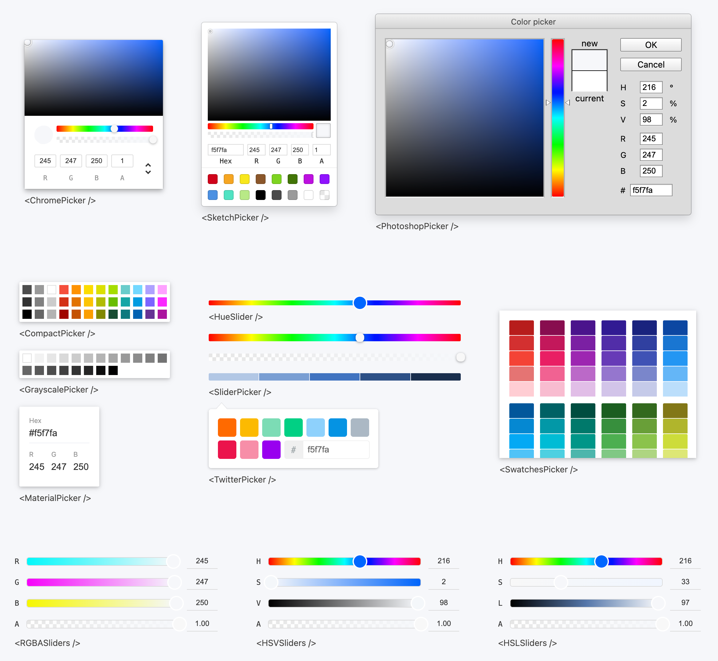
✨ Features
- Dual Vue Compatibility – Supports both Vue 2.7 and Vue 3 out of the box
- Modular & Tree-Shakable – Import only what you use
- TypeScript Ready – Full typings for better DX
- SSR-Friendly – Compatible with Nuxt and other SSR frameworks
- Optimized for Accessibility – Built with keyboard navigation and screen readers in mind
- Dark Mode Support – Built-in dark theme
📦 Installation
npm install vue-color
or
yarn add vue-color
🚀 Quick Start
1. Import styles
// main.ts
import { createApp } from 'vue'
import App from './App.vue'
// Import styles import 'vue-color/style.css';
createApp(App).mount('#app')
2. Use a color picker component
<template>
  <ChromePicker v-model="color" />
</template>
If you plan to use vue-color with Vue 2.7, please refer to Use with Vue 2.7.
📘 For a full list of available components, see the Documentation.
📚 Documentation
All Available Pickers
All color pickers listed below can be imported as named exports from vue-color.
import { ChromePicker, CompactPicker, HueSlider /* ...etc / } from 'vue-color';| Component Name | Docs | | ------- | ------- | | ChromePicker | View | | CompactPicker | View | | GrayscalePicker | View | | MaterialPicker | - | | PhotoshopPicker | View | | SketchPicker | View | | SliderPicker | View | | SwatchesPicker | View | | TwitterPicker | View | | HueSlider | View | | AlphaSlider | - | | HSLSliders | View | | HSVSliders | View | | RGBSliders | View |
Props & Events
All color picker components (expect for <HueSlider />) in vue-color share a set of common props and events for handling color updates and synchronization. Below we'll take <ChromePicker /> as an example to illustrate how to work with v-model.
v-model
<template>
  <ChromePicker v-model="color" />
</template>
The v-model of vue-color accepts a variety of color formats as input. It will preserve the format you provide, which is especially useful if you need format consistency throughout your app.
const color = defineModel({
  default: 'hsl(136, 54%, 43%)'
  // or
  default: '#32a852'
  // or
  default: '#32a852ff'
  // or
  default: { r: 255, g: 255, b: 255, a: 1 }
});
Under the hood, vue-color uses tinycolor2 to handle color parsing and conversion. This means you can pass in any color format that tinycolor2 supports—and it will just work.
v-model:tinyColor
<template>
  <ChromePicker v-model:tinyColor="tinyColor" />
</template>
In addition to plain color values, you can also bind a tinycolor2 instance using v-model:tinyColor. This gives you full control and utility of the tinycolor API.
⚠️ Note: You must use thetinycolorexported fromvue-colorto ensure compatibility with the library's internal handling.
SSR Compatibility
Since vue-color relies on DOM interaction, components must be rendered client-side. Example for Nuxt:
<template>
  <ClientOnly>
    <ChromePicker />
  </ClientOnly>
</template>
Dark Mode Support
By default, vue-color uses CSS variables defined under the :root scope. To enable dark mode, simply add a .dark class to your HTML element:
<html class="dark">
  <!-- your app -->
</html>
Use with Vue 2.7
To use vue-color with Vue 2.7:
<template>
  <ChromePicker v-model="color" />
</template>
Make sure to use vue-color/vue2 as the import path, and include the correct stylesheet: import vue-color/vue2/style.css in your main entry file.
TypeScript Support in Vue 2.7
Vue 2.7 has full TypeScript support, but vue-color does not include type declarations for the Vue 2.7 build.
You can work around this by manually adding the following shim:
// vue-color-shims.d.ts
declare module 'vue-color/vue2' {
  import { Component } from 'vue';
  import tinycolor from 'tinycolor2';
export const ChromePicker: Component;   export const SketchPicker: Component;   export const PhotoshopPicker: Component;   export const CompactPicker: Component;   export const GrayscalePicker: Component;   export const MaterialPicker: Component;   export const SliderPicker: Component;   export const TwitterPicker: Component;   export const SwatchesPicker: Component;   export const HueSlider: Component;   export const tinycolor: typeof tinycolor; }
declare module '*.css' {   const content: { [className: string]: string };   export default content; }
🧩 FAQ / Issue Guide
| Error / Symptom | Related Issue | |--------|----------------| | TS2742: The inferred type of 'default' cannot be named without a reference to ... (commonly triggered when using pnpm) | #278 |
🤝 Contributing
Contributions are welcome! Please open issues or pull requests as needed.


