
Vue large screen adaptive component vue大屏自适应组件
v-scale-screen
If you are using React, move to r-scale-screen
English | 简体中文
Large-screen adaptive container component, which can be used for large-screen project development, realizes screen adaptation, and can be adaptive according to width, height, and width and height ratios, and full-screen adaptation
In version 2.2.0 +, we support both vue > = v3 or > = 2.7, if your project is vue 2.6 version below, then use 1 x version
Demo
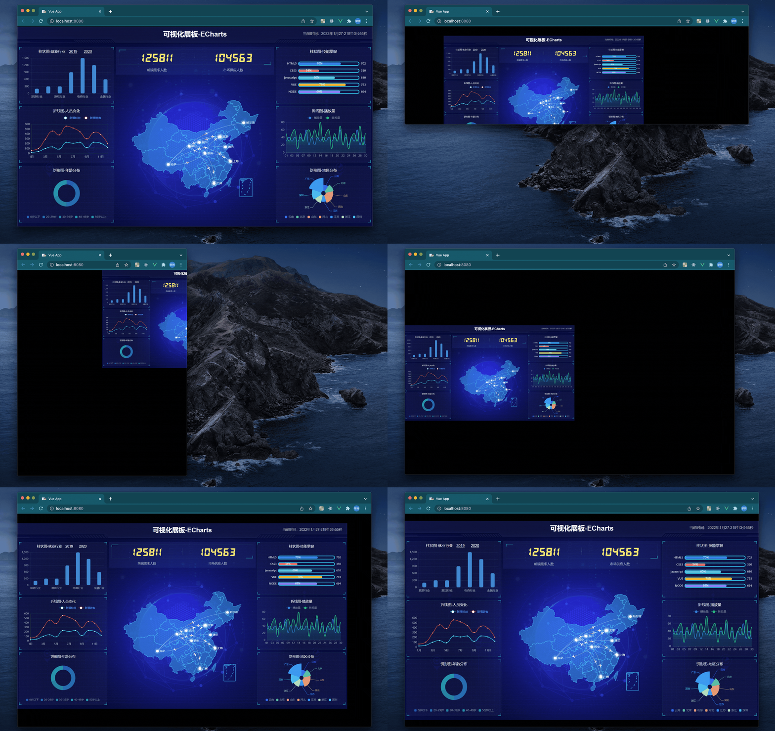
Install
npm install v-scale-screen
or
yarn add v-scale-screen
vue2.6 version
In vue2, we use plugin export, so we need Vue.use() to register
// main.js
import Vue from 'vue'
import VScaleScreen from 'v-scale-screen'
Vue.use(VScaleScreen)
<template>
  <v-scale-screen width="1920" height="1080">
    <div>
      <v-chart>....</v-chart>
      <v-chart>....</v-chart>
      <v-chart>....</v-chart>
      <v-chart>....</v-chart>
      <v-chart>....</v-chart>
    </div>
  </v-scale-screen>
</template>
Note: Please setbodystyle tooverflow: hidden;when using
Vue3 or Vue2.7 version
We export as components in vue 3
<template>
  <v-scale-screen width="1920" height="1080">
    <div>
      <v-chart>....</v-chart>
      <v-chart>....</v-chart>
      <v-chart>....</v-chart>
      <v-chart>....</v-chart>
      <v-chart>....</v-chart>
    </div>
  </v-scale-screen>
</template>
API
| Property | Description | Type | Default | | ------------------ | -------------------------------------------------------------------------------------------------------------------------------------------------------------------------------------------------------------------------------------------------------------------------------------------------------------- | -------------------------------- | ------- | | width | Large screen width | Number or String | 1920 | | height | Large screen height | Number or String | 1080 | | autoScale | Adaptive configuration, when configured as a boolean type, it is to enable or disable the adaptive configuration. When configured as an object, if x is true, the x-axis generates a margin; when y is true, the y-axis generates a margin. This configuration is enabled when the full screen is enabled fail | Boolean or {x:boolean,y:boolean} | true | | delay | Window resize delay time | Number | 500 | | fullScreen | Full-screen self-adaptive, there will be a stretching effect when this configuration item is enabled, and auto Scale will be invalid. It is not recommended to enable it if it is not necessary | Boolean | false | | boxStyle | Modify the container style, such as the side background color when displaying in the center, conforming to the Vue two-way binding style standard format | Object | null | | wrapperStyle | Modify the adaptive area style to conform to the Vue two-way binding style standard format | Object | null | | bodyOverflowHidden | After enabling, the body style will be automatically set to overflow: hidden | Boolean | true |


